
Direct Answer: To fix an AI-generated landing page on mobile without rebuilding it, developers should treat the working desktop HTML as an established baseline and isolate modifications to the specific containers causing layout failure. Instead of asking an AI to regenerate the entire document—which risks breaking working CSS grids, losing tracking scripts, and resetting copy—the effective approach is a three-part workflow: (1) diagnose the exact constraint (such as a hardcoded container width or an oversized display font); (2) apply scoped, bounded modifications to that specific DOM subtree; and (3) verify line wraps, touch targets, and visual hierarchy directly in a visual editor before exporting clean, portable HTML.
Most landing pages generated by AI look convincing in a desktop preview. Grids line up, fonts look modern, and spacing feels generous. But open that same page on a 375px mobile screen, and the experience frequently falls apart: a display headline takes up the entire first screen, an explanatory paragraph stretches beyond the right edge causing the page to wobble sideways, and action buttons cluster into awkward shapes.
The instinct for many developers is to paste the whole file back into a chat prompt with an instruction like "make this mobile friendly." That almost always makes things worse. Full-page regeneration destroys the details you already approved: working desktop breakpoints collapse, semantic tags get rewritten, custom analytics attributes disappear, and the model often hides the overflow with a quick overflow-x: hidden hack that simply chops off sentences instead of fixing the layout.
To fix an AI-generated landing page on mobile, you do not need to start over. When you understand why AI-generated code breaks on narrow screens, the fixes are surprisingly targeted and fast to execute.
Why AI-Generated Landing Pages Break on Mobile Screens
AI models generate code based on visual plausibility, but they lack awareness of real-world touch interaction and strict viewport constraints. When compressed into a 360px–390px mobile viewport, four common failure modes cause nearly all layout breakdowns:
| Mobile Failure Mode Underlying Technical Root Cause The Correct Engineering Fix | ||
| Horizontal scroll pollution (page wobbles sideways) | A paragraph, card, or image has a hardcoded pixel width (e.g., width: 420px) that exceeds the 375px viewport. | Unpin fixed container widths: replace with width: auto; max-width: 100% or fluid percentage widths. |
| Dominating headline (hero pushes offer below the fold) | Display typography (50px+) and wide line-heights calibrated for desktop screens. | Scale font size down proportionally (e.g., 34px–38px) and tighten line-height (1.08–1.15) to keep it within 2–3 visual lines. |
| Fragmented inline wraps (single words stranded on new lines) | Headlines split into multiple styled <span> tags where individual tags have conflicting sizes or display properties. | Treat the spans as one unified headline unit, applying consistent font-size while preserving inline accents. |
| Clipped text from overflow hacks | The model added overflow: hidden to an ancestor container to mask an unaddressed width bug. | Remove the overflow mask and fix the child element that is actually exceeding the container boundary. |
As documented in the MDN overflow specification, clipping content with overflow: hidden does not make a page responsive—it merely blinds the visitor to broken text. Real responsiveness means every element respects the container boundary naturally.
The Principle of Minimal Blast Radius
In software engineering, the blast radius is the amount of working code put at risk when making a change. When an AI generates a landing page that is 85% good, your goal should be to alter the 15% that needs improvement while keeping the remaining 85% completely frozen.
Instead of re-prompting from scratch, start by bringing your existing HTML file directly into a refinement canvas where the DOM is preserved as an immutable baseline.
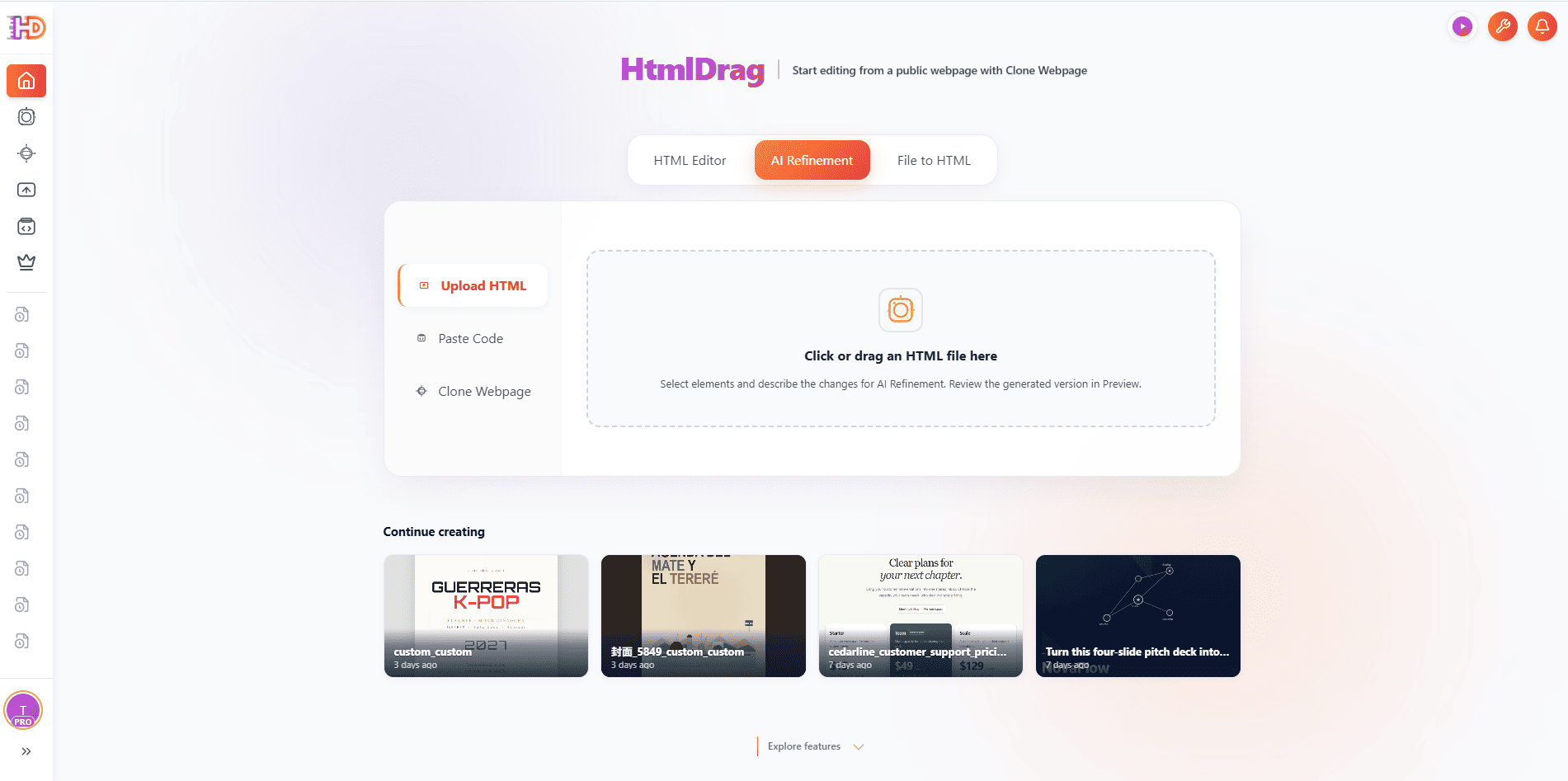 Figure 1. Starting from an existing HTML file preserves working structure, copy, and styling rather than regenerating the page from scratch.
When you start from existing code, you avoid hallucinations. You don't have to re-explain your brand palette, re-paste copywriting, or reconstruct layout grids. The existing document is the single source of truth.
Fixing the Mobile Hero: Typography Hierarchy and Container Unpinning
The first screen of a mobile landing page determines whether a visitor stays or bounces. If a headline occupies 70% of the screen height and pushes the value proposition off-screen, visitors lose context immediately.
In our architecture studio example, testing the page on a 375px mobile canvas revealed two distinct constraints: the headline was split into multiple styled spans occupying four awkward lines, and the descriptive paragraph was locked to a rigid 420px width, causing horizontal scroll.
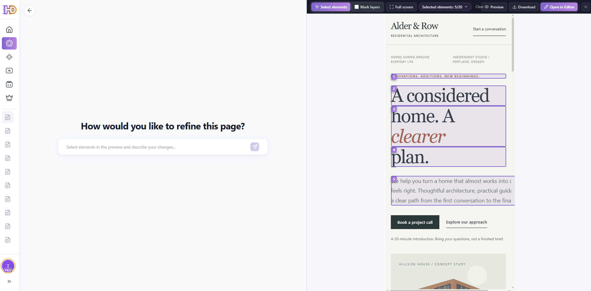 Figure 2. Identifying the layout constraints: an oversized multi-span headline and an unyielding 420px container width causing right-side overflow.
The key to fixing this without side effects is grouping related text elements into a single scoped instruction. If you only select a single word or span, the AI won't see how the surrounding lines wrap. By marking the eyebrow, the headline spans, and the paragraph together, you give the model the complete reading unit:
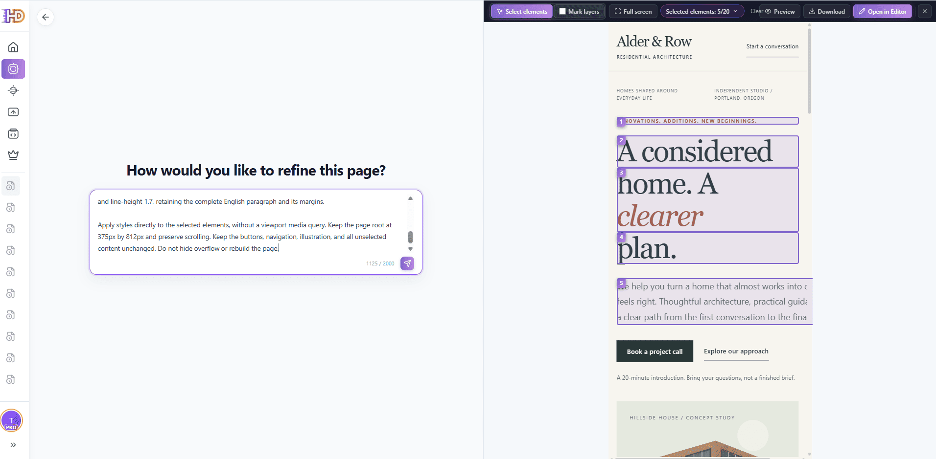 Figure 3. Targeting only the marked text nodes. The prompt explicitly preserves button groups, navigation, and surrounding containers.
When writing instructions for mobile refinement, follow three clear rules:
- Declare the unified role: If a headline consists of multiple
<span>tags, explicitly state that they form one continuous heading, so they receive matching line-height and proportional font sizes. - Unpin widths explicitly: Always specify replacing fixed pixel measurements on text containers with fluid rules:
width: auto; max-width: 100%. - Add negative constraints: Explicitly forbid touching unselected components: "Leave the navigation, buttons, and layout containers unchanged. Do not introduce overflow:hidden."
Refining Vector Assets and Micro-Copy in Place
AI-generated pages often include inline SVG illustrations or vector graphics. A common mistake is replacing the SVG with a generated raster image (PNG or JPG). Raster images introduce compression artifacts, increase page weight, and blur on high-density Retina screens.
Because inline SVGs live directly inside the DOM tree, you can refine their color palette, stroke weights, and surrounding captions through the same scoped workflow without touching the vector geometry.
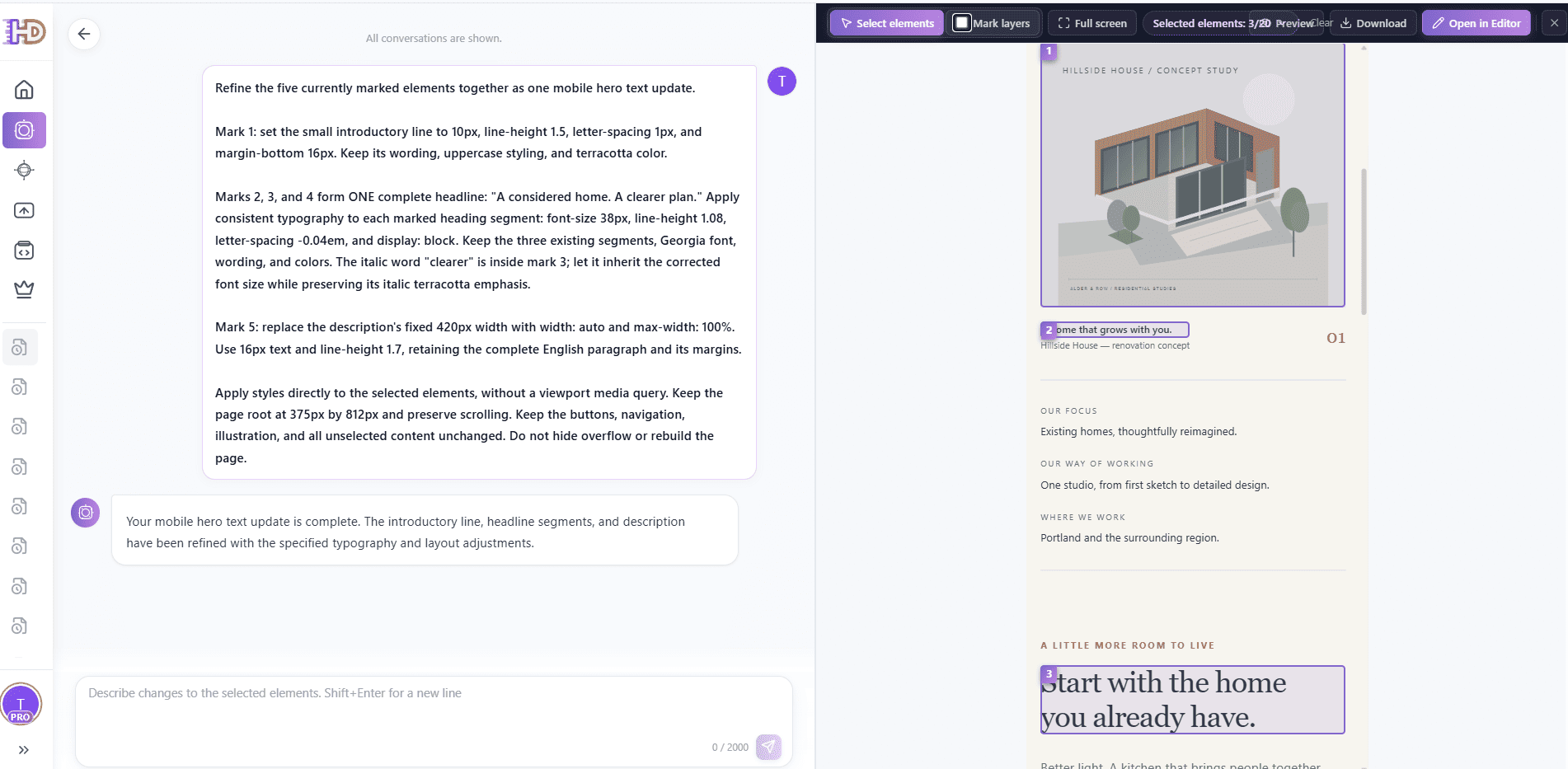 Figure 4. Selecting the inline SVG alongside its caption and supporting heading for a coordinated visual update.
By updating the SVG's internal color tokens to match the warm terracotta and forest green accents of the revised typography, the illustration feels custom-tailored to the brand rather than a generic stock asset:
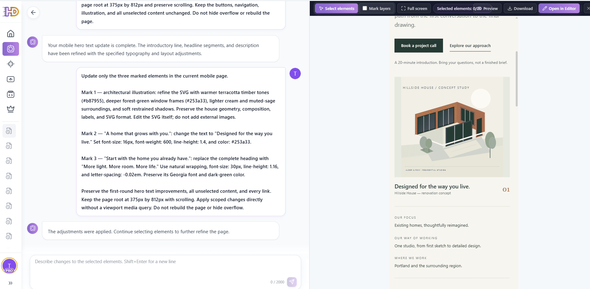 Figure 5. The refined mobile layout with coordinated vector palette, balanced line wraps, and harmonious visual weight.
A Hybrid Workflow: Combining Scoped AI with Visual HTML Editing
Conversational AI is great at multi-property changes, but it is notoriously inefficient for small, spatial decisions. Asking an AI to "move the button 4px lower and change the link destination" takes three prompt cycles and risks unintended style changes.
The most efficient workflow combines scoped AI for heavy lifting with direct visual editing for final polish:
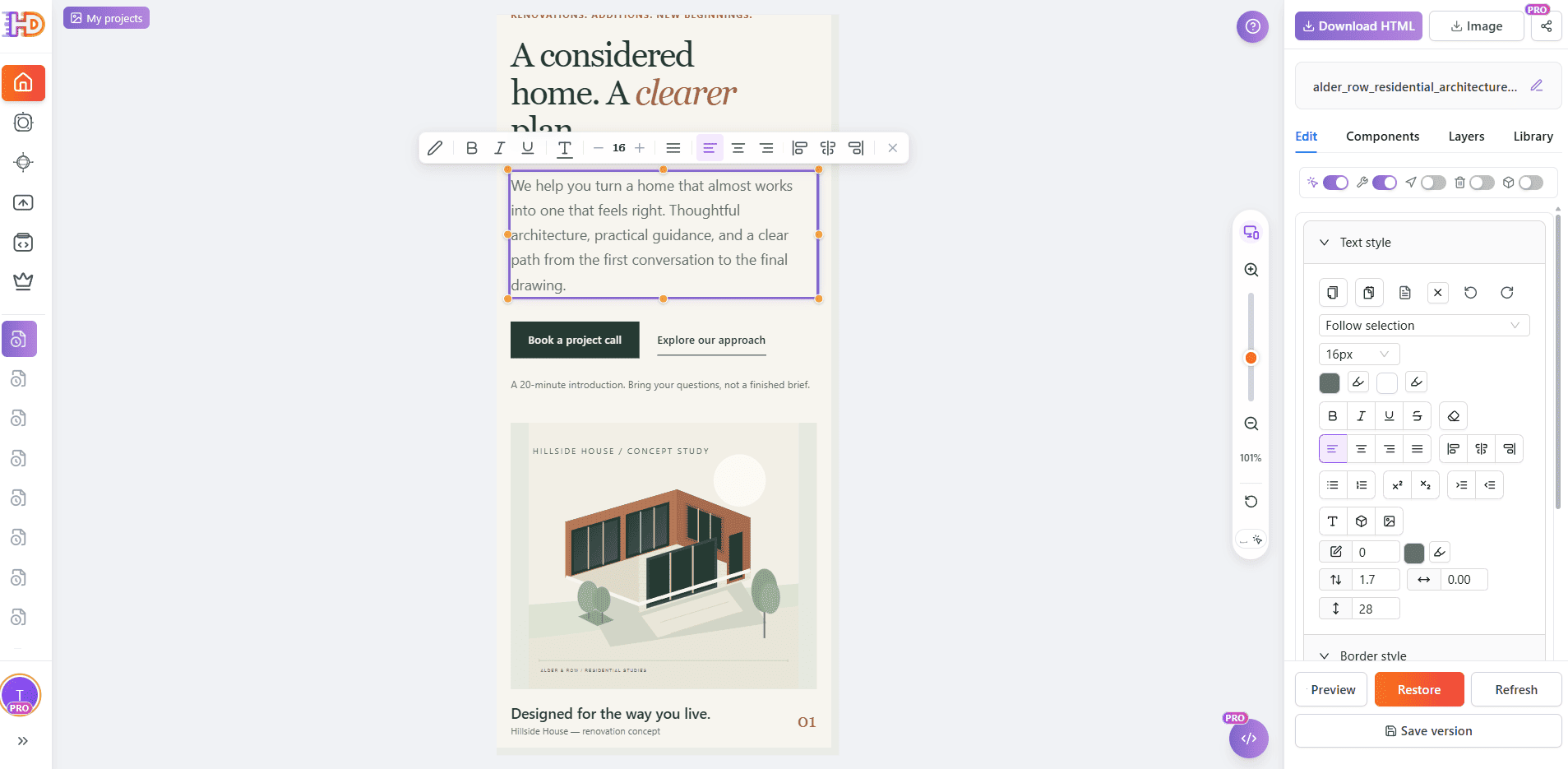 Figure 6. Direct visual inspection in the editor canvas. Selecting elements allows instant verification of rendered line heights, margins, and styles.
- Locking validated sections: Once your hero section looks right, lock it in the editor. This prevents accidental drag-and-drop shifts while you work on lower sections.
- Adding responsive data tables: If your landing page needs a plan comparison or feature list, insert a semantic
<table>component and wrap it in anoverflow-x: autocontainer. Mobile visitors can smoothly swipe through columns without causing the whole page to shift horizontally. - Binding conversion links & UTM parameters: Don't risk prompt hallucinations on your revenue links. Click the CTA button in the visual editor, type or paste the exact destination URL and campaign tracking tags (
utm_campaign,utm_source), and confirm the link directly. - Clean HTML export: Once satisfied, export standards-compliant HTML. There are no proprietary runtime scripts or vendor lock-in; the resulting file can be deployed to any static host, CDN, or CMS.
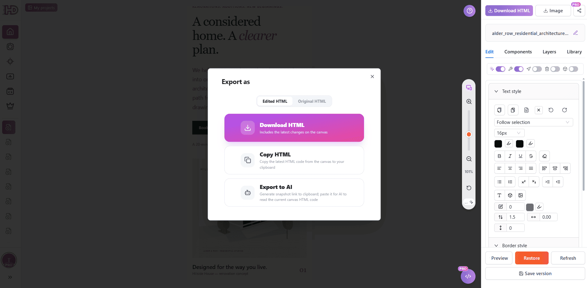 Figure 7. Exporting production-ready HTML directly from the canvas, ready for deployment.
Mobile Readiness Checklist Before Deploying
Before publishing your mobile landing page, verify these six criteria:
- Viewport meta tag is active: Ensure
<meta name="viewport" content="width=device-width, initial-scale=1.0">is present in the document<head>. - Strictly vertical scrolling: Drag the page horizontally on a real device or in mobile DevTools. There must be zero horizontal drift or blank margin on the right side.
- No artificial overflow clipping: Check that neither
bodynor the primary wrapper usesoverflow-x: hiddenas a bandage for an oversized child element. - Comfortable touch targets: Ensure primary action buttons and navigation links have at least 44 × 44px of tappable area and sufficient spacing to prevent mis-clicks.
- Clean typography wraps: Check that headlines wrap naturally without leaving single orphan words stranded on their own line.
- Independent browser verification: Open the exported HTML file directly in Chrome and Safari mobile viewports outside of the editing tool to verify that fonts and icons load correctly.
FAQ: Fixing AI-Generated HTML on Mobile
Why does shrinking font-size sometimes fail to eliminate horizontal overflow on mobile?
Font size only changes text dimensions; it does not change container box models. If a paragraph or wrapper has an explicit width rule like width: 420px or a rigid min-width, shrinking the text to 10px will still leave a 420px container breaking a 375px mobile screen. Always inspect and unpin the container width first.
Is resizing an editor preview canvas the same as responsive testing?
No. Preview canvas zoom scales the rendered pixels visually, but it does not execute CSS media queries or recalculate flexbox wrapping boundaries. Real mobile testing must be conducted at actual layout pixel widths (e.g., 375px or 390px).
How do I protect desktop layouts while refining mobile HTML?
If you are working with a single responsive file that uses media queries or utility classes, ensure your edits apply only within mobile breakpoint rules (e.g., mobile-first default styles) while keeping desktop overrides intact. If you maintain a dedicated mobile landing page, scope styles directly to the mobile canvas container.
Can AI refinement edit inline SVG graphics without breaking them?
Yes. Because inline SVG is part of the standard DOM, an AI can modify fill colors, stroke widths, and opacity properties directly in the SVG code. Specify in your prompt that the vector paths, viewBox, and geometry must remain intact and that no raster images should be substituted.
Have an existing AI landing page that needs mobile polish? Open HtmlDrag AI refinement, upload your HTML, and fix layout constraints without starting from scratch.