For many AI-generated websites and vibe-coded products, the page that most often turns excitement into hesitation is the pricing page. The first draft may already exist, the structure may already be usable, and the overall brand direction may already feel close. But once a visitor reaches pricing, the question changes from “what is this?” to “which option should I choose, why does it matter, and what should I do next?”
That is why AI-generated pricing sections often need a different kind of refinement than a homepage. The issue is not always missing content. More often, the issue is too much equal-weight information: plan cards that feel visually similar, feature lists that blur together, buttons that do not create urgency, and lower-page sections that add friction instead of confidence.
This article focuses on that exact editing workflow. Rather than regenerating an AI-built pricing page from scratch, we start from a public live page and show how to make it feel clearer, easier to scan, and more conversion-focused through visual editing alone.
Why This Topic Matters
Refining AI-generated websites is one of the most practical website-editing topics because AI builders and vibe coding can already produce usable first drafts quickly. What still determines whether a page performs well is the human refinement layer: clarity, hierarchy, trust, and decision flow. That is also where a browser-based visual HTML editor becomes useful, especially when you want to edit existing HTML instead of restarting the whole page.
- improve an AI-generated website without reopening code
- refine a vibe-coded pricing section without rebuilding the page
- improve plan-card hierarchy and CTA clarity after AI generation
- remove friction from FAQ, pricing tools, and lower-page sections
That makes AI-page refinement a strong long-tail topic for marketers, founders, consultants, and non-technical operators who already have a working page from AI or vibe coding but still need it to feel more deliberate and easier to act on.
What Usually Makes an AI-Generated Pricing Page Hard to Understand
Most AI-generated pricing pages do not fail because they are empty. They fail because they ask visitors to process too many decisions at once:
- weak plan hierarchy where every card looks equally important
- generic pricing copy that still sounds machine-drafted instead of decision-oriented
- overloaded feature stacks that make differences harder to compare
- unclear CTA wording that slows the next step
- extra tools and toggles that create complexity before confidence
- long lower-page sections that dilute the purchase decision instead of reinforcing it
If those issues are cleaned up quickly, the same AI-generated page can feel more direct and more trustworthy without needing a full redesign. For this walkthrough, we use brevo.com/pricing as the public demo page. The point is not that Brevo itself is AI-generated. The point is that its live pricing layout is stable enough to demonstrate the exact refinement workflow you would also use on an AI-generated or vibe-coded page.
Step-by-Step: Refine an AI-Generated Pricing Page Without Coding
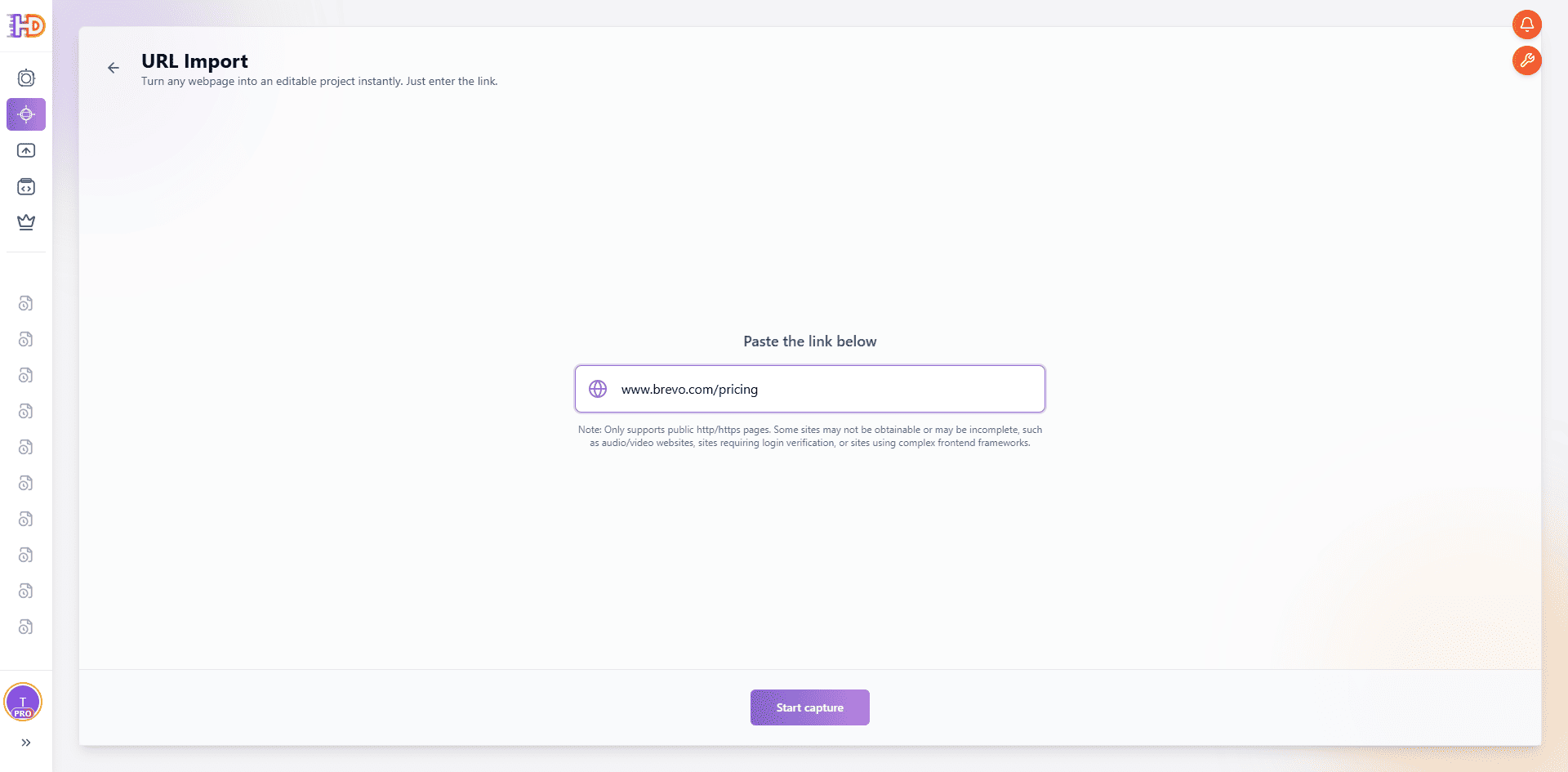
Step 1: Import the Live Pricing Page by URL and Open It as an Editable Canvas
Open HtmlDrag, a browser-based visual HTML editor for editing existing HTML, choose URL Import, and paste the pricing page you want to refine. In this example, we use:
The value of this step is not only that it captures a page. It turns an already-published pricing page into something you can adjust visually right away. That is especially useful when an AI builder or vibe-coding workflow has already given you a workable draft and what you need now is a faster pass on messaging, hierarchy, CTA emphasis, and decision flow. In practice, this means you can edit an existing website from URL instead of rebuilding the whole thing.
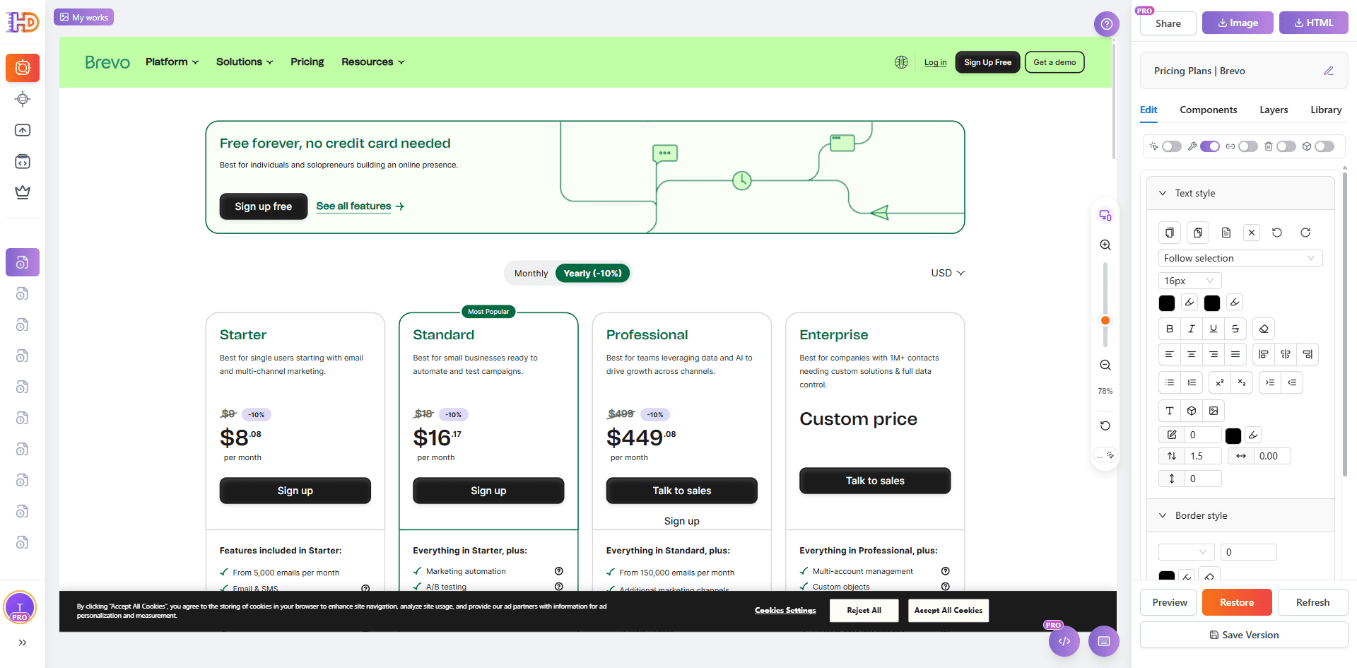
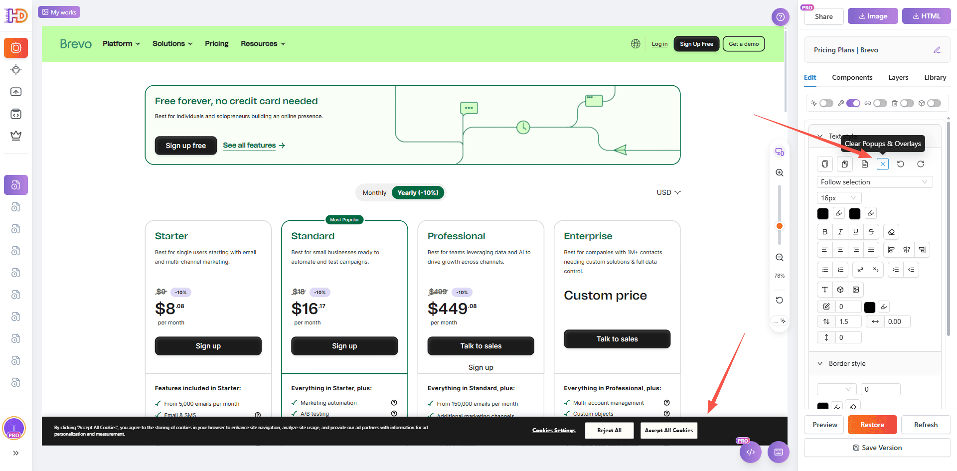
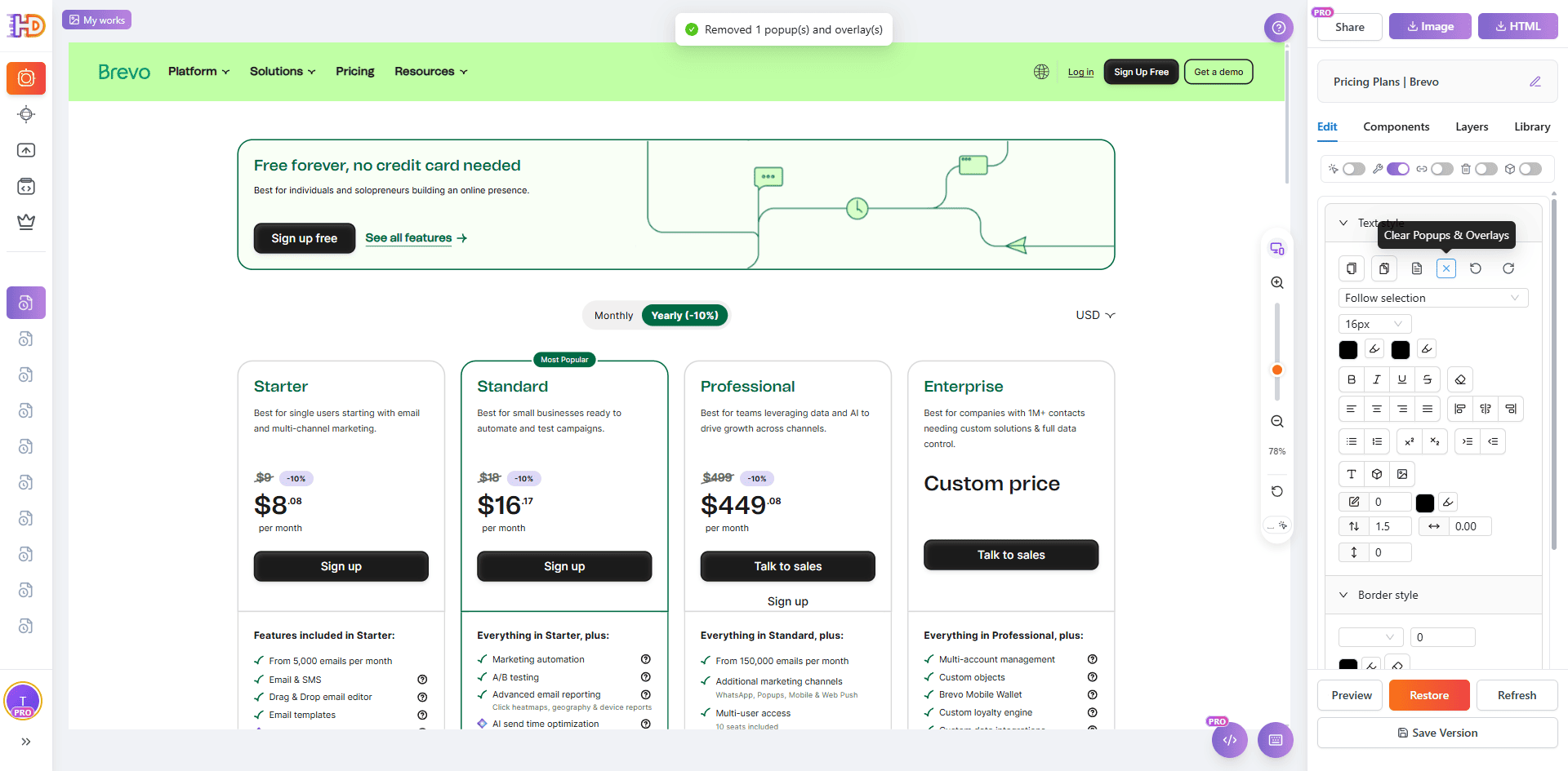
Step 2: Remove Popups and Overlays So the Page Returns to a Clean Editing State
After importing a public page, the most common problem is not that the page cannot be edited. The problem is that cookie bars, popups, or overlays make the layout harder to evaluate. On a pricing page, those distractions can easily interfere with how you judge plan cards, price copy, and CTA priority.
That is why the second step should focus on cleanup first. Use the cleanup control on the right side to remove popup layers and overlays so the page returns to a clean state. Once the canvas is clear, it becomes much easier to make confident decisions about pricing edits, button emphasis, and lower-page trimming.
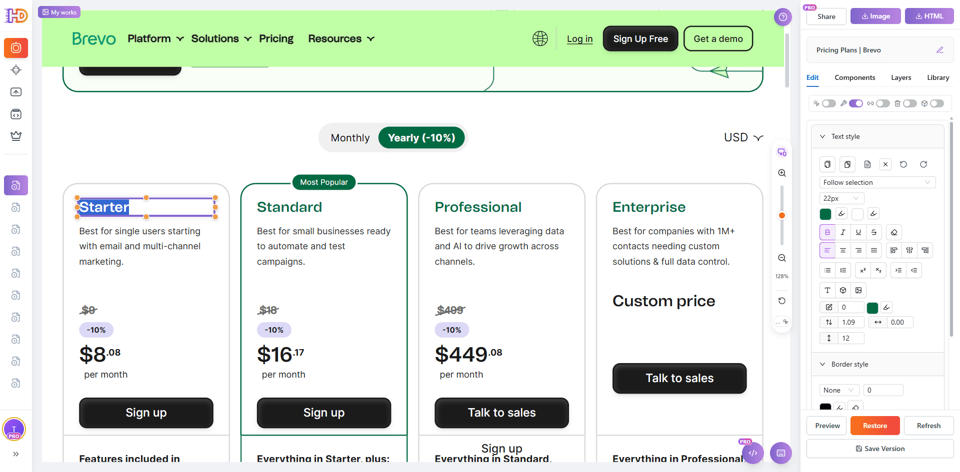
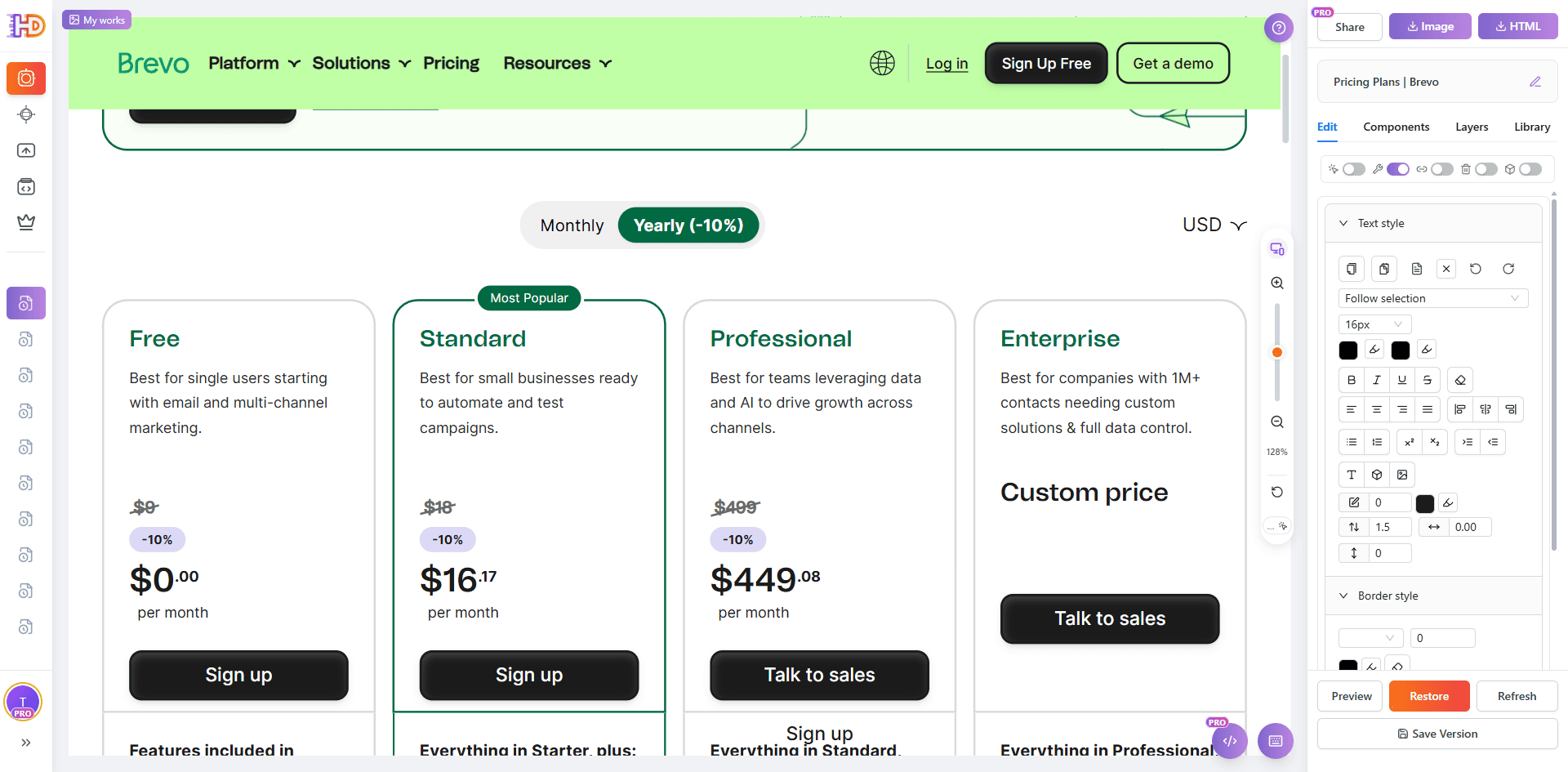
Step 3: Edit the Pricing Copy and Price Values So the Plan Is Easier to Understand
On an AI-generated pricing page, the pricing block is often the highest-value place to start. You do not always need to redesign the whole layout first. Simply making the plan labels, price wording, and visible numbers more direct can already make the choice easier to understand.
In this step, click directly into the pricing area and update the text to something clearer, such as changing the label to FREE and adjusting the visible price values. This is a small visual change, but it has a large impact on how quickly visitors understand what each plan represents.
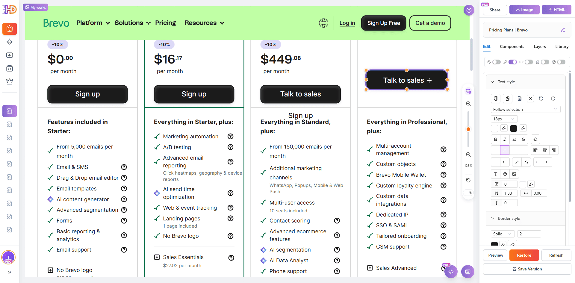
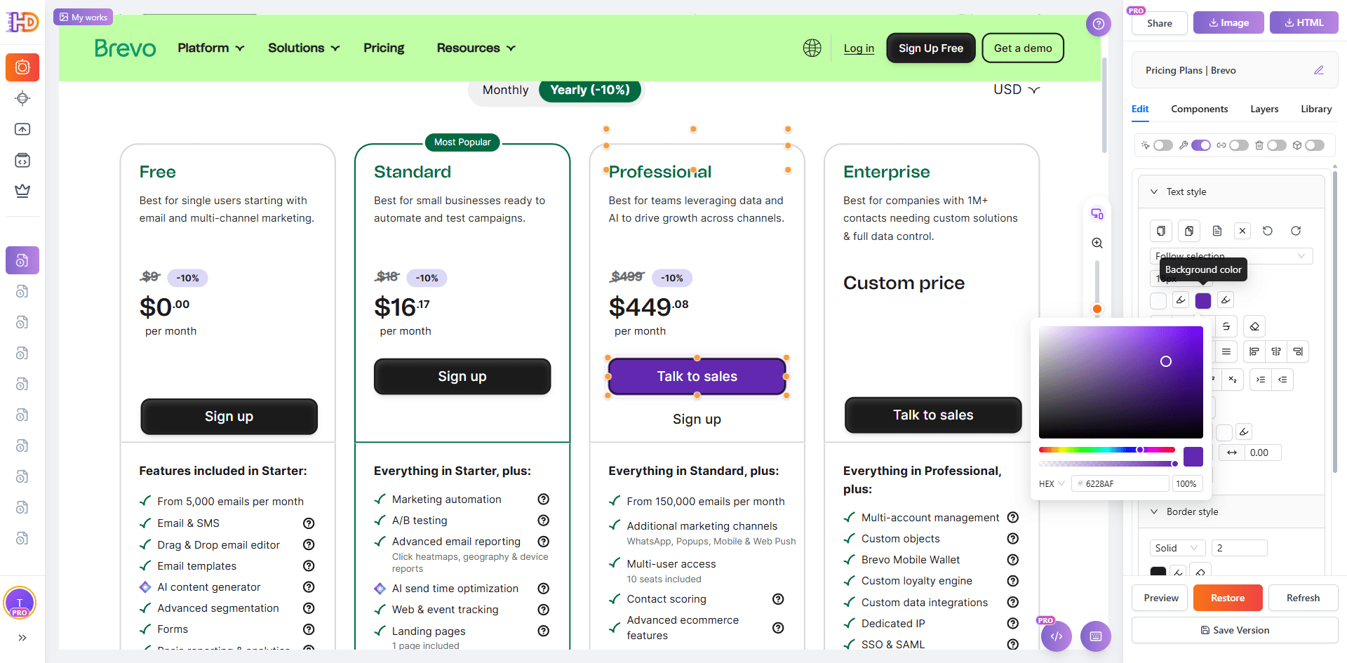
Step 4: Change the Button Color So the CTA Stands Out Faster
Many AI-generated pages do not suffer from missing buttons. They suffer from buttons that exist but do not carry enough visual direction. On a pricing page, if the CTA color blends too closely into nearby elements, users may notice the button without feeling pushed toward action.
That makes button color a high-value refinement point. By adjusting the CTA color, you can make the preferred action more visible without changing the whole layout. It is a small edit, but it improves scan speed, emphasis, and the sense of momentum toward the next step.
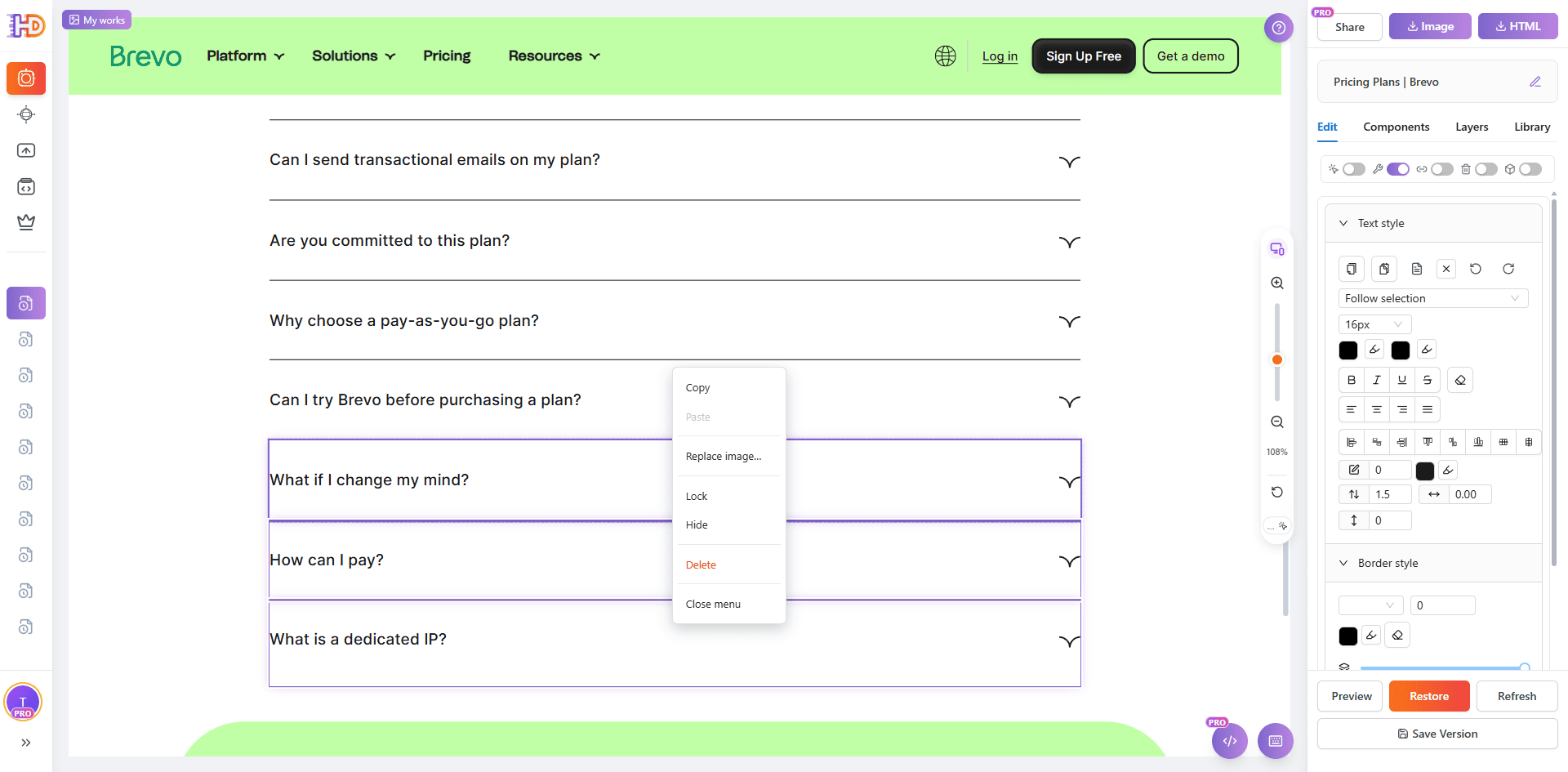
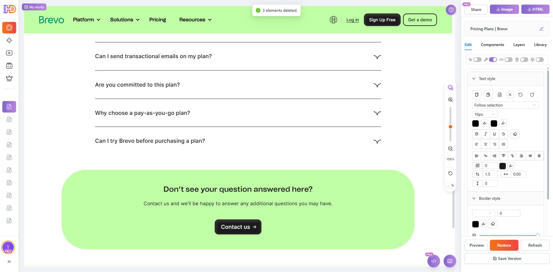
Step 5: Delete the Extra Content Below the FAQ So the Page Ends More Cleanly
The lower a pricing page goes, the easier it is to accumulate too much explanatory content. FAQ sections can reduce doubt, but if several low-value blocks continue below the FAQ, they often stretch the page and weaken the decision that the visitor has already started to make.
That is why the final step is subtraction. Remove the extra sections below the FAQ that do not meaningfully support conversion. The result is simple but effective: the page becomes shorter, tighter, and more focused on the pricing decision and CTA instead of forcing more scrolling after the main questions are already answered.
AI-Generated Default Draft vs Clearer, More Conversion-Focused Version
| Focus Area | Default Pricing Page | Clearer Edited Version |
| Page entry | The live page exists, but it is not easy to change directly | Import by URL and turn it into an editable canvas immediately |
| Popups and overlays | Cookie bars and overlays interfere with evaluation | Cleanup makes the pricing section easier to judge |
| Pricing expression | Plan labels and visible prices are not direct enough | FREE and price copy become easier to understand |
| CTA button | The button exists, but the color does not stand out enough | A stronger button color makes the next step easier to notice |
| Content below the FAQ | The page keeps extending and weakens decision momentum | Removing extra blocks keeps the page shorter and tighter |
Who This Workflow Helps Most
- Founders using AI builders or vibe coding who need their generated pricing page to feel more intentional
- Marketers who want an AI-generated page to convert better without a full rebuild
- Consultants and freelancers who refine AI-generated or exported HTML pages for clients
- Growth teams trying to reduce hesitation between product interest and signup
- Non-technical teams that need more control over messaging and hierarchy without touching code
FAQ
Do I need to regenerate the whole AI website to improve the pricing page?
No. In many cases, the structure is already good enough. The bigger gains often come from clearer plan hierarchy, better CTA emphasis, shorter supporting copy, and less lower-page friction.
Does this only work for Brevo?
No. Brevo is only the public example used here. The same workflow works for many AI-generated pricing pages, vibe-coded websites, exported HTML files, public comparison pages, and other live plan-selection pages that are already structurally usable.
What should I improve first if I want the fastest impact?
Start with popup cleanup, pricing copy, CTA button color, and the extra content below the FAQ. Those are usually small edits with an outsized effect on clarity, decision speed, and click direction.
Why not just ask the AI tool to regenerate the whole page again?
You can, but regeneration often rewrites too much and removes details you already want to keep. If the page is already live and the structure mostly works, a visual editing pass is often the quickest way to improve clarity without restarting the whole workflow.
Final Take
An AI-generated pricing page does not need to be perfect on the first pass. It needs to help visitors make a decision with less hesitation. That is why clarity, hierarchy, and confidence matter more than adding even more information.
If your AI-generated pricing page already has the right pieces but still feels hard to choose from, the fastest improvement is often not rebuilding it from scratch. It is making five focused edits: import the page from URL, remove popups, update the pricing copy and price values, strengthen the button color, and delete the extra blocks below the FAQ.
That is exactly why a workflow in htmldrag.com can be such a practical bridge between an AI first draft and a clearer, more conversion-focused page. When you need a visual HTML editor that helps you edit existing HTML and refine a website directly from URL, this kind of browser-based editing flow becomes especially valuable.