
AI can turn a prompt into a presentable landing page in minutes. That first version is useful, but it is not automatically a launch-ready version. Before traffic reaches it, someone still needs to check the visible promise, the reading order, the call to action, repeated elements, and any information a visitor needs to make a decision.
This is a visual QA pass: a focused review of the page people will actually see, not a substitute for engineering, analytics, accessibility, legal review, or functional testing. If the HTML already has a useful structure, the practical next move is usually not to generate the whole page again. It is to keep the useful HTML, correct the visible layer in context, preview the result, and hand off the reviewed version.
The workflow below uses Paste Code with an AI-style product launch page. The screenshots record the real editor states from that workflow. They show where a visual edit happens; they do not turn example copy, placeholder customer names, or unfinished table cells into production facts.
What a visual QA pass should answer before launch
Do the review after the page has a real offer, approved source content, and a proposed destination for each action. Do not begin by changing random colors or moving every element. Start by answering a short set of reader-facing questions:
- Can a first-time visitor understand the offer from the hero alone?
- Does the primary CTA name the next action clearly and lead to the approved destination?
- Is any banner, badge, label, or filler sentence repeating rather than supporting the main message?
- Does the page add structured detail only where that detail helps a visitor decide?
- Which approved brand and structural elements should remain unchanged while the surrounding page is refined?
That distinction matters. A visual editor is excellent for local, visible changes. A form that fails to submit, an unverified tracking event, a broken integration, an incorrect entitlement, or a security issue still needs its normal technical QA path.
Start from the AI-generated HTML you already have
1. Paste a complete, authorized page as a working copy
Use the HTML you have the right to update: output from an AI tool, a developer handoff, or a previous campaign page. Keep the original source available as a reference. In HtmlDrag, open Paste Code and begin with the complete page rather than recreating its sections one at a time.
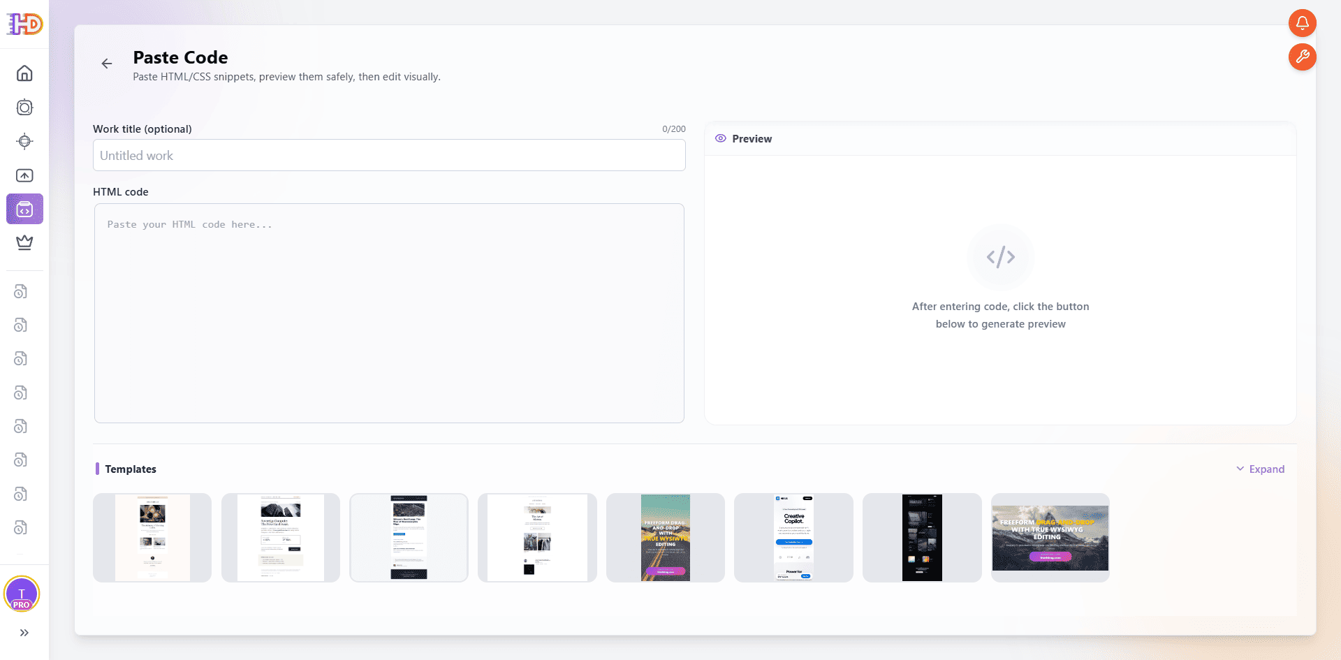 Paste Code starts with the existing HTML rather than a new prompt or a blank design.
2. Let the page render before judging one element
After the source is pasted, wait for the editor to prepare the working page. The screenshot shows that preparation state, with the original code still visible. It is a useful reminder that a visual review begins only after the full page is available, not while a single snippet is still being interpreted.
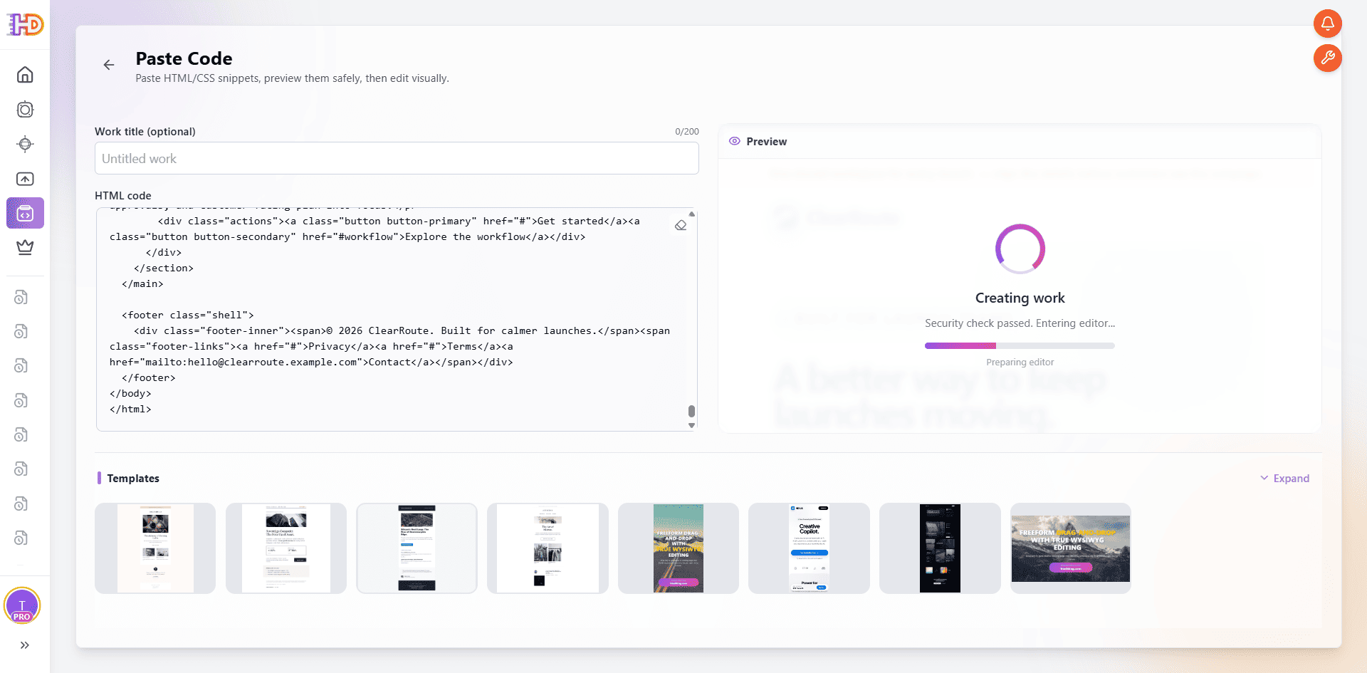 The existing code is being turned into an editable working page; no claim is made that the source is already ready to publish.
3. Read the original page as a visitor would
Once the canvas opens, scan the hero, nearby CTA, supporting cards, release details, and final CTA in sequence. In the starting page below, the original headline is selected while the rest of the page remains visible. That context is the point: a headline can sound acceptable in isolation and still be too generic for the offer around it.
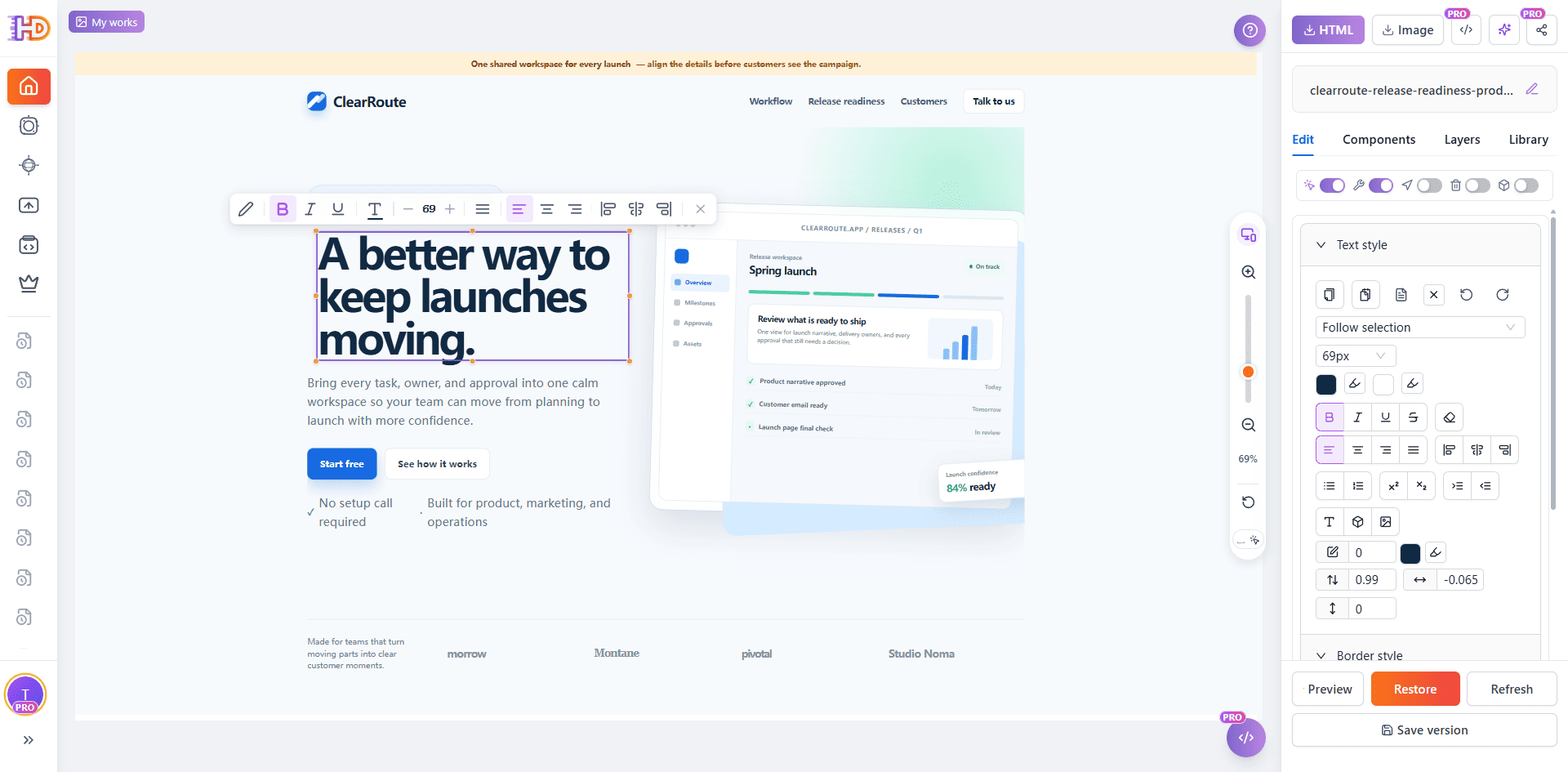 Select the original hero while the surrounding CTA and product visual remain in view.
Fix the visible priorities before adding more content
4. Replace a generic hero with a decision-specific promise
AI drafts often say that a team can “move faster,” “work smarter,” or “keep things moving.” Those phrases are not necessarily wrong; they are often too broad to tell a visitor why this page exists. Rewrite the hero around the decision the product helps the reader make.
Here, the selected title becomes “Keep every launch decision, approval, and customer detail ready to ship.” The screenshot records the new headline in the editor. Treat it as a demonstration of in-context text editing, not as universal copy for another product. Your approved message should name your own audience, outcome, and scope.
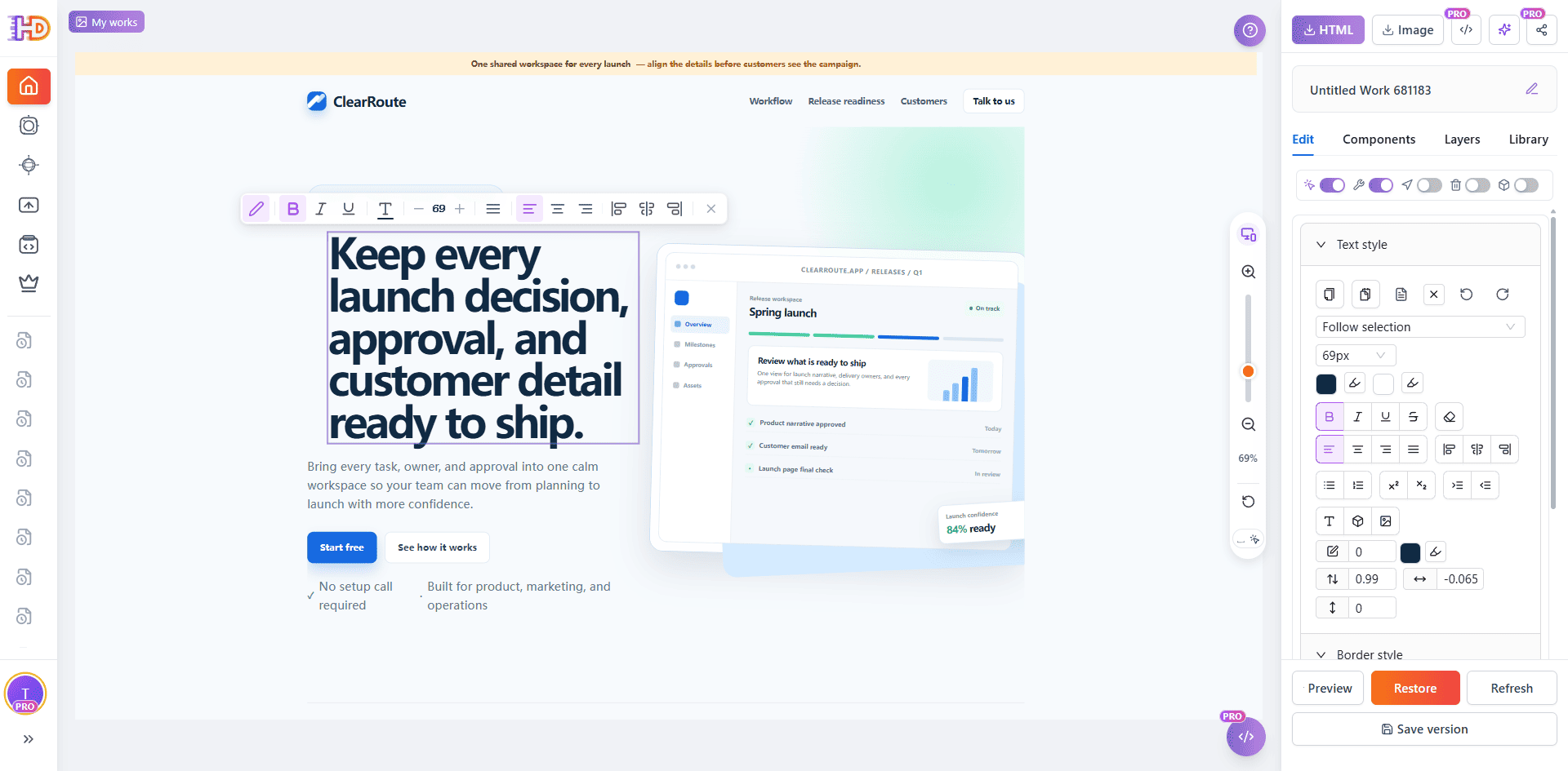 A specific promise can be reviewed directly beside the CTA and the page’s main visual.
5. Delete repetition instead of stacking another message on top
Not every visible element deserves to stay. A generic announcement strip can compete with a newly clarified hero without adding new information. In the recorded workflow, the top strip is selected and the contextual menu exposes the delete action. Removing a repeated or obsolete element is often a stronger QA decision than adding another badge, slogan, or color treatment.
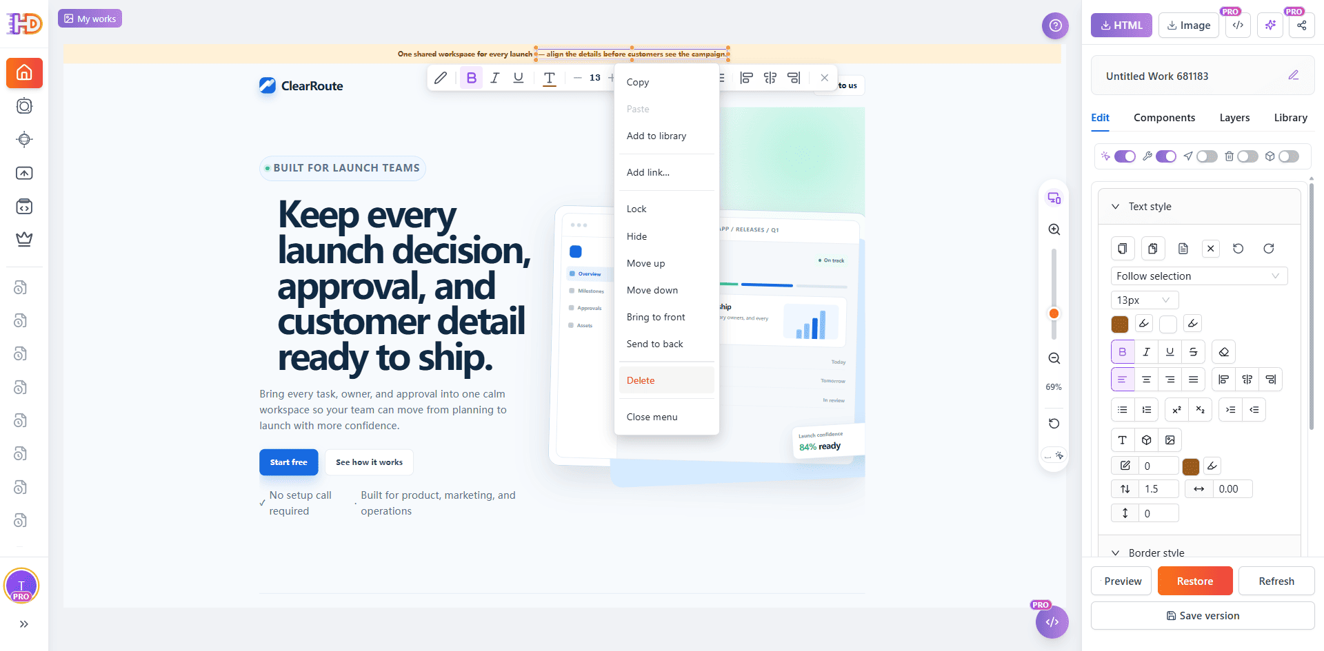 Delete is available from the selected element’s contextual menu; remove only content your campaign no longer needs.
6. Make the CTA match the next real action
“Start free” is not always the right action for a page that needs a sales conversation, launch review, application, or approval. The recorded edit changes the visible label to “Book a launch readiness review” and shows the selected button with its style controls. It proves an in-context CTA label and visual treatment change.
The link destination is a separate decision. HtmlDrag supports adding or editing a link for a selected element, but the screenshot does not show a destination being saved. Before publishing, connect the CTA only to the approved URL, then test that destination in the live environment.
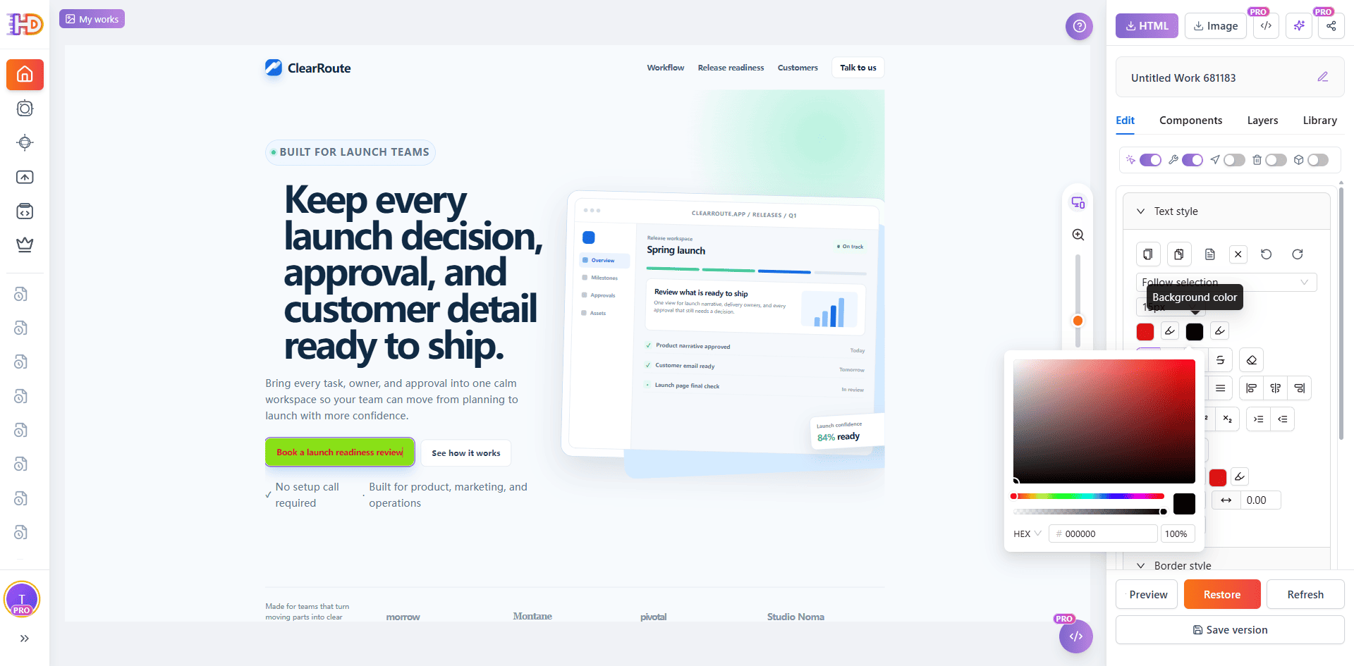 The CTA label and its visual emphasis can be checked on the real hero before its approved destination is attached and tested.
Add only the detail that helps a visitor choose
7. Insert a new element with a defined job
When the page needs a small new action or supporting element, use the Components tab instead of rebuilding the section. The screenshot records a Button insertion and the editor confirmation. A new button, text block, image, icon, table, or shape should have a specific reader-facing purpose—not merely fill a blank area.
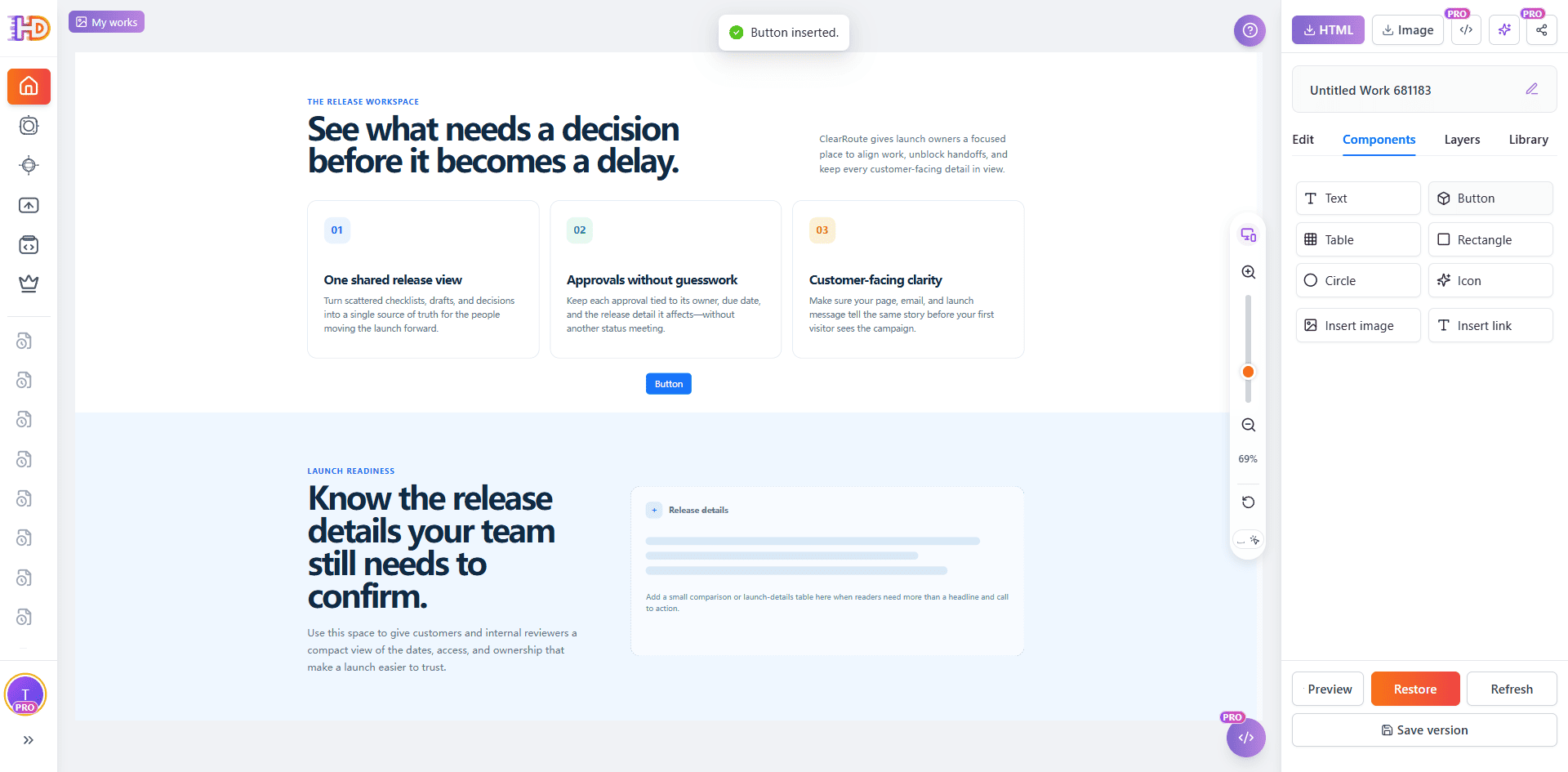 The editor confirms that a Button element was inserted; its label, position, and necessity still need review.
8. Treat a newly inserted link element as unfinished until its destination is approved
The next recorded state shows an inserted “See the launch readiness steps” element selected with Add link… available in its contextual menu. This demonstrates the route to attach a hyperlink after an element is on the canvas. It does not show a final destination, so this example should not be described as a completed internal link.
For a production page, use an action label that tells visitors what happens next, attach only the approved destination, and verify the final URL after deployment. The same caution applies to existing buttons: visible wording and destination must agree.
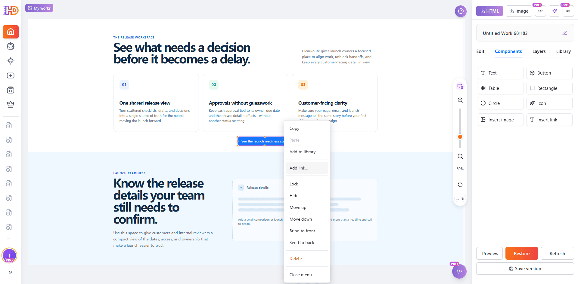 A selected inserted element can receive a link through the contextual menu; the final URL remains a campaign decision.
9. Use a table when rows and columns reduce comparison work
A landing page may need one compact block of structured detail: what to confirm, who owns it, and whether it is ready. Open Components, choose Table, then select the smallest useful grid. The image below records a 3 × 3 grid selection, not a promise that every page needs a table.
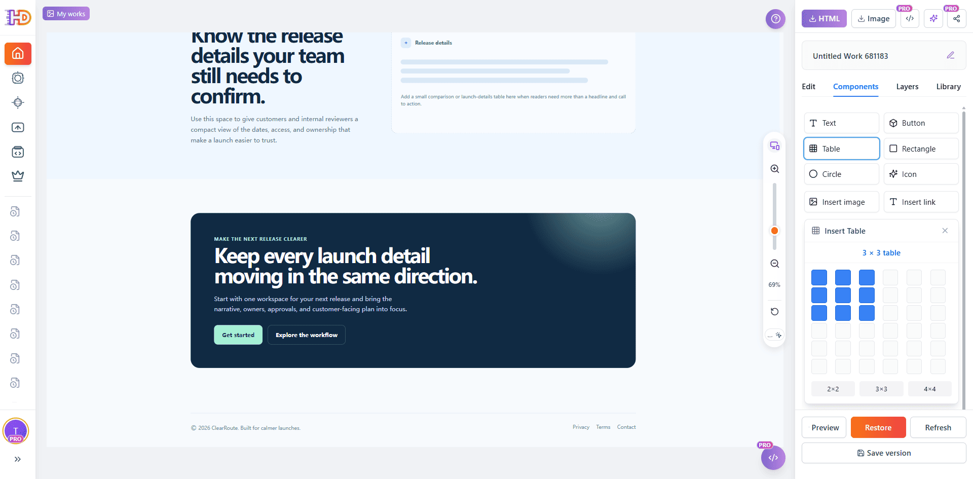 Start with the smallest table that answers a reader question, then edit its content and visual weight in context.
10. Review every table cell as public-facing content
The inserted table below has editable headers—What to confirm, Owner, and Status—and an active cell. That is all the screenshot establishes. The remaining cells are visibly incomplete, so they must not be presented as a final release plan, approved owner list, or customer-facing status table.
Before export, replace placeholders with approved facts, remove unused rows and columns, confirm that the visual placement supports the surrounding section, and check that the table remains readable at the page sizes your audience uses.
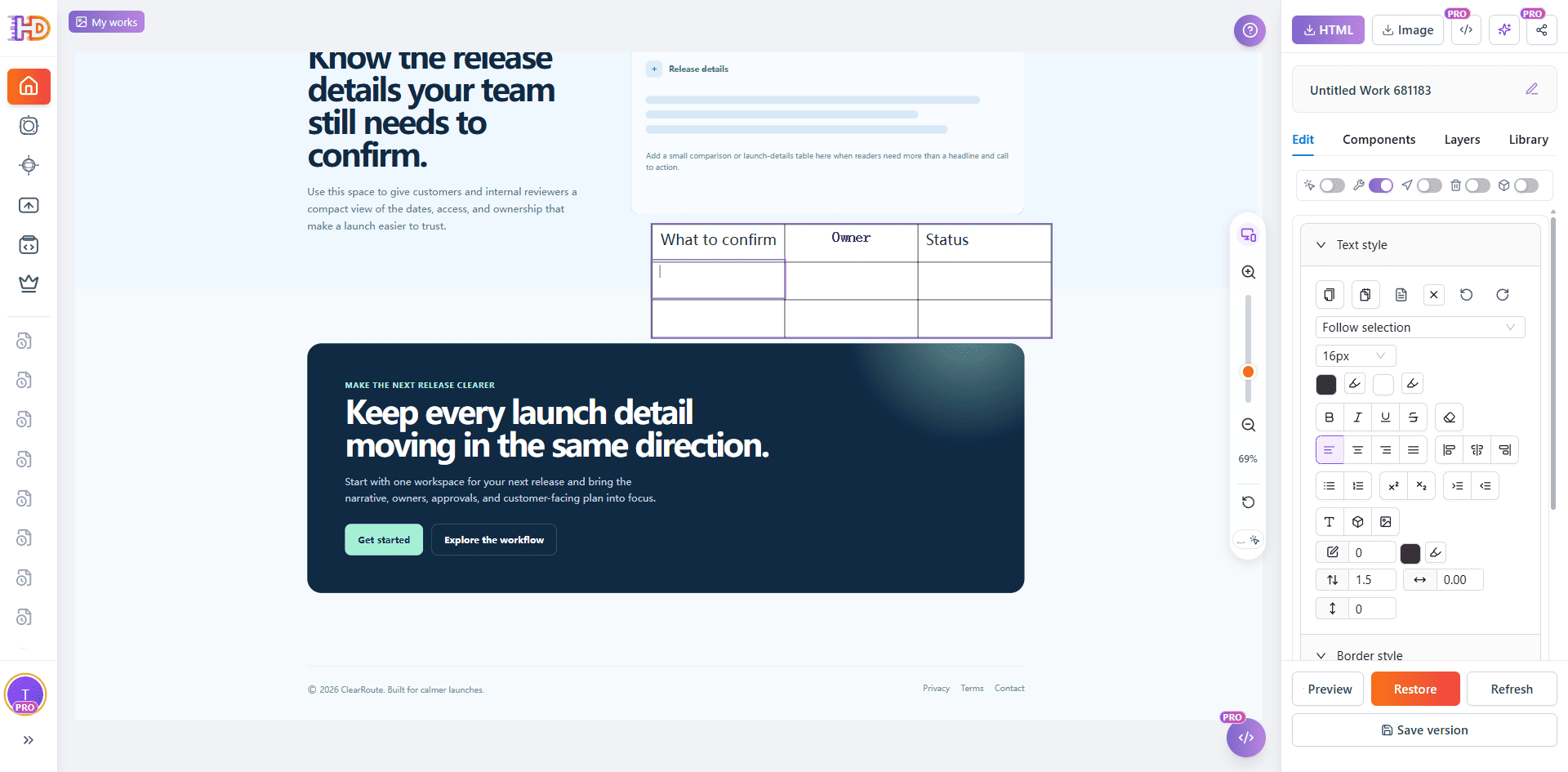 The table is editable on the canvas; incomplete cells should be completed or removed before a launch review.
Protect what is already right, then preview the whole page
Do not turn a focused pass into an accidental redesign. If a brand mark, approved product visual, or structural element is already correct, use the Layers panel to lock it before working around it. Locking is a control for preventing accidental movement or edits; it is not evidence that the element has passed brand, legal, or accessibility review.
Then leave the editing controls and review the page as a visitor. The preview below shows the revised hero with the generic strip removed and the CTA relabeled. Check the full content flow, not just the first viewport: line breaks, focus, repeated messages, incomplete details, links, footer content, and the final CTA all belong to the launch review.
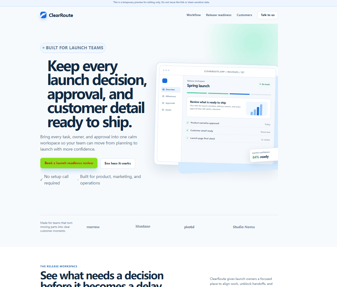 Preview returns the working page to a visitor-facing view for visual QA before handoff.
Export the reviewed HTML, then finish the real launch checks
When the visual pass is complete, export the version you reviewed. The Export as panel provides Edited HTML, Original HTML, Download HTML, Copy HTML, and Export to AI options. Export is a handoff point, not a production deployment and not a guarantee that every technical requirement has been met.
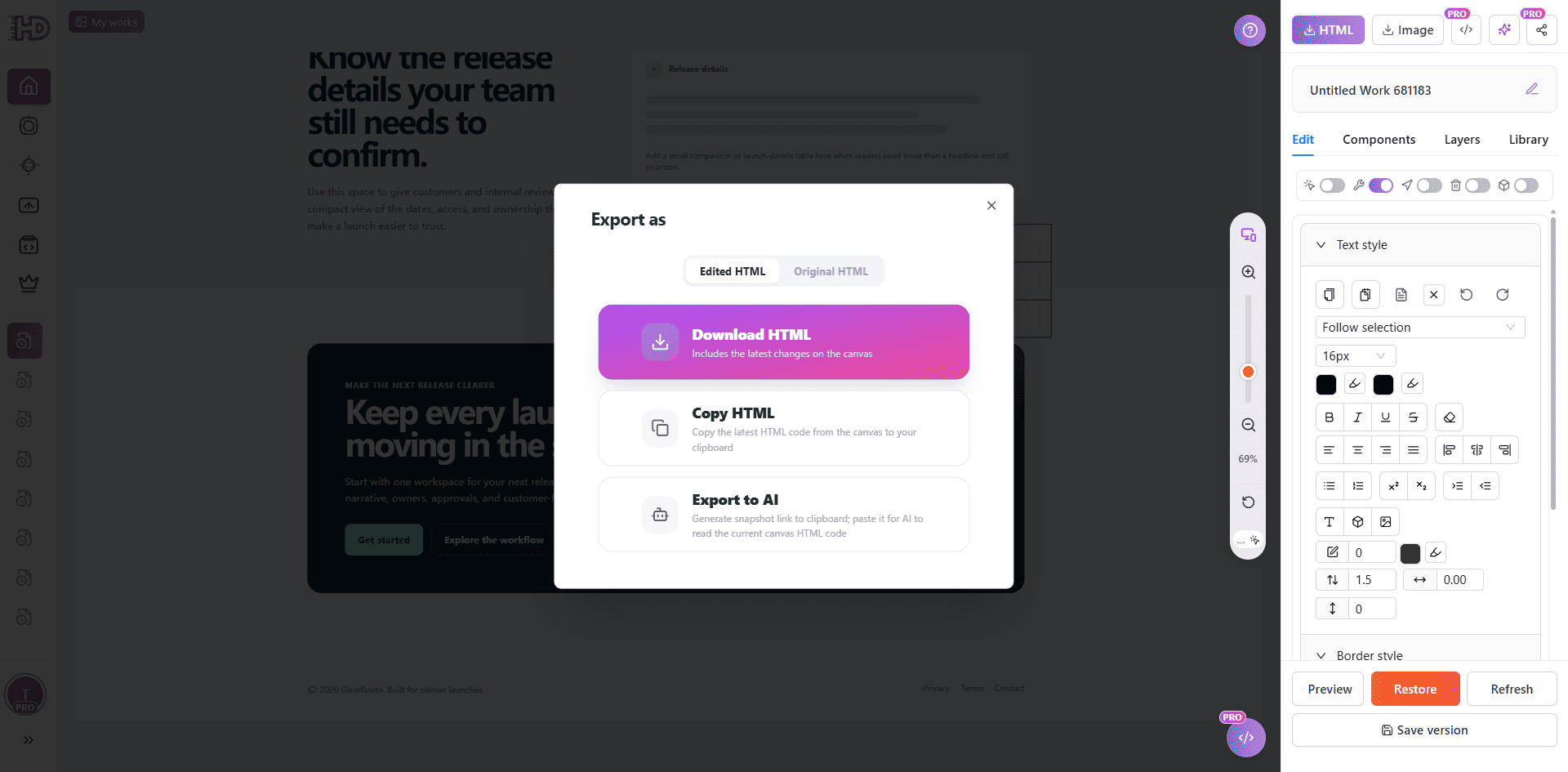 Export the edited HTML after visual review, then continue through normal code review, functional QA, analytics, legal, accessibility, and publishing checks.
Keep the first draft. Review the visible decisions.
AI removes the blank-page problem. It does not remove the responsibility to decide what the page says, what action it asks a visitor to take, and which details are safe to publish. A focused visual QA pass lets you keep the useful structure, correct the parts visitors encounter, and avoid restarting work that is already sound.
Paste existing HTML into HtmlDrag when an AI-generated landing page needs a practical last visual pass before the normal launch process continues.