Guida Utente di HtmlDrag
Benvenuto in HtmlDrag. Questa guida ti aiuterà a iniziare da zero, coprendo la gestione dell'account, l'importazione dei contenuti, la modifica visiva e l'esportazione dei lavori.
1. Account e Accesso
Prima di utilizzare HtmlDrag, devi creare un account. Offriamo diversi metodi di registrazione e accesso per aiutarti a iniziare rapidamente.
1.1 Registrati
HtmlDrag utilizza la registrazione via email. Inserisci semplicemente alcuni dettagli di base per creare il tuo account. Dopo la registrazione corretta, verrai automaticamente connesso e reindirizzato alla home page.
Registrazione via email
Nella pagina di registrazione, completa i seguenti passaggi per creare il tuo account:
- Inserisci email: Fornisci il tuo indirizzo email utilizzato di frequente. Questo servirà come credenziale di accesso e canale di notifica. Assicurati che il formato sia corretto, es.
[email protected]. - Imposta password: La password deve contenere lettere e numeri, con una lunghezza di 8-32 caratteri. Ti consigliamo di utilizzare una password sicura per proteggere il tuo account.
- Conferma password: Reinserisci la password per assicurarti che entrambe le voci corrispondano.
- Imposta nickname (opzionale): Puoi personalizzare il tuo nickname. Se lasciato vuoto, il sistema genererà automaticamente un nickname predefinito per te.
- Accetta i Termini: Spunta "Ho letto e accetto i Termini di Servizio e la Privacy Policy", quindi clicca sul pulsante "Registrati" per completare la registrazione.
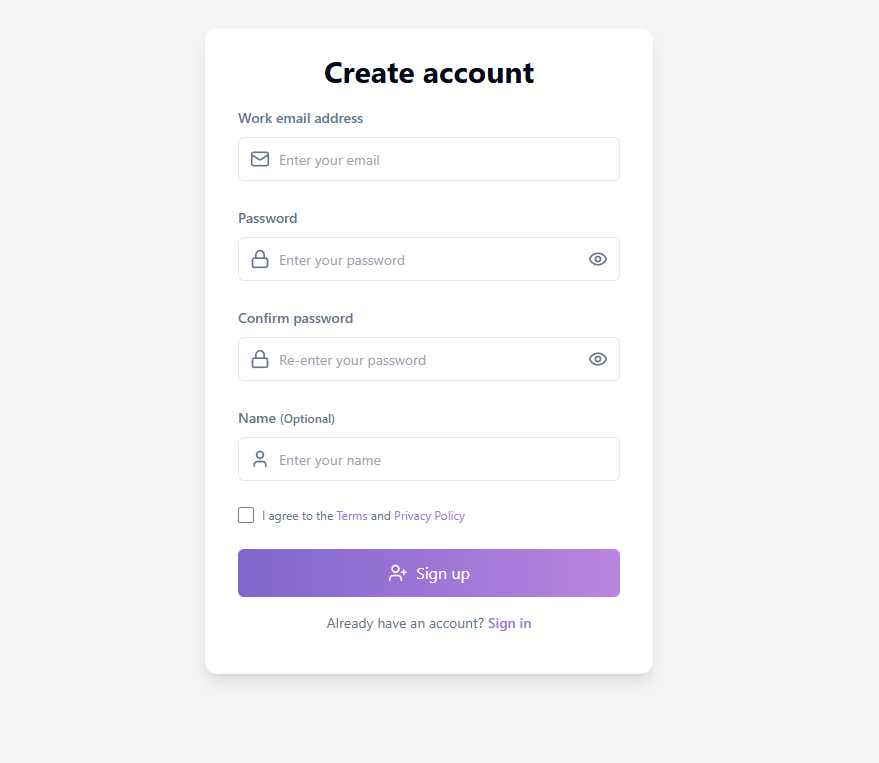
Pagina di registrazione: Inserisci email e informazioni di base per creare un account
Verifica Email & Ricompensa Crediti
Dopo la registrazione corretta, il sistema invierà un'email di verifica alla tua casella di posta. Al completamento della verifica dell'email, riceverai crediti bonus che possono essere utilizzati per le funzionalità Generatore AI e Importa URL. Se non ricevi l'email, controlla la cartella spam; puoi cliccare su "Invia di nuovo" per richiedere un'altra email di verifica dopo 3 minuti.
Suggerimento: Completare la verifica dell'email non solo ti fa guadagnare crediti bonus, ma sblocca anche l'esperienza completa e migliora la sicurezza del tuo account.
1.2 Accedi
HtmlDrag supporta diversi metodi di accesso. Scegli l'opzione più conveniente in base alle tue preferenze.
Accesso con Email & Password
Accedi utilizzando l'email e la password con cui ti sei registrato:
- Inserisci il tuo indirizzo email nella pagina di accesso
- Inserisci la tua password (clicca sull'icona dell'occhio per attivare la visibilità della password)
- Clicca sul pulsante "Continua" per completare l'accesso
Dopo l'accesso corretto, verrai automaticamente reindirizzato alla home page dove potrai iniziare a creare.
Accesso tramite Terze Parti (Google / GitHub)
Per un accesso più rapido, puoi accedere utilizzando il tuo account Google o GitHub:
- Accedi con Google: Clicca sul pulsante "Accedi con Google". Nel popup di autorizzazione Google, seleziona il tuo account e conferma l'autorizzazione.
- Accedi con GitHub: Clicca sul pulsante "Accedi con GitHub". Verrai reindirizzato alla pagina di autorizzazione di GitHub. Dopo la conferma, verrai automaticamente riportato su HtmlDrag.
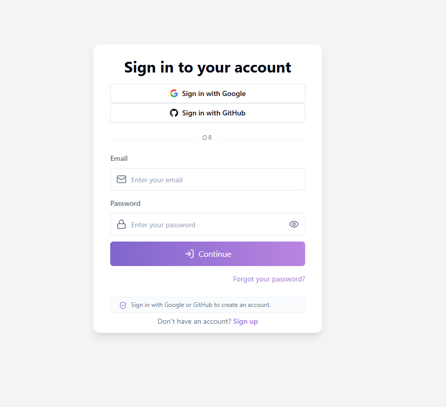
Pagina di accesso: Supporta email/password e account di terze parti
Suggerimento: L'utilizzo dell'accesso Google o GitHub crea automaticamente un account—non è necessaria una registrazione separata. Al tuo primo accesso tramite terze parti, il sistema creerà automaticamente un account collegato per te.
Link Password Dimenticata
Se hai dimenticato la tua password, clicca sul link "Password dimenticata?" in basso a destra nella pagina di accesso per avviare il processo di reimpostazione della password (vedi Sezione 1.3).
1.3 Password dimenticata
Se hai dimenticato la tua password, puoi reimpostarla utilizzando un codice di verifica via email. L'intero processo viene completato in un'unica pagina senza reindirizzamenti.
Processo di Reimpostazione Password
Segui questi passaggi per reimpostare la tua password:
- Inserisci email: Fornisci l'indirizzo email che hai utilizzato durante la registrazione
- Ottieni codice di verifica: Clicca sul pulsante "Invia Codice". Il sistema invierà un'email contenente un codice di verifica a 6 cifre
- Inserisci codice di verifica: Inserisci il codice a 6 cifre che hai ricevuto nel campo codice di verifica
- Imposta nuova password: Inserisci la tua nuova password (deve contenere lettere e numeri, 8-32 caratteri)
- Conferma nuova password: Reinserisci la nuova password per assicurarti che corrispondano
- Clicca su "Reimposta Password": Completa la reimpostazione della password. Dopo aver visualizzato il messaggio di successo, verrai automaticamente reindirizzato alla pagina di accesso
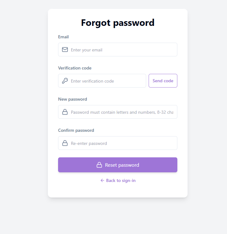
Password dimenticata: Reimposta tramite codice di verifica email
Validità del Codice di Verifica
Il codice di verifica ha un periodo di validità limitato—ti preghiamo di utilizzarlo prontamente dopo aver ricevuto l'email. Se il codice è scaduto, puoi cliccare sul pulsante "Invia di nuovo" per richiedere un nuovo codice (dovrai attendere che il conto alla rovescia termini prima di inviare nuovamente).
Nota: Se la tua email non è registrata nel sistema, il codice di verifica non può essere inviato. Assicurati di inserire l'indirizzo email utilizzato durante la registrazione.
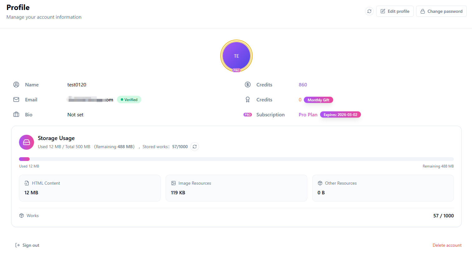
2. Profilo
Il Profilo è l'hub centrale per gestire le informazioni del tuo account, i lavori e gli ordini. Clicca sull'avatar nell'angolo in alto a destra per accedervi.
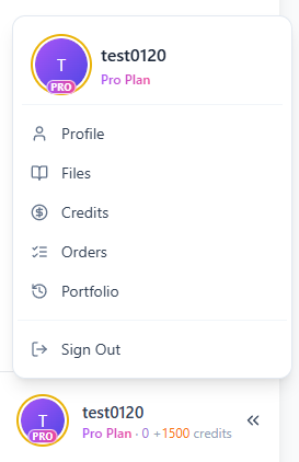
Profilo: Gestisci account, lavori e ordini in un unico posto
2.1 Impostazioni Profilo
Il modulo Impostazioni Profilo ti consente di gestire le informazioni di base del tuo account, inclusi avatar, nickname, email, biografia e impostazioni della password.
Cambia Avatar
Clicca sul pulsante "Cambia avatar" nell'area avatar e seleziona un file immagine locale da caricare. Il sistema ritaglierà e salverà automaticamente il tuo nuovo avatar.
Cambia Nickname
Clicca sul pulsante modifica accanto al tuo nickname, inserisci un nuovo nome e clicca su "Salva". Il tuo nickname verrà visualizzato su tutti i tuoi lavori e commenti.
Gestione Email
La sezione email mostra il tuo indirizzo email attuale e lo stato di verifica:
- Verificata: La tua email è stata verificata e tutte le funzionalità sono disponibili
- Non verificata: Clicca su "Invia email di verifica" per completare la verifica e guadagnare crediti bonus
- Cambia email: Devi prima verificare la tua email attuale, quindi inserire un nuovo indirizzo email per completare il cambio
Biografia
Inserisci la tua auto-introduzione nell'area biografia (consigliato: non più di 200 caratteri), quindi clicca su "Salva" per aggiornare.
Cambia Password / Imposta Password
Clicca sul pulsante "Cambia password" per aprire la finestra di dialogo delle impostazioni della password:
- Utenti con una password esistente: Inserisci la tua password attuale, quindi imposta una nuova password (8-32 caratteri, incluse lettere e numeri)
- Utenti senza password: Imposta direttamente una nuova password. Dopo l'impostazione, puoi accedere con email e password
Elimina Account
Per eliminare il tuo account, clicca sul pulsante "Elimina account" in fondo alla pagina. Per sicurezza, dovrai verificare la tua identità tramite codice di verifica via email.
Nota: Dopo aver inviato la richiesta di eliminazione, il tuo account entrerà in un periodo di conservazione (tipicamente 30 giorni) durante il quale non potrai accedere. Dopo questo periodo, il sistema eliminerà permanentemente i tuoi lavori, crediti e cronologia.
Profilo: Gestisci avatar, nickname, email e password
2.2 Utilizzo Archiviazione
Il modulo Utilizzo Archiviazione mostra il consumo di spazio del tuo account, aiutandoti a capire lo spazio rimanente e pianificare le tue creazioni di conseguenza.
Panoramica Archiviazione
La sezione superiore mostra il tuo utilizzo complessivo, incluso:
- Usato: Lo spazio di archiviazione attualmente in uso
- Totale: Il limite di archiviazione del tuo account (gli utenti del Pro godono di una capacità maggiore)
- Rimanente: Spazio disponibile per creare nuovi lavori
- Lavori archiviati: Numero attuale di lavori salvati e il limite
Ripartizione Archiviazione
Il sistema classifica l'archiviazione in tre tipi:
- Contenuto HTML: Spazio utilizzato dal codice della pagina web dei tuoi lavori
- Risorse Immagine: Spazio utilizzato dai file immagine caricati
- Altre Risorse: Spazio utilizzato da altri allegati
Limite Conteggio Lavori
Gli utenti del Free e del Pro hanno limiti diversi per il conteggio dei lavori. Quando raggiungi il limite, dovrai eliminare alcuni lavori o aggiornare il tuo piano prima di crearne di nuovi.
Aggiorna Archiviazione & Upgrade
Clicca sul pulsante aggiorna per aggiornare le informazioni di archiviazione. Per più spazio di archiviazione, clicca su "Aggiorna archiviazione" per visitare la pagina Prezzi e scegliere un piano adatto.
Suggerimento: Se lo spazio di archiviazione del tuo account è pieno o il conteggio dei lavori raggiunge il limite, il sistema congelerà la creazione di nuovi lavori. Elimina alcuni lavori o aggiorna il tuo piano per ripristinare i permessi di caricamento.
2.3 File
Il modulo Gestione File mostra tutti i lavori che hai creato, supportando operazioni di visualizzazione, modifica, condivisione ed eliminazione.
Lista Lavori & Filtri
I lavori sono visualizzati come schede o in un elenco. Puoi filtrarli usando:
- Cerca: Inserisci codice lavoro o titolo per cercare
- Filtro tipo: Filtra per Generatore AI, Caricamento File, Istantanea URL, Incolla Codice, ecc.
- Intervallo date: Seleziona date di inizio e fine per filtrare i lavori di un periodo specifico
- Ordina per: Ordina per più recente, più vecchio, conteggio mi piace o conteggio visualizzazioni
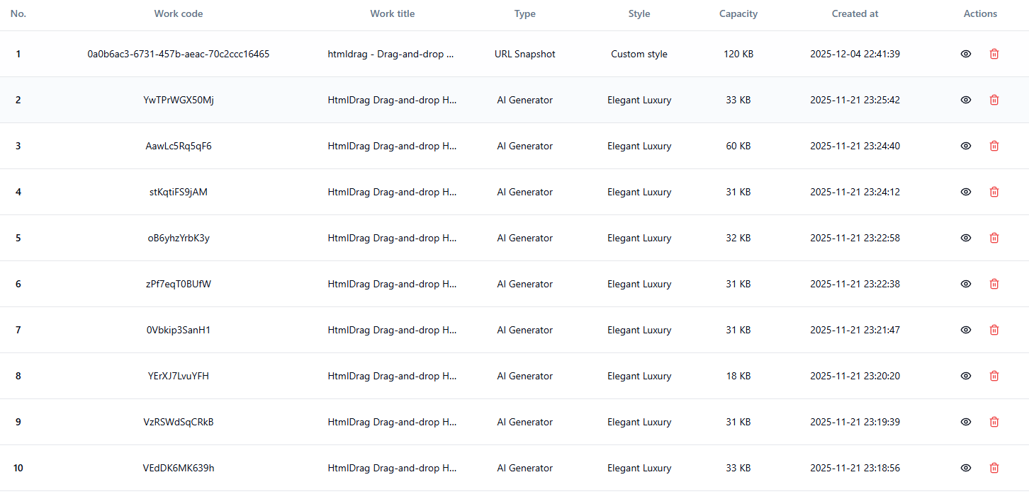
Gestione File: Visualizza, filtra e gestisci tutti i lavori
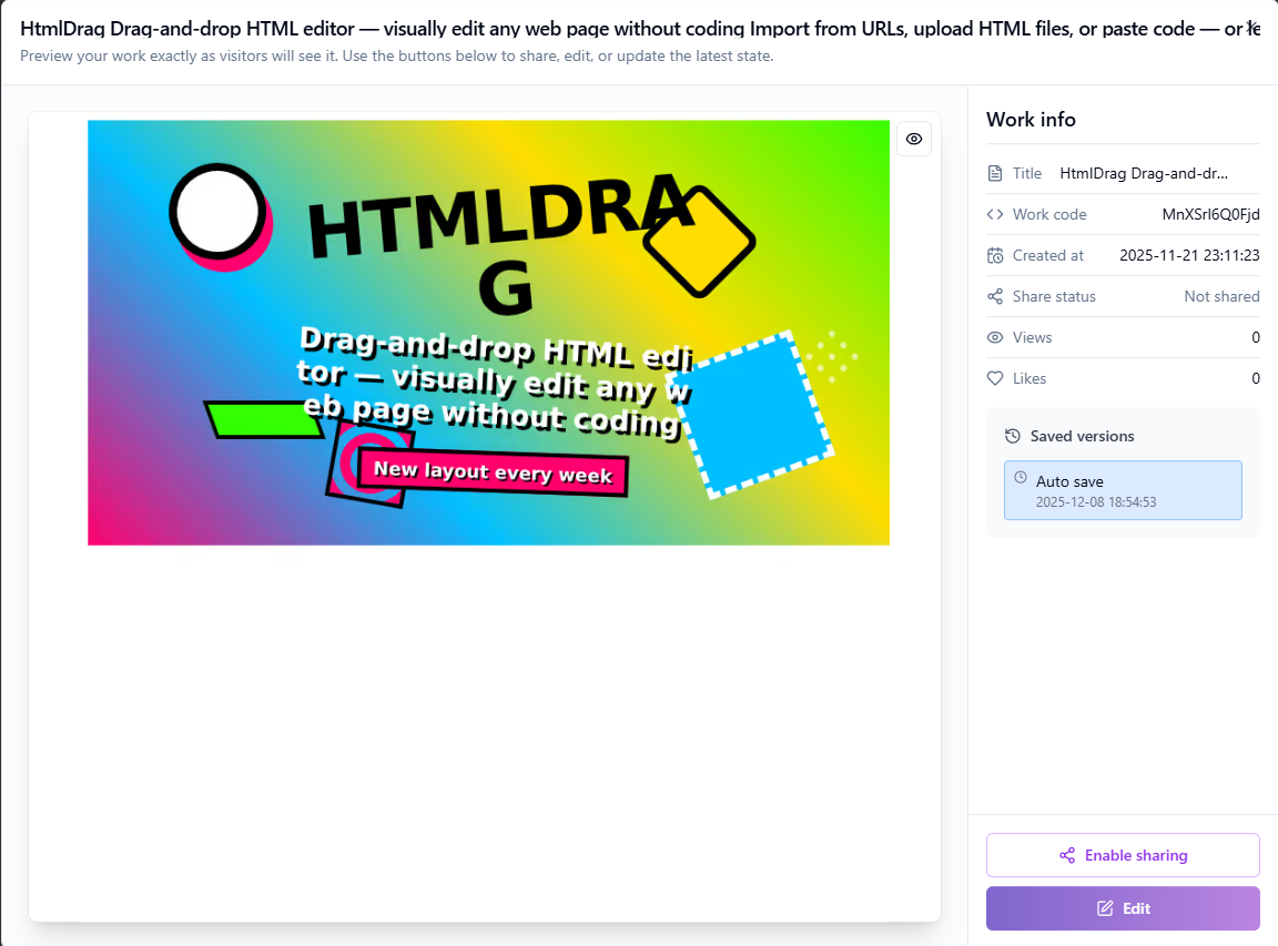
Visualizza & Modifica Lavori
Clicca sul pulsante "Visualizza" su una scheda lavoro per visualizzarlo in anteprima. Nell'interfaccia di anteprima, puoi:
- Modificare il titolo del lavoro (doppio clic sul titolo per modificare)
- Cliccare su "Modifica" per entrare nell'editor visivo e continuare a modificare
- Visualizzare la cronologia di salvataggio del lavoro e ripristinare a una versione specifica
Gestione Stato Condivisione
Gli utenti del Pro possono condividere i lavori, permettendo ad altri di visualizzarli tramite link:
- Abilita condivisione: Clicca sul pulsante "Condividi" per generare un link di condivisione valido per 7 giorni
- Aggiorna condivisione: I lavori già condivisi possono avere i loro link aggiornati, reimpostando il periodo di validità
- Interrompi condivisione: Clicca su "Interrompi condivisione" per invalidare immediatamente il link
Elimina Lavori
Clicca sul pulsante "Elimina" su una scheda lavoro per eliminarlo. Il sistema mostrerà due finestre di dialogo di conferma per prevenire eliminazioni accidentali:
- Prima conferma: Chiede se vuoi eliminare questo lavoro
- Seconda conferma: Ricorda che l'eliminazione è irreversibile
Suggerimento: Puoi eliminare fino a 3 record alla volta. Dopo aver eliminato un lavoro, il suo spazio di archiviazione verrà liberato.
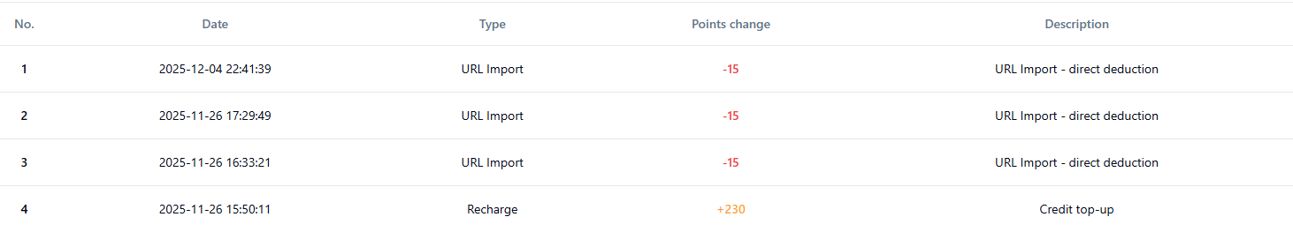
2.4 Crediti
Il modulo Cronologia Crediti mostra la cronologia delle transazioni di crediti del tuo account, inclusi i record di consumo e guadagno.
Cronologia Transazioni Crediti
I record dei crediti sono visualizzati in una tabella contenente le seguenti informazioni:
- Data: Quando è avvenuta la modifica dei crediti
- Tipo: Il tipo di operazione della modifica dei crediti
- Variazione punti: Crediti aggiunti (positivi) o dedotti (negativi)
- Descrizione: Spiegazione dettagliata della modifica
Puoi utilizzare i filtri dell'intervallo di date per visualizzare i record di un periodo di tempo specifico.
Tipi di Crediti
- Generatore AI: Crediti consumati quando si utilizza la funzionalità Generatore AI
- Importa URL: Crediti consumati quando si utilizza la funzionalità Importa URL
- Ricompensa Registrazione: Crediti assegnati ai nuovi utenti dopo la registrazione e la verifica dell'email
- Bonus Piattaforma: Crediti regalati dalla piattaforma
- Regalo Mensile: Allocazione mensile di crediti per gli utenti del Pro
- Ricarica Crediti: Crediti ottenuti tramite acquisti di crediti
- Aggiustamento Admin: Crediti aggiustati manualmente dagli amministratori
Cronologia Crediti: Visualizza dettagli transazioni crediti
Suggerimento: Gli utenti del Pro ricevono crediti extra ogni mese. I crediti possono essere utilizzati per funzionalità a pagamento come Generatore AI e Importa URL.
2.5 Ordini
Il modulo Cronologia Ordini mostra la tua cronologia acquisti e i record di pagamento, facilitando la consultazione e la gestione degli ordini.
Gestione Ordini
La lista ordini mostra i tuoi record di acquisto. Puoi:
- Visualizzare stato e dettagli dell'ordine
- Utilizzare filtri per trovare rapidamente ordini specifici
- Continuare il pagamento per ordini in sospeso
- Chiudere o eliminare ordini che non ti servono più
Suggerimento: Se riscontri problemi di pagamento, puoi chiudere l'ordine corrente ed effettuarne uno nuovo.
2.6 Portfolio
La pagina Portfolio è il tuo spazio dedicato per visualizzare e gestire tutte le tue creazioni. Accedivi rapidamente dalla barra laterale o dal menu utente.
Visualizzazione Lavori
La pagina visualizza tutti i tuoi lavori come schede, ciascuna contenente:
- Anteprima miniatura: Anteprima visiva del lavoro per una rapida identificazione
- Titolo lavoro: Mostra il nome del lavoro, clicca per modificare
- Ora creazione: Registra quando il lavoro è stato creato
- Stato condivisione: Mostra se il lavoro è attualmente condiviso
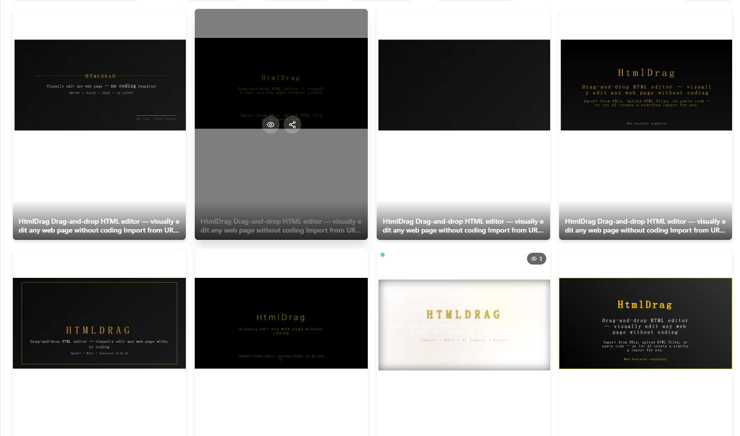
Portfolio: Visualizza e gestisci tutte le tue creazioni in un unico posto
Azioni Rapide
Ogni scheda lavoro fornisce comodi pulsanti di azione:
- Modifica: Entra nell'editor visivo per continuare a creare
- Condividi: Genera o gestisci link di condivisione (solo Pro)
3. Navigazione barra laterale
HtmlDrag offre diversi modi per importare contenuti nell'editor, coprendo tutti gli scenari dalla creazione da zero all'elaborazione secondaria. Usa la barra laterale sinistra per passare rapidamente tra i punti di ingresso.
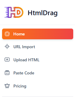
Navigazione barra laterale: Accesso rapido a diversi punti di ingresso creazione
3.1 Home
Home è il punto di ingresso predefinito di HtmlDrag, con il Generatore AI. Inserisci qui il tuo contenuto per generare rapidamente design web professionali.
3.2 Importa URL
Importa URL ti permette di inserire qualsiasi link di pagina web pubblica, e il sistema catturerà automaticamente il contenuto della pagina e genererà un lavoro modificabile. Questo è il modo ideale per ottenere rapidamente design web esistenti per ulteriori modifiche.
Inserisci URL
Incolla l'indirizzo della pagina web che vuoi catturare nel campo di input. Sono supportati solo link http/https pubblici; indirizzi privati o locali non sono consentiti.
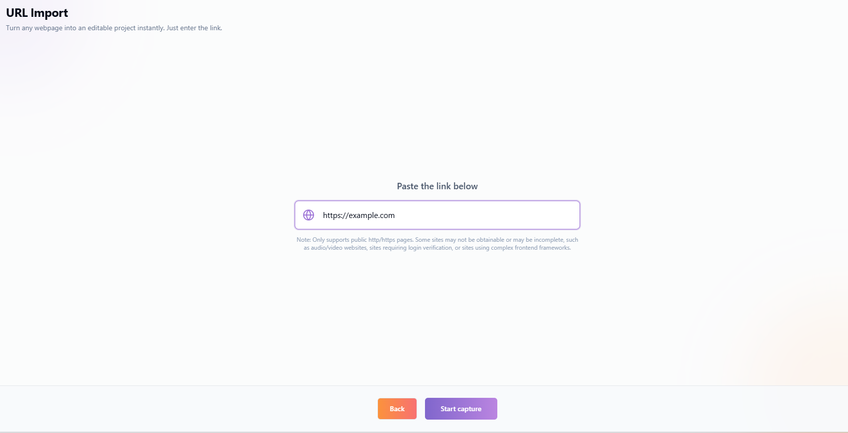
Importa URL: Inserisci URL, cattura pagina web all'istante
Conferma Deduzione Crediti
Dopo aver cliccato su "Inizia cattura", apparirà una finestra di dialogo di conferma della deduzione dei crediti, mostrando i crediti richiesti per questa operazione, il tuo saldo crediti attuale e i crediti bonus mensili. I crediti bonus mensili vengono detratti per primi, con qualsiasi costo rimanente detratto dai tuoi crediti attuali.
Progresso & Stato Cattura
Una volta confermato, il sistema inizia a catturare il contenuto della pagina. Si prega di non lasciare la pagina durante la cattura per evitare interruzioni. Dopo una cattura riuscita, verrai automaticamente reindirizzato all'editor.
Suggerimenti:
Alcuni siti web non possono essere catturati: I siti web che richiedono verifica di accesso o utilizzano framework frontend complessi (come alcune applicazioni SPA) potrebbero non essere catturati o potrebbero essere incompleti.
Siti audio/video: I contenuti dinamici da siti audio e video potrebbero non essere catturati correttamente.
Pagina troppo grande: Se il contenuto della pagina supera la dimensione consentita dal server, la cattura potrebbe fallire. Prova invece con una pagina più semplice.
3.3 Carica HTML
La funzionalità Carica HTML ti consente di importare file HTML locali in HtmlDrag. Il sistema eseguirà una scansione di sicurezza e genererà un lavoro modificabile. Questo è l'ideale per template HTML esistenti o design email che necessitano di ulteriori modifiche.
Formato File & Limiti Dimensione
Supporta formati file .html e .htm. La dimensione del singolo file non deve superare il limite del sistema (vedi interfaccia di caricamento per limiti specifici). I file caricati subiscono un'elaborazione avanzata, che può aumentare significativamente la dimensione effettiva di archiviazione rispetto al file originale. Assicurati di avere sufficiente capacità rimanente.
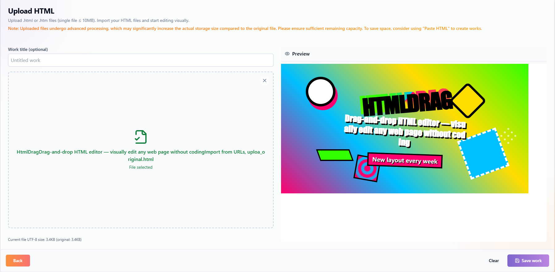
Carica HTML: Trascina e rilascia o clicca per caricare file HTML
Scansione Sicurezza
Il sistema scansiona i file caricati per sicurezza, rilevando e rimuovendo potenziali script dannosi, tag pericolosi e risorse esterne sospette. In base al livello di rischio (basso, medio, alto, critico), il sistema fornirà avvisi appropriati o bloccherà il salvataggio.
Nota: Non caricare file contenenti codice dannoso. I caricamenti dannosi possono comportare la sospensione dell'account.
Anteprima & Salva
Dopo che il file è stato analizzato, puoi visualizzare il risultato nell'area di anteprima. Una volta confermato, clicca su "Salva lavoro" per salvare il lavoro nel tuo account, e potrai entrare nell'editor visivo per modificarlo in qualsiasi momento.
3.4 Incolla Codice
La funzionalità Incolla Codice ti consente di incollare direttamente codice HTML, e il sistema eseguirà una scansione di sicurezza e lo convertirà in un design visivo. Questo è il metodo di importazione più flessibile, adatto a sviluppatori o utenti che necessitano di un controllo preciso sul codice.
Incolla Codice HTML
Incolla il tuo codice HTML nell'area di input codice. Puoi facoltativamente compilare un titolo del lavoro (se lasciato vuoto, il sistema utilizzerà il nome predefinito "Lavoro senza titolo").
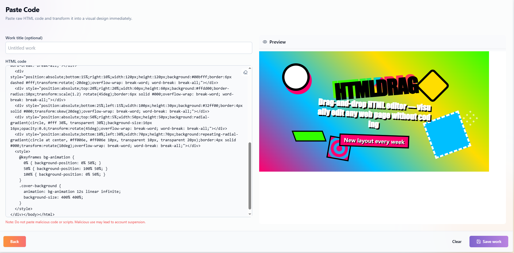
Incolla Codice: Incolla codice HTML direttamente per iniziare a modificare
Scansione Sicurezza
Simile al caricamento file, il sistema esegue un rilevamento di sicurezza sul codice incollato. Se il livello di rischio del codice è troppo alto, la politica di sicurezza del sistema rifiuterà di elaborare questo contenuto. Ti preghiamo di rivedere il codice e riprovare.
Nota: Non incollare codice o script dannosi. L'uso dannoso può comportare la sospensione dell'account.
Genera Anteprima & Salva
Dopo aver inserito il codice, clicca sul pulsante "Genera anteprima". Una volta che il codice supera il controllo di sicurezza, l'anteprima verrà generata automaticamente. Dopo aver confermato il risultato, clicca su "Salva lavoro" per salvare il lavoro nel tuo account.
3.5 Generatore AI
Generatore AI rende meglio con materiale reale: PDF, PPT/PPTX, Excel/XLSX, CSV, Word, Markdown, TXT, JPG/PNG o input libero. Descrivi obiettivo, pubblico e stile.
- Carica materiale o scrivi la richiesta.
- L’AI organizza titoli, paragrafi, liste, card e sezioni.
- Controlla completezza, gerarchia, immagini, tabelle e testi.
- Rifinisci nel canvas HtmlDrag testi, immagini, blocchi, colori e layout.
- Salva, condividi o scarica l’HTML.
Ogni materiale richiede una struttura adatta.
3.6 Prezzi
La pagina Prezzi è dove gestisci il tuo abbonamento e le ricariche crediti. Scegli il piano più adatto a te e sblocca più possibilità creative.
Piani Abbonamento
HtmlDrag offre piani di abbonamento Pro e Pro Max. Dopo esserti abbonato, puoi utilizzare i vantaggi inclusi durante il periodo di abbonamento attivo:
Pro: Per creator abituali che hanno bisogno del flusso completo di modifica HTML, generazione IA, condivisione ed esportazione.
Pro Max: Per creazione IA più intensiva, progetti più grandi e limiti di utilizzo più elevati.
Gli abbonamenti si rinnovano in base al ciclo di fatturazione mostrato al checkout. Puoi gestire o annullare il rinnovo dal tuo account o dal fornitore di pagamento.
Prezzi: Scegli il piano più adatto a te
Ricarica Crediti
Se hai bisogno solo di un uso temporaneo delle funzionalità di generazione AI o Importa URL, puoi scegliere di ricaricare i crediti. I crediti acquistati non scadono mai, e puoi ricaricare in qualsiasi momento quando scarseggiano—nessuna attesa richiesta.
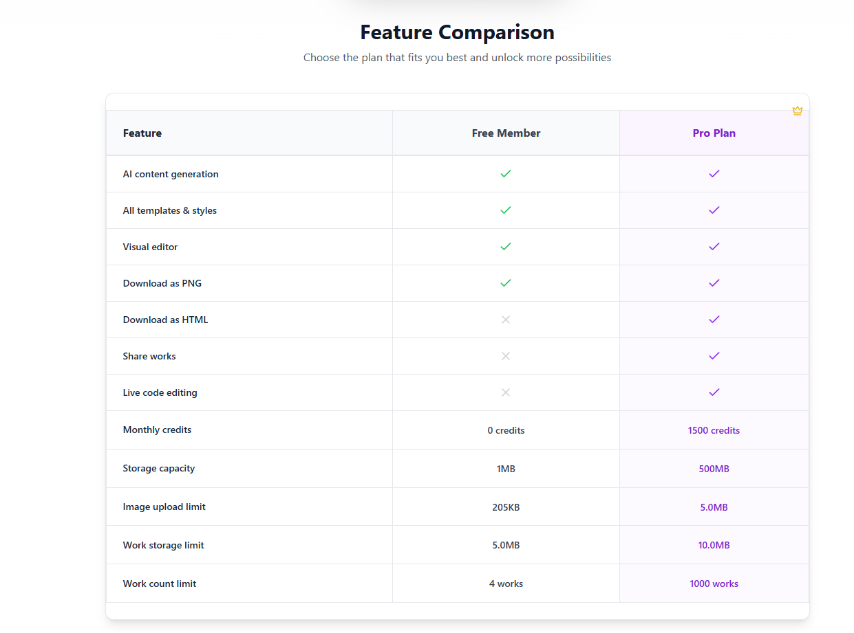
Confronto Funzionalità
Le principali differenze tra Free e Pro sono le seguenti:
| Funzionalità | Free | Pro |
|---|---|---|
| Generazione contenuti AI | ✓ | ✓ |
| Tutti i template & stili | ✓ | ✓ |
| Editor visivo | ✓ | ✓ |
| Scarica come PNG | ✓ | ✓ |
| Scarica come HTML | ✗ | ✓ |
| Condividi lavori | ✗ | ✓ |
| Modifica codice live | ✗ | ✓ |
| Crediti mensili | Quota base | Quota premium |
| Capacità archiviazione | Capacità base | Capacità maggiore |
Guida Utilizzo Crediti
Ogni generazione AI consuma una quantità fissa di crediti. Gli utenti del Free ricevono crediti bonus mensili base, mentre gli utenti del Pro ne ricevono di più. I crediti acquistati non scadono mai, e puoi ricaricare in qualsiasi momento quando scarseggiano—nessuna attesa per il ripristino della quota.
3.7 Cronologia
Nella barra laterale sinistra, "I miei lavori" (Cronologia) fornisce un accesso rapido alle tue creazioni passate. Elenca tutti i tuoi record di modifica in ordine cronologico.
Selezione Rapida & Modifica
Clicca su qualsiasi record nell'elenco per caricarlo rapidamente nell'editor e continuare da dove avevi lasciato, senza re-importare.
Dettagli Finestra Anteprima
Passa il mouse su un record della cronologia per vedere la sua finestra di anteprima. Nella finestra di anteprima, puoi:
- Modificare Titolo Direttamente: Clicca sul testo del titolo per modificare il nome del lavoro istantaneamente.
- Visualizzare Stato Condivisione: Le icone indicano se il lavoro è attualmente condiviso.
- Azioni Rapide: Accedi a modifica, elimina e altre scorciatoie.
Cronologia: Anteprima rapida e gestione dei lavori passati
4. Editor Visivo
Il cuore di HtmlDrag è un potente editor WYSIWYG che ti permette di lavorare direttamente in un vero ambiente HTML, eliminando la necessità di modificare il codice.
4.1 Panoramica Interfaccia Editor
L'editor utilizza un layout classico a tre colonne: navigazione sinistra con cronologia lavori, area di anteprima della tela centrale e pannello funzionale destro. Le barre superiore e inferiore forniscono azioni di lavoro e controlli di modifica.
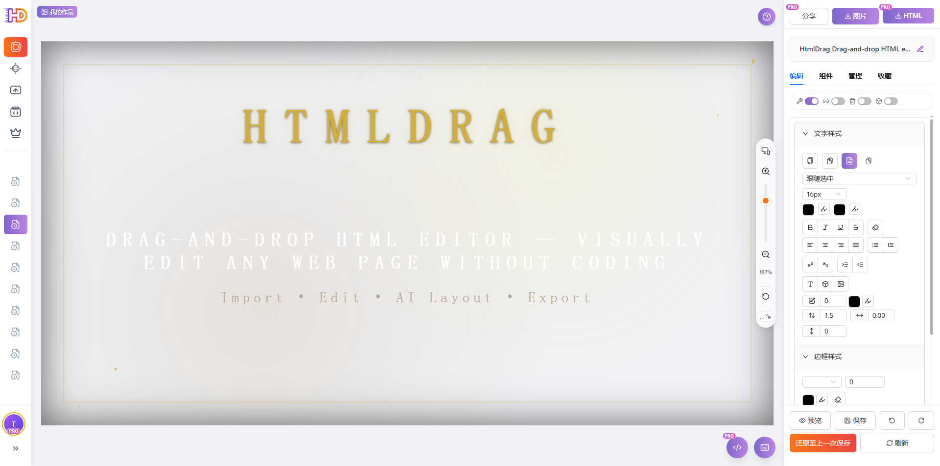
Interfaccia Editor: Navigazione sinistra, tela centrale, pannello destro
Navigazione Sinistra & Cronologia
La navigazione sinistra fornisce punti di accesso rapido. Clicca su "I miei lavori" per espandere l'elenco della cronologia lavori per una navigazione e un passaggio rapidi. I lavori condivisi mostrano un badge "Condiviso" per aiutarti a gestire lo stato di condivisione.
Area Tela Centrale
La tela è la finestra di anteprima dal vivo dove puoi selezionare, trascinare e modificare direttamente gli elementi della pagina. Supporta operazioni di zoom e panoramica tramite il controller zoom in basso. Tutte le modifiche si riflettono in tempo reale.
Pannello Destro (Modifica / Componenti / Livelli / Libreria)
Il pannello destro contiene quattro schede: Modifica (regolazioni di stile e switch modalità), Componenti (inserisci nuovi elementi), Livelli (elenco livelli e operazioni batch) e Libreria (libreria componenti personale). Clicca su qualsiasi scheda per passare tra le funzionalità.
Barra Titolo Superiore & Azioni
La barra superiore visualizza il titolo del lavoro (doppio clic per modificare), con pulsanti di azione sulla destra per condividere, scaricare come immagine e scaricare come HTML. Alcune funzionalità richiedono privilegi del Pro.
Barra Strumenti Inferiore
La barra degli strumenti inferiore fornisce Anteprima (apre in una nuova finestra), Annulla, Ripeti, Aggiorna anteprima, Ripristina ultimo stato salvato, Ripristina HTML iniziale e pulsanti Salva per i controlli di modifica principali.
4.2 Operazioni Base
HtmlDrag fornisce operazioni visive intuitive: passaggio del mouse, clic singolo, doppio clic e clic destro coprono la maggior parte delle attività di modifica.
Riconoscimento Elementi
Passa il mouse su qualsiasi elemento sulla tela, e il sistema lo rileverà automaticamente e mostrerà un bordo tratteggiato per aiutarti a identificare rapidamente gli elementi utilizzabili. Il riconoscimento copre testo, immagini, pulsanti, contenitori e altri elementi HTML.
Riconoscimento elementi: Bordo tratteggiato appare al passaggio del mouse
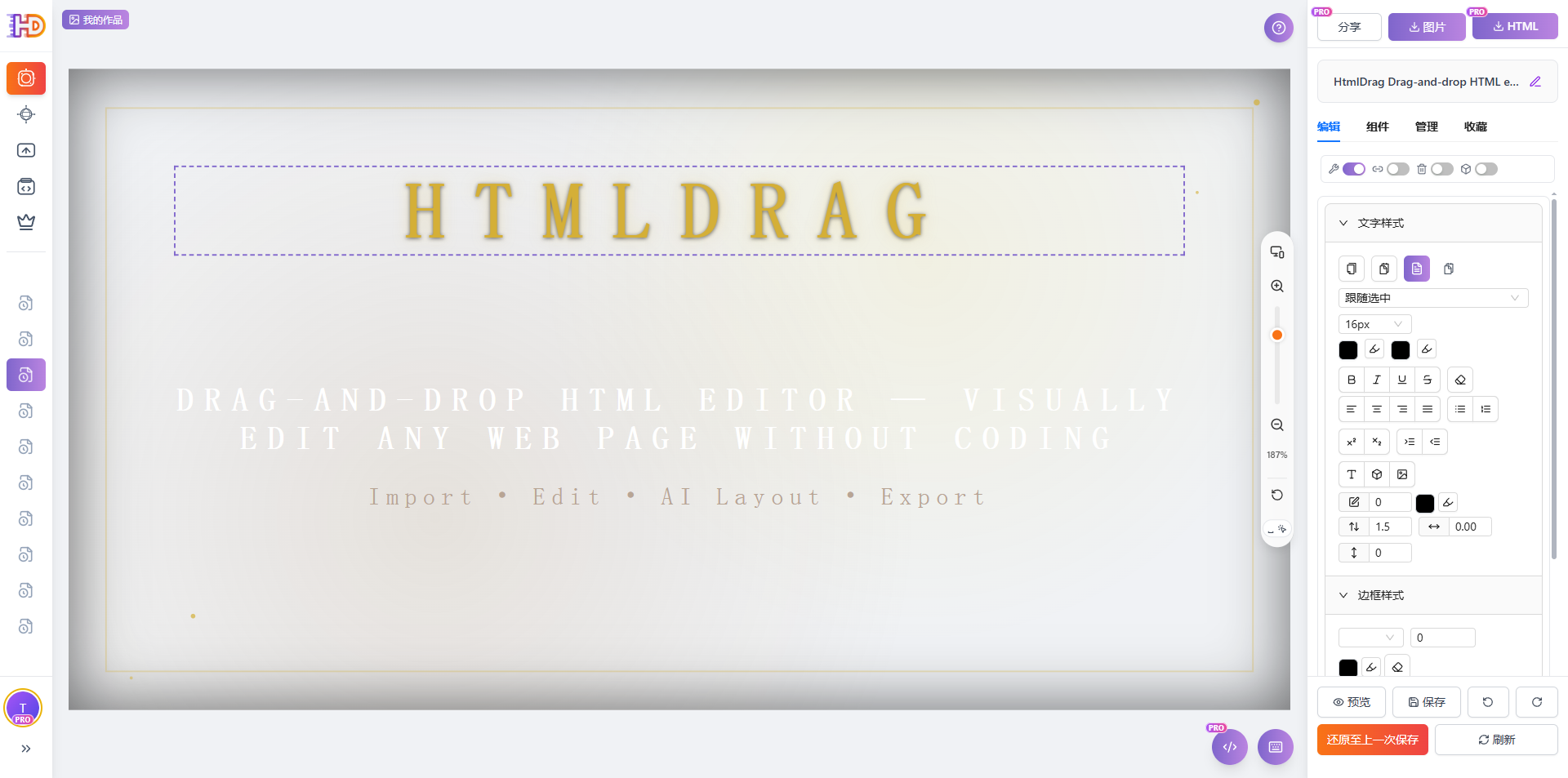
Modalità Trascinamento
Clic singolo su qualsiasi elemento per entrare in modalità trascinamento, che mostra un bordo di selezione con otto maniglie di ridimensionamento. Puoi: trascinare l'elemento per riposizionarlo; trascinare le maniglie d'angolo per scalare proporzionalmente; trascinare le maniglie laterali per ridimensionare in una direzione. Mentre selezionato, il pannello "Modifica" destro mostra le proprietà di stile dell'elemento per la regolazione.
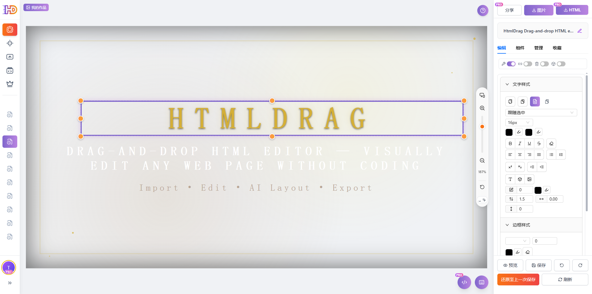
Modalità trascinamento: Clicca per selezionare, sposta liberamente e ridimensiona
Modalità Modifica
Doppio clic su un elemento di testo per entrare in modalità modifica: il cursore si posizionerà all'interno del testo per la modifica diretta. In modalità modifica, il pannello destro mostra strumenti di stile testo per font, dimensione, colore, grassetto, corsivo e altro. Clicca fuori dall'elemento o premi Esc per uscire dalla modalità modifica.
Modalità modifica: Doppio clic per entrare, modifica testo direttamente
Menu Contestuale
Clic destro su un elemento selezionato per aprire il menu contestuale, fornendo accesso rapido a Copia, Incolla, Aggiungi alla Libreria, modifica link, operazioni sui livelli, Blocca, Nascondi, Elimina e altro. Vedi 4.9 Menu Contestuale per i dettagli.
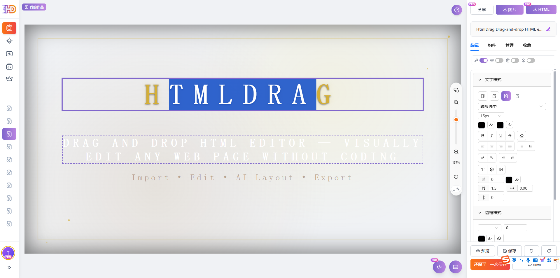
Selezione Multipla
Tieni premuto Shift e clicca su più elementi per selezionarli insieme per operazioni batch. In modalità selezione multipla, il pannello destro mostra strumenti di allineamento (allinea bordi sinistro/destro/superiore/inferiore, centra orizzontalmente/verticalmente, distribuisci orizzontalmente/verticalmente) per una rapida organizzazione del layout.
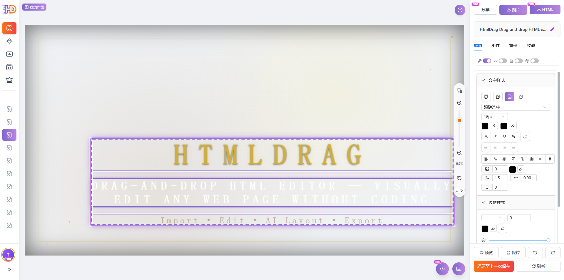
Selezione multipla: Tieni premuto Shift e clicca per selezionare più elementi
4.3 Barra scorciatoie I miei lavori
La barra scorciatoie "I miei lavori" a sinistra ti permette di espandere/comprimere l'elenco dei lavori e passare rapidamente da un lavoro all'altro, facilitando transizioni fluide tra più creazioni.
Espandi & Comprimi
Clicca sul pulsante "I miei lavori" in alto a sinistra per espandere l'elenco dei lavori della barra laterale. Clicca di nuovo o clicca fuori dalla barra laterale per comprimerla. Quando espansa, puoi sfogliare visivamente le miniature e i titoli dei tuoi lavori storici.
Cambia Lavori
Clicca su qualsiasi scheda lavoro nell'elenco per caricare immediatamente il suo contenuto nell'editor. Questo ti permette di confrontare e modificare rapidamente diverse bozze di design senza tornare alla home page o al profilo.
4.4 Scorciatoie da tastiera Tela
Padroneggiare le scorciatoie da tastiera può aumentare significativamente la tua efficienza di modifica. Ecco le principali scorciatoie supportate nell'area della tela:
| Azione | Scorciatoia |
|---|---|
| Zoom | Ctrl / Cmd + Rotella Mouse |
| Panoramica | Spazio + Trascina Mouse |
| Selezione Multipla | Shift + Clic |
| Copia | Ctrl / Cmd + C |
| Incolla | Ctrl / Cmd + V |
| Annulla | Ctrl / Cmd + Z |
| Elimina | Canc / Backspace |
4.5 Pannello destro - Scheda Modifica
La scheda "Modifica" è l'area più utilizzata, fornendo switch modalità e ricchi strumenti di regolazione dello stile. Dopo aver selezionato un elemento, il pannello mostra intelligentemente le opzioni di modifica in base al tipo di elemento.
Scheda Modifica: Switch modalità e strumenti stile
Switch Modalità
La parte superiore del pannello fornisce quattro interruttori di modalità per controllare il comportamento di interazione dell'editor. Ogni interruttore può essere attivato o disattivato indipendentemente, con una notifica che indica lo stato corrente.
| Modalità | Descrizione |
|---|---|
| Modifica Componenti | Quando abilitato, puoi selezionare e regolare componenti funzionali interattivi (come pulsanti, input modulo, ecc.); quando disabilitato, solo il contenuto testuale può essere modificato. Ideale per scenari che richiedono una manipolazione precisa degli elementi del modulo. |
| Navigazione Link | Quando abilitato, cliccare su elementi collegati in modalità modifica naviga direttamente all'URL di destinazione; quando disabilitato, la navigazione è bloccata così puoi modificare l'elemento link stesso. Nota: Questa impostazione non influisce sull'anteprima o sulla funzionalità del link scaricato. |
| Modalità Eliminazione | Quando abilitato, puoi eliminare elementi semplicemente cliccandoci sopra senza usare il menu contestuale; quando disabilitato, riprende la normale modalità di modifica. Ideale per cancellare rapidamente più elementi. |
| Livelli Decorativi | Quando abilitato, puoi identificare e modificare contenitori vuoti ed elementi decorativi (come contenitori bordo, livelli sfondo, ecc.); quando disabilitato, vengono riconosciuti solo elementi con contenuto effettivo. Per layout di pagina complessi, abilitare questa funzione consente un controllo più fine sugli elementi decorativi. |
Suggerimento: La navigazione link è disabilitata per impostazione predefinita durante la modifica per consentire la modifica dei componenti. Per seguire i link, attiva l'interruttore "Navigazione Link" nel pannello Modifica. Anche l'invio di moduli è bloccato in modalità modifica per proteggere il tuo contenuto.
Stile Testo
Dopo aver selezionato un elemento di testo o essere entrato in modalità modifica, il pannello mostra strumenti completi per lo stile del testo con le seguenti opzioni di formattazione:
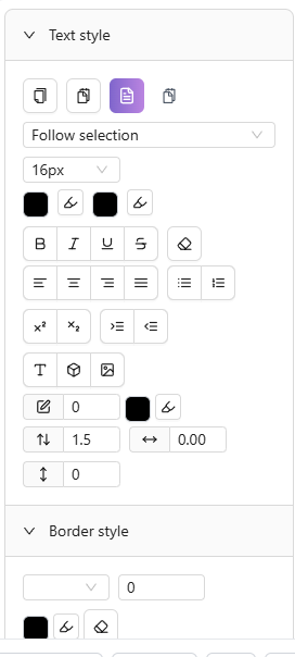
Stile testo: Impostazioni font, dimensione, colore
| Funzionalità | Descrizione |
|---|---|
| Font | Scegli tra font di sistema, font inglesi (Inter, Roboto, Open Sans, ecc.) e font cinesi (SimSun, SimHei, Microsoft YaHei, Source Han Sans, ecc.). |
| Dimensione Font | Molteplici dimensioni preimpostate da 12px a 72px, o inserisci manualmente una dimensione personalizzata. |
| Colore Font / Colore Sfondo | Imposta il colore del testo e l'evidenziazione dello sfondo tramite selettore colore, con supporto per il selettore colore della tela. |
| Grassetto, Corsivo, Sottolineato, Barrato | Attivazione con un clic per effetti grassetto, corsivo, sottolineato e barrato. |
| Allineamento | Quattro opzioni di allineamento del testo: sinistra, centro, destra e giustificato. |
| Altezza Riga, Spaziatura Lettere, Spaziatura Paragrafo | Regola l'altezza della riga (da 1x a 3x), la spaziatura delle lettere e la spaziatura del paragrafo per una tipografia ottimizzata. |
| Apice, Pedice | Formatta il testo selezionato come apice o pedice per formule matematiche, notazioni chimiche, ecc. |
| Elenco Puntato, Elenco Numerato | Converti rapidamente il testo in elenchi non ordinati (puntati) o ordinati (numerati). |
| Controllo Rientro | Aumenta o diminuisci il rientro per regolare la gerarchia del paragrafo. |
Stile Elemento
Dopo aver selezionato qualsiasi elemento, usa gli strumenti di stile elemento per regolarne l'aspetto:
| Funzionalità | Descrizione |
|---|---|
| Stile Bordo | Imposta il tipo di bordo (nessuno, solido, tratteggiato, punteggiato), larghezza (1px-10px) e colore. Clicca su "Cancella bordo" per rimuovere rapidamente tutti i bordi. |
| Raggio Angolo | Regola il raggio dell'angolo di tutti e quattro gli angoli per creare rettangoli arrotondati o effetti circolari. |
| Opacità | Usa il cursore per regolare l'opacità dell'elemento (0%-100%) per effetti di trasparenza. |
| Ombra | Quattro preimpostazioni di ombra—nessuna, ombra leggera, ombra media, ombra profonda—per rapidi effetti di profondità. |
| Posizione & Dimensione | Imposta con precisione le coordinate X/Y dell'elemento e i valori di larghezza/altezza. |
| Blocca Proporzioni | Quando abilitato, la regolazione della larghezza scala automaticamente l'altezza in modo proporzionale. |
Stile Immagine
Dopo aver selezionato un elemento immagine, regola le opzioni di visualizzazione e sostituisci l'immagine:
| Funzionalità | Descrizione |
|---|---|
| Adattamento Immagine | Quattro modalità di adattamento: contain (scala proporzionalmente), cover (riempi), fill (allunga), none (dimensione originale). |
| Posizione | Usa il posizionatore a griglia di 9 per impostare l'allineamento dell'immagine all'interno del suo contenitore (in alto a sinistra, in alto al centro, in alto a destra, centro a sinistra, centro, centro a destra, in basso a sinistra, in basso al centro, in basso a destra). |
| Sostituisci Immagine | Carica una nuova immagine locale o inserisci un URL per sostituire. Il caricamento locale supporta JPG, PNG, GIF, WebP e altri formati comuni. |
Stile Tabella
Quando è selezionata una tabella o una cella di tabella, diventano disponibili strumenti di modifica tabella dedicati. Per istruzioni dettagliate, vedi 4.10 Modifica Tabelle.
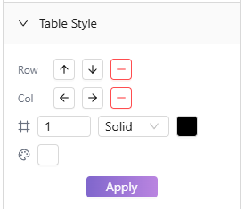
Stile tabella: Operazioni riga/colonna, bordi e impostazioni cella
| Funzionalità | Descrizione |
|---|---|
| Ops Riga/Colonna | Inserisci righe sopra/sotto, colonne a sinistra/destra, o elimina righe/colonne. |
| Allineamento Cella | Imposta l'allineamento orizzontale (sinistra, centro, destra) e verticale (alto, medio, basso) per il contenuto della cella. |
| Stile Bordo | Regola larghezza, stile (solido, tratteggiato, ecc.) e colore del bordo della tabella. |
| Sfondo Cella | Imposta il colore di sfondo della cella—ideale per evidenziare intestazioni o dati importanti. |
| Unisci/Dividi | Seleziona celle adiacenti per unirle in una sola; le celle unite possono essere divise di nuovo in originali. |
Modifica Link
Aggiungi link cliccabili a qualsiasi elemento, o modifica link esistenti:
| Funzionalità | Descrizione |
|---|---|
| Inserisci / Modifica Link | Inserisci l'URL di destinazione per aggiungere la navigazione cliccabile all'elemento selezionato. Supporta link http/https. |
| Rimuovi Link | Rimuovi il link dall'elemento, ripristinandolo a un elemento regolare. Il sistema confermerà il numero di link da rimuovere prima dell'esecuzione. |
Strumenti Allineamento (Selezione Multipla)
Quando sono selezionati più elementi, il pannello visualizza strumenti di allineamento e distribuzione per aiutarti a organizzare rapidamente i layout degli elementi:
| Funzionalità | Descrizione |
|---|---|
| Allinea Bordi Sinistri / Destri / Superiori / Inferiori | Allinea tutti gli elementi selezionati al bordo dell'elemento più a sinistra/destra/in alto/in basso. |
| Centra Orizzontalmente / Verticalmente | Allinea i punti centrali di tutti gli elementi selezionati orizzontalmente o verticalmente. |
| Distribuisci Orizzontalmente / Verticalmente | Distribuisci più elementi selezionati con spaziatura uguale orizzontalmente o verticalmente. |
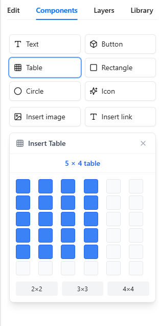
4.6 Pannello destro - Scheda Componenti
La scheda "Componenti" fornisce opzioni di inserimento rapido per vari tipi di elementi, aiutandoti ad aggiungere rapidamente nuovi contenuti alla tela. Clicca su un pulsante per inserire il componente corrispondente.
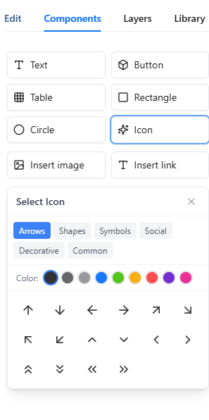
Scheda Componenti: Inserisci vari elementi con un clic
| Componente | Descrizione |
|---|---|
| Inserisci Testo | Inserisci un blocco di testo modificabile nella tela. Doppio clic dopo l'inserimento per entrare in modalità modifica e modificare il contenuto. |
| Inserisci Pulsante | Inserisci un elemento pulsante pre-stilizzato. Puoi modificare il testo del pulsante e aggiungere un link. |
| Inserisci Immagine | Apre la finestra di dialogo di caricamento immagine che supporta il caricamento locale o l'inserimento URL. Si applicano limiti di dimensione file singolo e caricamento batch—vedi interfaccia di caricamento per i dettagli. |
| Inserisci Icona | Apre il selettore icone con sei categorie—Frecce, Forme, Simboli, Social, Decorativo e Comune. Imposta colore e dimensione icona prima di inserire. |
| Inserisci Tabella | Apre il selettore dimensione tabella. Passa il mouse per scegliere righe e colonne (es. tabella 3×4), quindi clicca per inserire. |
| Inserisci Link | Inserisci un elemento di testo collegato nella tela. Inserisci l'URL del link e il testo da visualizzare. |
| Inserisci Rettangolo / Cerchio | Inserisci elementi forma base. Usa strumenti stile elemento per regolare bordo, colore sfondo, raggio e altre proprietà per decorazione o layout. |
4.7 Pannello destro - Scheda Livelli
La scheda "Livelli" fornisce una visualizzazione elenco di tutti gli elementi modificabili sulla tela, supportando filtri, operazioni batch e posizionamento preciso—uno strumento potente per gestire elementi di pagina complessi.
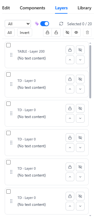
Scheda Livelli: Gestione livelli e operazioni batch
Elenco Schede Elementi
Il pannello visualizza tutti gli elementi gestibili come schede. Ogni scheda mostra il tipo di tag dell'elemento (es. DIV, IMG, SPAN) e il livello del layer, con elementi di testo che mostrano un'anteprima del contenuto. Gli elementi del livello decorativo sono contrassegnati con un badge "Decorativo". Icone di blocco/sblocco rapido e nascondi/mostra appaiono sul lato destro di ogni scheda.
Opzioni Filtro
Clicca sul pulsante filtro per filtrare l'elenco per stato elemento, con le seguenti opzioni:
| Filtro | Descrizione |
|---|---|
| Tutti | Mostra tutti gli elementi gestibili |
| Bloccati | Mostra solo elementi bloccati |
| Sbloccati | Mostra solo elementi sbloccati |
| Nascosti | Mostra solo elementi nascosti |
| Visibili | Mostra solo elementi visibili |
Operazioni Batch
Dopo aver selezionato più elementi nell'elenco schede, usa i pulsanti di operazione batch per l'elaborazione unificata:
| Operazione | Descrizione |
|---|---|
| Seleziona Tutto / Inverti Selezione | Seleziona rapidamente tutti gli elementi o inverti la selezione corrente |
| Blocca Selezionati / Sblocca Selezionati | Blocca o sblocca in batch gli elementi selezionati; gli elementi bloccati non possono essere modificati o spostati |
| Nascondi Selezionati / Mostra Selezionati | Nascondi o mostra in batch gli elementi selezionati; gli elementi nascosti sono invisibili sulla tela ma rimangono nell'HTML |
| Elimina Selezionati | Elimina in batch gli elementi selezionati con richiesta di conferma |
Switch Precisione
La scheda Livelli fornisce un interruttore di precisione per controllare la precisione del riconoscimento degli elementi:
| Stato | Descrizione |
|---|---|
| Precisione Attiva | Auto-deduplicazione, mostrando solo elementi host per ridurre le schede duplicate |
| Precisione Disattiva | Mostra tutti gli elementi candidati (inclusi frammenti inline), ideale per operazioni precise su elementi inline |
Clicca su Scheda per Localizzare
Clicca su qualsiasi scheda elemento per scorrere automaticamente la tela ed evidenziare l'elemento corrispondente, facilitando la localizzazione rapida di componenti specifici sulla pagina. Questo è particolarmente utile quando si lavora con layout di pagina complessi o stratificati.
4.8 Pannello destro - Scheda Libreria
La scheda "Libreria" è la tua libreria di componenti personali dove puoi salvare elementi o componenti utilizzati di frequente per il riutilizzo in diversi lavori, aumentando la tua efficienza creativa.
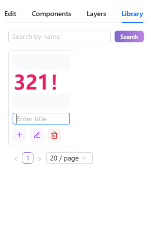
Scheda Libreria: Libreria componenti personale
Elenco Componenti Preferiti
Il pannello mostra tutti i tuoi componenti salvati come schede, ciascuna mostrando una miniatura e un nome. Le miniature sono generate automaticamente al salvataggio; i componenti senza nome vengono visualizzati come "Senza titolo".
Cerca Preferiti
Usa la casella di ricerca per trovare rapidamente i componenti salvati per nome. L'elenco filtra in tempo reale mentre digiti.
Inserisci Componente Preferito
Clicca sul pulsante "Inserisci" su una scheda libreria per aggiungere quel componente alla tela corrente. I componenti inseriti possono essere modificati e regolati normalmente.
Rinomina / Elimina Preferiti
Ogni scheda libreria offre opzioni "Rinomina" ed "Elimina". Rinominare rende i componenti più facili da trovare in seguito; l'eliminazione rimuove permanentemente il componente salvato—usa con cautela.
Come Aggiungere alla Libreria
Seleziona qualsiasi elemento sulla tela, quindi scegli "Aggiungi alla Libreria" dal menu contestuale per salvare quell'elemento e i suoi figli come un componente. Una conferma "Aggiunto alla Libreria" appare in caso di successo.
4.9 Menu Contestuale
Cliccare con il tasto destro su un elemento selezionato apre il menu contestuale, fornendo accesso rapido ad azioni comuni. Il contenuto del menu si regola dinamicamente in base al tipo di elemento selezionato.
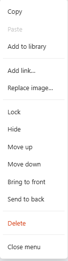
Menu contestuale: Accesso rapido ad azioni comuni
| Voce Menu | Descrizione |
|---|---|
| Copia / Incolla | Copia l'elemento selezionato negli appunti, o incolla il contenuto degli appunti sulla tela. Supporta copia e incolla tra lavori. |
| Aggiungi alla Libreria | Salva l'elemento selezionato nella tua libreria personale per il riutilizzo in altri lavori. |
| Aggiungi/Modifica/Rimuovi Link | Aggiungi un link di navigazione cliccabile all'elemento, o modifica/rimuovi link esistenti. La rimozione richiede conferma. |
| Sostituisci Immagine | Mostrato solo per elementi immagine; sostituisci rapidamente con un caricamento locale o un'immagine URL. |
| Sposta Su / Sposta Giù | Regola la posizione dell'elemento nell'ordine di sovrapposizione; sposta su lo porta in avanti. |
| Porta in Primo Piano / Porta in Secondo Piano | Sposta l'elemento direttamente davanti o dietro a tutti gli elementi. |
| Blocca / Sblocca | Gli elementi bloccati non possono essere modificati o spostati, prevenendo modifiche accidentali. Sblocca per ripristinare la modificabilità. |
| Nascondi / Mostra | Nascondi temporaneamente l'elemento dalla tela mantenendolo nell'HTML. Mostra ripristina la visibilità. |
| Elimina | Elimina permanentemente l'elemento selezionato. Quando sono selezionati più elementi, viene mostrato il conteggio. |
Menu Specifico Tabella
Quando si clicca con il tasto destro su una cella di tabella, il menu mostra operazioni aggiuntive specifiche per la tabella:
| Voce Menu | Descrizione |
|---|---|
| Elimina Riga | Elimina l'intera riga contenente la cella corrente (non è possibile eliminare l'ultima riga) |
| Elimina Colonna | Elimina l'intera colonna contenente la cella corrente (non è possibile eliminare l'ultima colonna) |
4.10 Modifica Tabelle
Quando una tabella o una cella di tabella è selezionata, il pannello destro mostra strumenti di modifica tabella dedicati con funzionalità complete di stile e regolazione della struttura della tabella.
Modifica tabella: Operazioni riga/colonna e impostazioni stile
Operazioni Riga & Colonna
La sezione "Righe & Colonne" del pannello editor tabella fornisce:
| Operazione | Descrizione |
|---|---|
| Inserisci Riga Sopra / Sotto | Inserisci una nuova riga sopra o sotto la riga corrente |
| Elimina Riga | Elimina la riga attualmente selezionata (non è possibile eliminare l'ultima riga) |
| Inserisci Colonna Sinistra / Destra | Inserisci una nuova colonna a sinistra o a destra della colonna corrente |
| Elimina Colonna | Elimina la colonna attualmente selezionata (non è possibile eliminare l'ultima colonna) |
Unisci / Dividi Celle
Dopo aver selezionato più celle adiacenti, usa "Unisci Celle" per combinarle in una sola. Per celle unite, usa "Dividi Cella" per ripristinarle alle celle multiple originali.
Allineamento Cella
Imposta l'allineamento del contenuto della cella in due dimensioni:
| Dimensione | Opzioni |
|---|---|
| Orizzontale | Sinistra, Centro, Destra |
| Verticale | Alto, Medio, Basso |
Stile Bordo
Personalizza l'aspetto del bordo della tabella incluso:
| Proprietà | Descrizione |
|---|---|
| Larghezza Bordo | Imposta spessore bordo |
| Stile Bordo | Solido, Tratteggiato, Punteggiato, Doppio, Nessuno |
| Colore Bordo | Scegli il colore del bordo tramite selettore colore |
Clicca "Applica" per salvare le modifiche.
Sfondo Cella
Imposta il colore di sfondo della cella usando il selettore colore—ideale per evidenziare intestazioni o righe di dati importanti.
4.11 Controllo Zoom & Viewport
Il controller zoom in basso nella tela fornisce zoom e regolazione della dimensione del viewport, aiutandoti a visualizzare in anteprima il tuo lavoro su diverse dimensioni di dispositivo.
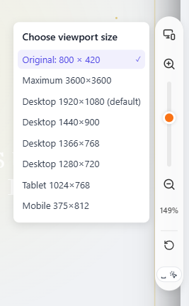
Controllo zoom: Regola zoom tela e dimensione viewport
Zoom Avanti / Zoom Indietro / Ripristina
Usa i pulsanti "+" e "−" per zoomare avanti o indietro la vista della tela, o tieni premuto Ctrl/Cmd + rotella del mouse per zoomare rapidamente. Clicca sul numero percentuale per ripristinare allo zoom predefinito. Tieni premuto Spazio + trascina per panoramica tela.
Preimpostazioni Dimensione Viewport
Clicca sul selettore viewport per passare tra dimensioni di anteprima, simulando la visualizzazione su diversi dispositivi:
| Dimensione Viewport | Descrizione |
|---|---|
| Auto | Adatta alla dimensione del contenuto, adatto per la maggior parte degli scenari |
| Desktop 1920×1080 (Predefinito) | Monitor desktop Full HD |
| Desktop 1440×900 | Schermo laptop comune |
| Desktop 1366×768 | Risoluzione laptop popolare |
| Desktop 1280×720 | Risoluzione HD |
| Tablet 1024×768 | Dispositivo tablet standard |
| Mobile 375×812 | iPhone e dispositivi mobili simili |
Patch di Anteprima
Per pagine HTML con strutture speciali, sono disponibili tre patch di anteprima per ottimizzare la visualizzazione. Abilitare o disabilitare le patch salverà automaticamente e aggiornerà l'anteprima:
| Patch | Descrizione |
|---|---|
| USP — stabilizza pagine ultra-alte | Ottimizza tele ultra-alte o senza bordi, riducendo il jitter. Adatto per file statici complessi/senza bordi |
| UFP — fissa larghezza viewport | Limita la larghezza del viewport, ripristinando la corretta visualizzazione di layout complessi |
| SHP — ottimizza dimensioni insolite | Ottimizza HTML strutturato insolitamente per una migliore compatibilità |
Suggerimento: Se le patch non mostrano effetti evidenti, prova prima "Ripristina HTML iniziale", poi riabilita la patch.
4.12 Editor HTML
L'Editor HTML ti consente di visualizzare e modificare direttamente il codice sorgente HTML completo del tuo lavoro—ideale per utenti avanzati che necessitano di perfezionamenti o aggiunte di codice personalizzate. Questa funzionalità è solo per il Pro.
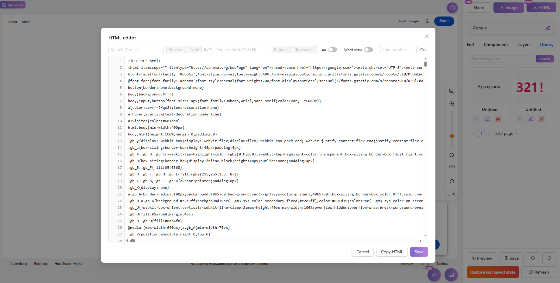
Editor HTML: Modifica codice sorgente direttamente (Pro)
Visualizza / Modifica HTML Completo
Quando apri l'Editor HTML, viene visualizzato il codice sorgente HTML completo (incluso <!DOCTYPE html>). Puoi modificare il codice direttamente; salvare applica le tue modifiche.
Cerca & Sostituisci
Usa Ctrl+F per aprire trova, inserendo parole chiave per localizzare rapidamente il codice. Usa Ctrl+H per aprire sostituisci per sostituzione testo batch. La barra degli strumenti mostra il conteggio delle corrispondenze (es. "3 / 15"), con opzioni per singolo o sostituisci tutto.
Vai alla Riga
Usa Ctrl+G o la funzione di salto della barra degli strumenti per inserire un numero di riga e navigare rapidamente a quella riga—utile per file HTML di grandi dimensioni.
Maiuscole/Minuscole
Abilita l'opzione "Maiuscole/Minuscole" durante la ricerca per corrispondere precisamente al contenuto sensibile alle maiuscole.
A Capo Automatico
Quando a capo automatico è abilitato, le lunghe righe di codice vanno a capo automaticamente per la visualizzazione senza scorrimento orizzontale.
Copia / Salva
Clicca "Copia HTML" per copiare il codice sorgente completo negli appunti. Dopo la modifica, clicca Salva per applicare le modifiche. Se il contenuto è vuoto o contiene errori di sintassi, appariranno messaggi appropriati.
Nota: Se il contenuto HTML supera i limiti di archiviazione, il salvataggio mostrerà "Spazio insufficiente, impossibile salvare questa modifica." Elimina contenuti non necessari o aggiorna il tuo piano per aumentare la capacità.
4.13 Barra degli strumenti inferiore
La barra degli strumenti inferiore fornisce i pulsanti di azione principali dell'editor, incluse funzioni di anteprima, annulla/ripeti, ripristina e salva.
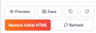
Barra degli strumenti inferiore: Anteprima, salva e ripristina
Anteprima (Apre in Nuova Finestra)
Clicca sul pulsante anteprima per aprire un'anteprima completa del tuo lavoro in una nuova finestra, mostrando il risultato di visualizzazione reale. La pagina di anteprima mostra un avviso temporaneo di anteprima ricordando agli utenti che questa è un'anteprima in fase di modifica con un link non riutilizzabile.
Annulla / Ripeti
Annulla inverte l'ultima operazione; Ripeti ripristina un'operazione annullata. Supporta più passaggi di annulla/ripeti. Disponibile anche tramite Ctrl+Z (annulla) e Ctrl+Y (ripeti).
Aggiorna Anteprima
Cliccando aggiorna si ricarica l'area di anteprima. Il sistema salva prima il contenuto corrente, quindi aggiorna la tela per mostrare lo stato più recente. Utile dopo modifiche estese per sincronizzare la visualizzazione.
Ripristina ultimo stato salvato
Ripristina il lavoro all'ultimo stato salvato manualmente. Tutte le modifiche non salvate andranno perse—usare con cautela. Il sistema richiede conferma prima dell'esecuzione.
Ripristina HTML iniziale
Ripristina l'HTML del lavoro al suo stato originale quando è stato creato per la prima volta. Tutta la cronologia delle modifiche verrà cancellata. Questa azione è irreversibile—assicurati di aver eseguito il backup dei contenuti importanti.
Salva
Salva manualmente tutte le modifiche correnti. Il sistema supporta anche il salvataggio automatico, ma il salvataggio manuale dopo modifiche importanti è raccomandato per garantire la sicurezza dei dati. "Salvataggio riuscito" appare al completamento.
4.14 Barra degli strumenti superiore
La barra degli strumenti superiore visualizza le informazioni sul lavoro e pulsanti di azione rapida, fornendo accesso rapido alle funzionalità di condivisione e download.
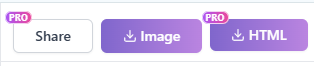
Barra degli strumenti superiore: Titolo, condividi e download
Titolo Lavoro (Doppio Clic per Modificare)
La parte superiore mostra il titolo corrente del lavoro; fai doppio clic nell'area del titolo per entrare in modalità modifica e cambiare il nome. Il titolo non può essere vuoto; "Titolo aggiornato con successo" appare in caso di successo. I lavori senza nome vengono visualizzati come "Lavoro senza titolo".
Pulsante Condividi
Clicca sul pulsante condividi per abilitare la condivisione del lavoro e generare un link accessibile. Vedi 4.16 Funzionalità Condivisione per i dettagli. Questa funzionalità è solo per il Pro.
Pulsanti Download
Il lato destro fornisce pulsanti "Scarica come immagine" e "Scarica come HTML". Vedi 4.15 Scarica Lavoro per i dettagli.
4.15 Scarica Lavoro
HtmlDrag offre opzioni di esportazione flessibili, permettendoti di scaricare il tuo lavoro come immagine o file HTML standard per condivisione, archiviazione o ulteriore sviluppo.
Clicca sul pulsante "Scarica come immagine" nella barra superiore per generare e scaricare un'immagine PNG di alta qualità dell'intero contenuto della tela. Questo è perfetto per presentazioni di design, condivisione sui social media o anteprime.
Scarica come HTML
Gli utenti del Pro possono esportare lavori come file sorgente HTML standard. Cliccando sul pulsante "Scarica come HTML" offre due opzioni:
- Scarica HTML Corrente: Include tutte le modifiche e gli adattamenti che hai apportato nell'editor—ciò che vedi è ciò che ottieni.
- Scarica HTML Originale: Esporta il codice originale di quando il lavoro è stato creato per la prima volta, senza modifiche successive.
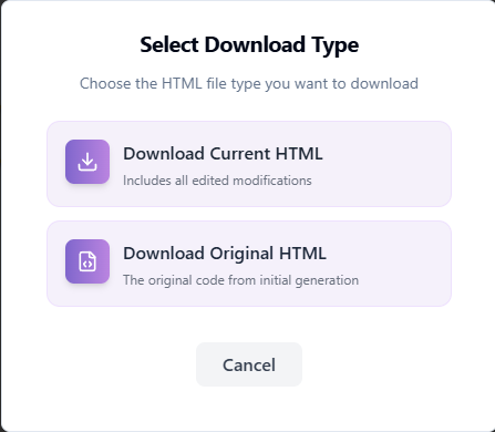
Opzioni download: Scegli tra versione modificata corrente o versione originale
4.16 Funzionalità Condivisione
La funzionalità Condivisione ti consente di generare un link accessibile pubblicamente per il tuo lavoro, facilitando la condivisione delle creazioni. La pagina di condivisione fornisce anche statistiche di accesso. Questa funzionalità è solo per il Pro.
Impostazioni condivisione: Gestisci link e stato
Impostazioni & Gestione
- Abilita Condivisione: Clicca sul pulsante condividi per generare un link di condivisione unico. Alla prima abilitazione, appare "Condivisione abilitata, link copiato negli appunti".
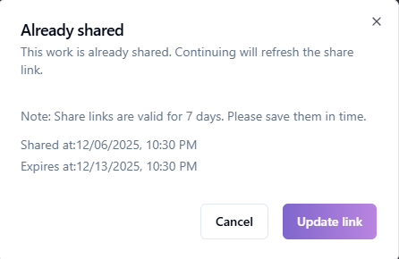
- Validità: I link di condivisione sono validi per 7 giorni per impostazione predefinita. Puoi visualizzare l'orario di scadenza specifico nella finestra di dialogo di condivisione.
- Aggiorna Orario: Se il link sta per scadere o vuoi estenderlo, clicca su "Aggiorna link" per reimpostare il periodo di validità.
- Interrompi Condivisione: Clicca su "Interrompi condivisione" per invalidare immediatamente il link corrente, impedendo ulteriori accessi.
- Copia Link: Clicca sul pulsante copia per copiare il link di condivisione negli appunti.
Pagina Condivisione & Statistiche
I visitatori che aprono il link di condivisione vedranno una pagina di presentazione indipendente. La barra laterale destra visualizza le informazioni sul lavoro, incluso:
- Titolo & Autore: Mostra il tuo nickname e il titolo del lavoro.
- Statistiche: Visualizza Visualizzazioni e Mi piace per tracciare la popolarità.
- Scadenza: Mostra quando scadrà il link di condivisione.
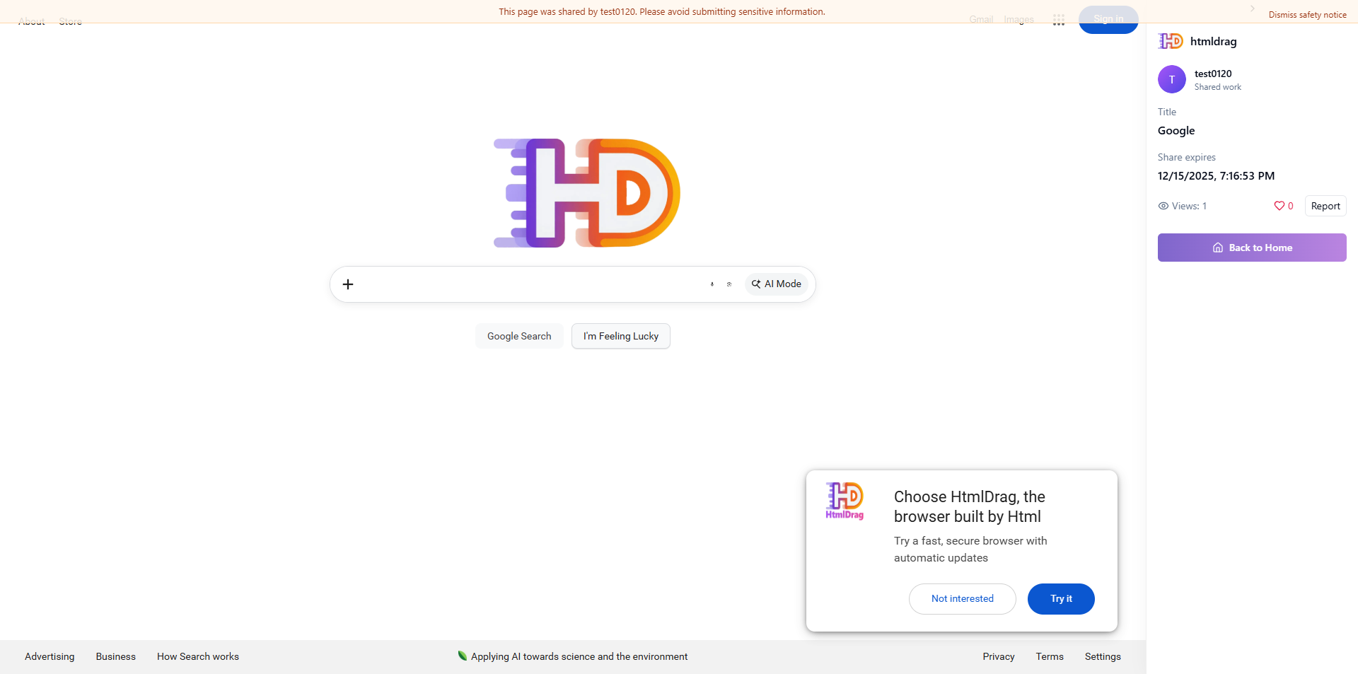
Pagina condivisione: Vista visitatore e statistiche
Nota: Se un lavoro viene segnalato e verificato per violazioni delle policy, il sistema potrebbe disabilitare la condivisione per quel lavoro con il messaggio "Questo lavoro è stato segnalato e verificato, la condivisione è stata disabilitata dal sistema."
5. Altre Funzionalità
Oltre alle funzionalità di modifica principali, HtmlDrag fornisce anche funzionalità di messaggistica e feedback per aiutarti a rimanere aggiornato e comunicare con noi.
5.1 Messaggi
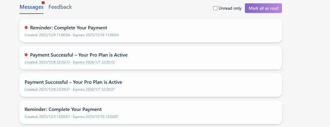
Il modulo Messaggi riceve importanti notifiche di sistema, inclusi stato account, promemoria di pagamento, avvisi di scadenza abbonamento e aggiornamenti delle funzionalità.
Messaggi: Ricevi notifiche di sistema e avvisi
Lista Messaggi di Sistema
La lista messaggi è ordinata cronologicamente, mostrando titolo, riepilogo, ora di creazione e ora di scadenza. Clicca su un messaggio per visualizzare i dettagli o eseguire azioni (es. "Continua Pagamento", "Rinnova Ora").
Filtro Non Letti
Spunta la casella "Solo non letti" in alto a destra per filtrare rapidamente i messaggi non letti, aiutandoti a concentrarti sulle notifiche importanti.
Segna Tutti come Letti
Clicca sul pulsante "Segna tutti come letti" per segnare istantaneamente tutti i messaggi nella lista corrente come letti, cancellando gli indicatori a punto rosso.
Dettagli Messaggio
Clicca su una scheda messaggio per visualizzare il contenuto completo della notifica. Per messaggi di ordine o abbonamento, i dettagli includono spesso pulsanti di azione rapida per tua comodità.
5.2 Feedback
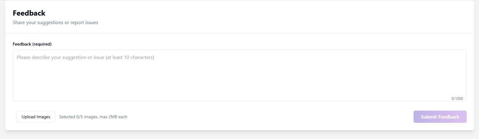
Se riscontri problemi o hai suggerimenti, inviali tramite il modulo Feedback. Puoi caricare immagini per descrivere meglio il tuo problema.
Feedback: Invia problemi o suggerimenti
Lista Feedback & Stato
La lista mostra la cronologia delle tue segnalazioni e lo stato corrente:
- In Lavorazione: Feedback inviato, in attesa di revisione admin.
- Risposto: L'admin ha risposto; clicca per visualizzare.
- Chiuso: Feedback archiviato o risolto; nessuna ulteriore risposta consentita.
Invia Nuovo Feedback
Clicca "Nuovo Feedback", inserisci il tuo contenuto (richiesto, min 10 caratteri). Puoi "Carica Immagini" (max 2MB ciascuna) per fornire screenshot. Clicca "Invia Feedback" quando hai fatto.
Dettagli Feedback & Conversazione
Clicca su un elemento della lista per visualizzare la cronologia completa della conversazione, inclusi i tuoi messaggi e le risposte dell'admin. In alto sono mostrati ID Feedback e allegati.
Continua Risposta
Per feedback "In Lavorazione" o "Risposto", usa la casella di input in basso per fornire più informazioni o rispondere all'admin finché non è risolto.
6. Suggerimenti di Sistema
Durante l'uso, potresti incontrare avvisi di sistema o limiti. Ecco spiegazioni e suggerimenti per i suggerimenti di sistema comuni.
6.1 Avvisi Rilevamento HTML
Per garantire la qualità dell'importazione e la stabilità dell'editor, il sistema scansiona automaticamente URL e file, avvisandoti di potenziali problemi.
Rilevamento Risorse Locali
Se una pagina contiene percorsi locali (es. file:// o C:/), le risorse non verranno caricate. Suggerimento: Assicurati che tutte le risorse utilizzino link pubblici HTTP/HTTPS.
Protezione Hotlink Immagini
Alcuni siti bloccano l'accesso esterno alle immagini. Suggerimento: Usa "Sostituisci immagine" per caricare file locali o ospitarli su un servizio pubblico.
Pagine a Rendering Dinamico (SPA)
Le pagine che si basano interamente su JavaScript (SPA) potrebbero essere importate vuote o incomplete perché il DOM dinamico non viene catturato direttamente. Suggerimento: Usa "Incolla Codice" copiando l'HTML renderizzato dal tuo browser.
Font Esterni / Librerie Icone
Font o icone con header CORS mancanti potrebbero essere visualizzati in modo errato. Suggerimento: Sostituiscili con font di sistema o icone della libreria nell'editor.
Contenuto Incorporato (iframe)
Per sicurezza, alcuni contenuti iframe potrebbero essere bloccati o non interattivi. Il sistema preserva i segnaposto ove possibile.
6.2 Archiviazione & Limiti
HtmlDrag applica quote di risorse in base al tuo piano. Potresti vedere avvisi come "Limite archiviazione raggiunto" o "Limite lavori raggiunto".
Limite Archiviazione Raggiunto
Non puoi salvare modifiche o caricare file quando lo spazio è esaurito. Soluzione:
- Elimina vecchi elementi nel "Portfolio" per liberare spazio.
- Clicca "Aggiorna ora" nella finestra di dialogo per ottenere più capacità con un Pro.
Limite Conteggio Lavori
Gli utenti del Free hanno un limite sul numero di lavori salvati. Elimina vecchi lavori o aggiorna per aumentare questo limite.
Limiti Caricamento Immagini
Il sistema controlla la dimensione del singolo file e i limiti batch. Se vedi "Dimensione file supera il limite" o "Dimensione batch superata", comprimi le immagini o caricale in batch più piccoli. Gli utenti del Pro godono di limiti più alti.
6.3 Scansione Sicurezza
La Scansione Sicurezza integrata valuta automaticamente il rischio del contenuto quando importi URL, carichi file o incolli codice per proteggere il tuo account.
Livello di Rischio
Basato su minacce come XSS, script dannosi o tag pericolosi, i rischi sono classificati come:
- Rischio Basso: Avvisi minori; di solito sicuro procedere.
- Rischio Medio: Potenziali problemi; procedere con cautela.
- Rischio Alto: Rischi gravi; procedere solo se la fonte è attendibile.
- Rischio Critico: Contiene malware o contenuti di phishing; bloccato immediatamente.
Modalità Sicura
Per file con qualche rischio, il sistema offre "Misure di sicurezza" come Auto Sanitize. Puoi scegliere di "Continua in modalità sicura", dove il sistema rimuove il codice pericoloso preservando layout e modificabilità.
Inizia con HtmlDrag
HtmlDrag offre un generoso Free. I nuovi utenti ricevono crediti bonus alla registrazione
per provare il Generatore AI e l'Importazione URL. La modifica visiva è completamente gratuita e senza limiti.