In the AI website builder era, generating a first draft is easy. The harder part comes after generation: how do you make an AI-generated website feel more custom, more intentional, and less like a template?
That is the real post-generation problem. Most teams do not need to rebuild the page from scratch. They need a fast way to improve what already exists: sharpen the hero message, clarify the CTA, replace generic visuals, adjust section rhythm, and clean up the small pieces of interface copy that still feel auto-generated.
This article focuses on that exact workflow. Rather than rebuilding a page from scratch, we start from a public live page and show how to visually refine it so it looks closer to a real branded site, not just an AI draft.
Why This Topic Matters
Search interest around AI website builders keeps growing, but the more practical question is no longer only which builder can generate a page fastest. It is how to make the generated page look good enough to ship.
- improve an AI-generated website without reopening code
- make a landing page look less generic
- update hero copy and CTA after AI generation
- replace template-looking visuals and polish microcopy
That makes visual post-generation editing a strong long-tail topic for marketers, founders, freelancers, and non-technical teams that already have a usable page but want it to look more polished.
What Usually Makes an AI-Generated Site Feel Generic
Most AI-generated pages do not need a full rebuild. They usually need a focused round of practical cleanup:
- broad hero copy that could apply to almost any product
- weak CTA wording that does not clearly guide the next step
- flat visual hierarchy with not enough emphasis on the key message
- placeholder-style imagery that makes the page feel unfinished
- repetitive feature sections full of generic benefits
- default-feeling microcopy inside inputs, prompt boxes, and helper text
If you can fix those quickly, the same page can feel far more custom without needing a full redesign. For this walkthrough, we use mailerlite.com as the public demo page. Compared with heavily client-rendered sites, its homepage structure is more stable and better suited for demonstrating a visual editing pass across hero copy, CTA wording, feature cards, trust sections, and small UI text.
Step-by-Step: Make an AI-Generated Website Look More Custom
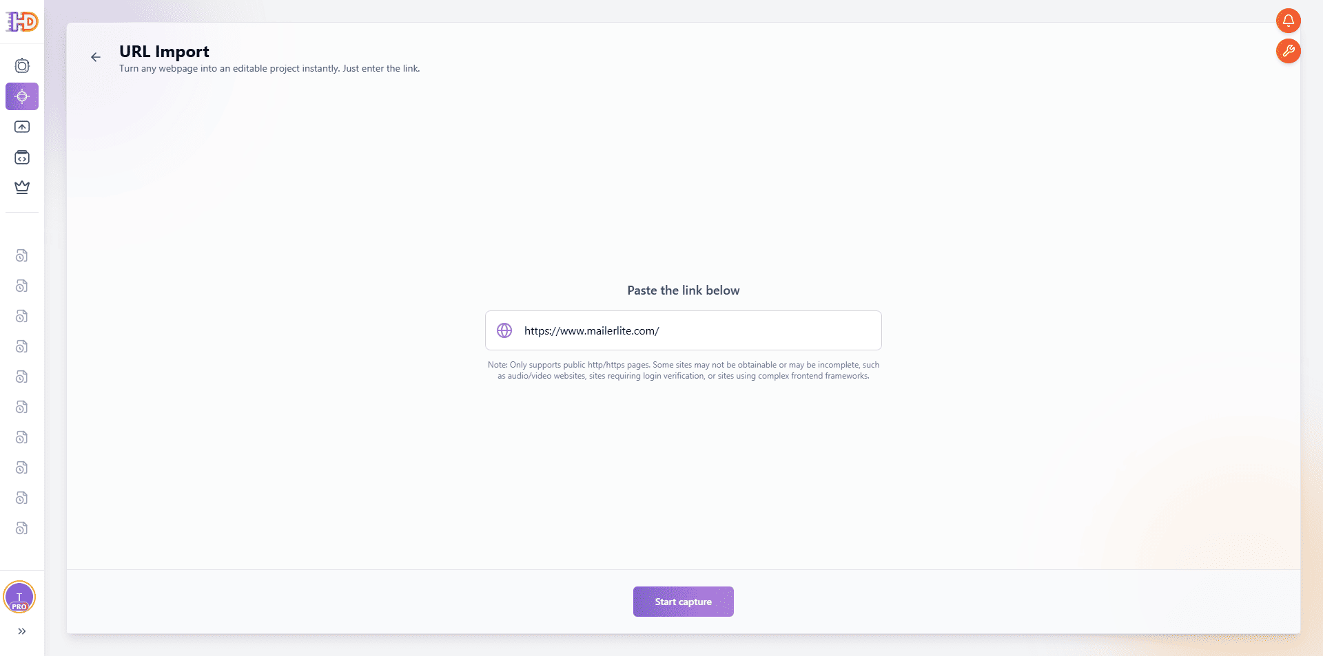
Step 1: Import the Live Page by URL and Open It as an Editable Canvas
Open HtmlDrag, choose URL Import, and paste the live page you want to refine. In this example, we still use:
The point of this step is not just to capture a page. It is to turn a real, already-published website into something you can edit visually right away. That makes it especially useful for post-generation refinement, where the structure is already there and you mostly need better messaging, visuals, and cleanup.
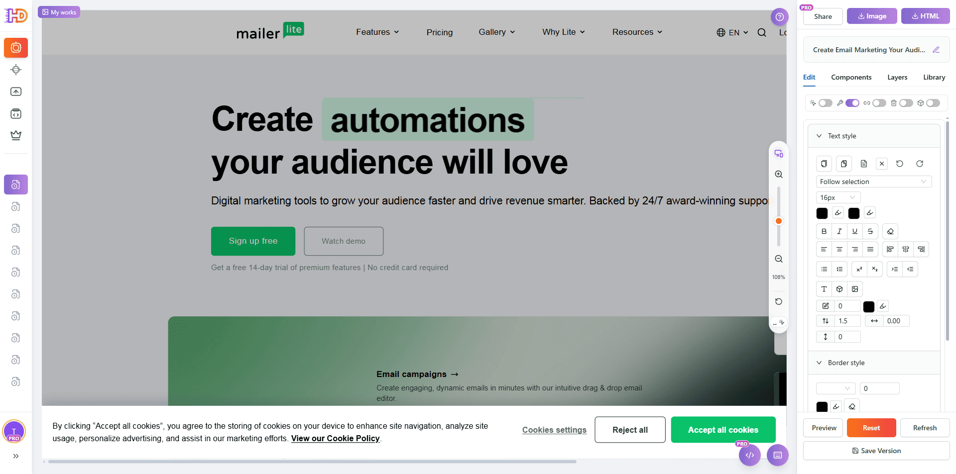
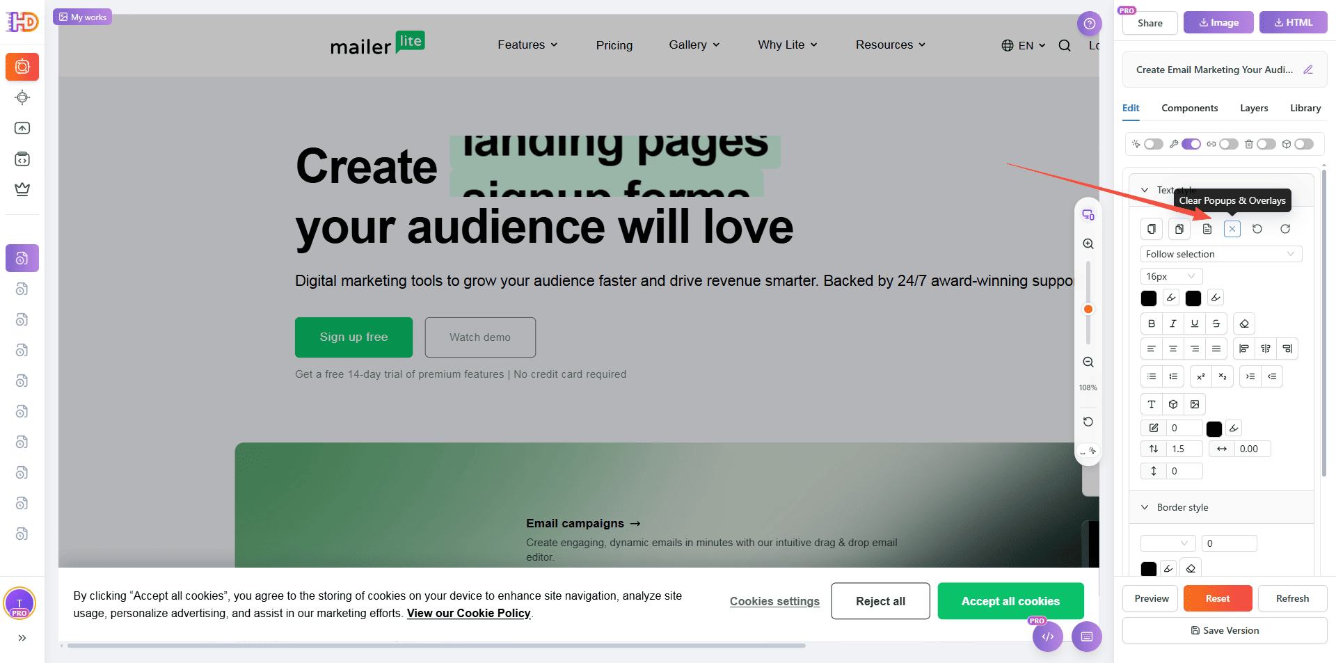
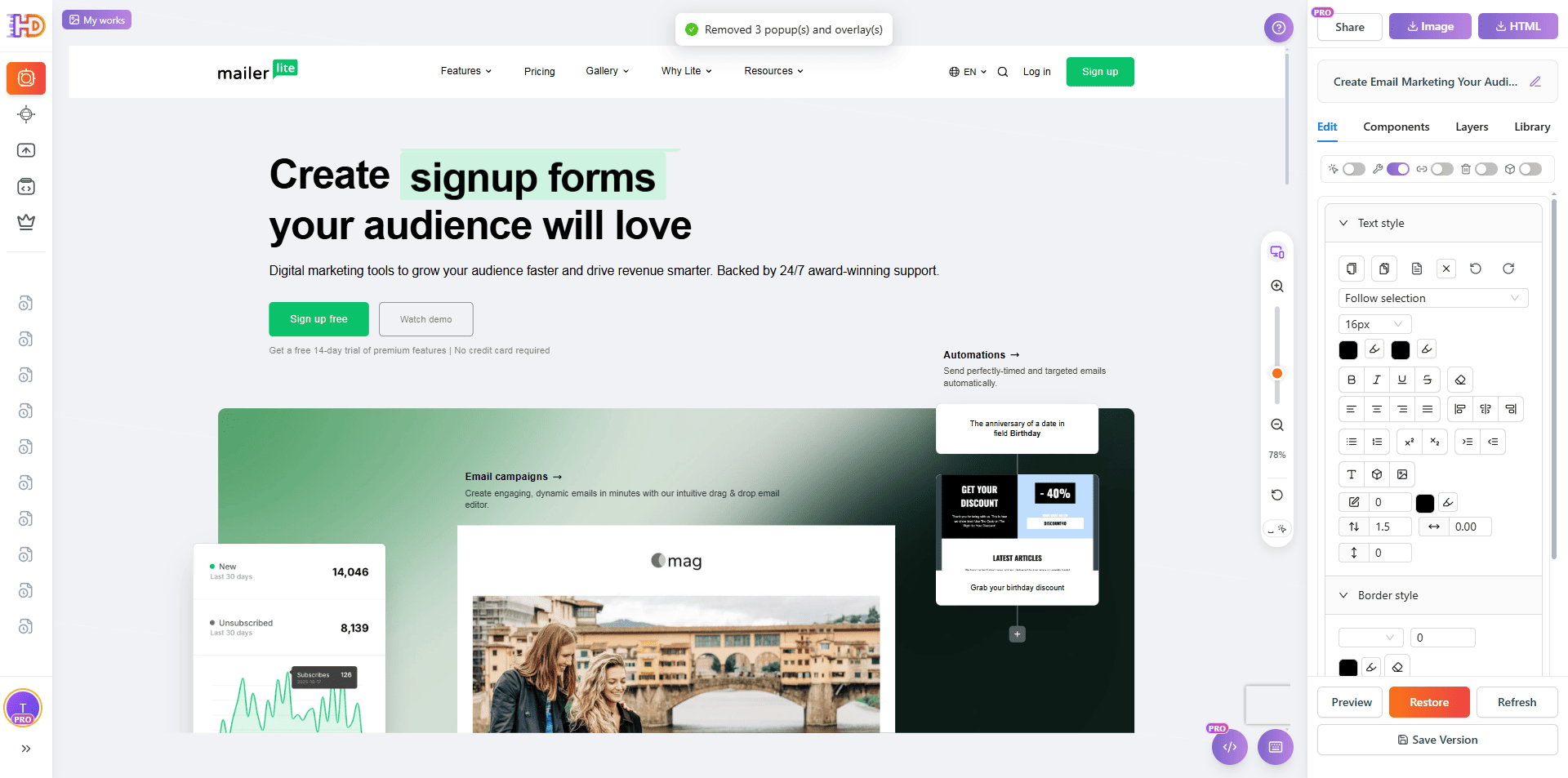
Step 2: Remove Popups and Overlays Before You Start Editing
Real live sites do not always load into a perfectly clean editing state. In this capture, the MailerLite homepage is initially blocked by a cookie popup. If you leave overlays in place, text selection, styling, and image replacement become harder and the screenshots look messy.
A better workflow is to clean the popup first, then continue with the actual editing pass. This gives you a cleaner canvas and makes the rest of the changes easier to read.
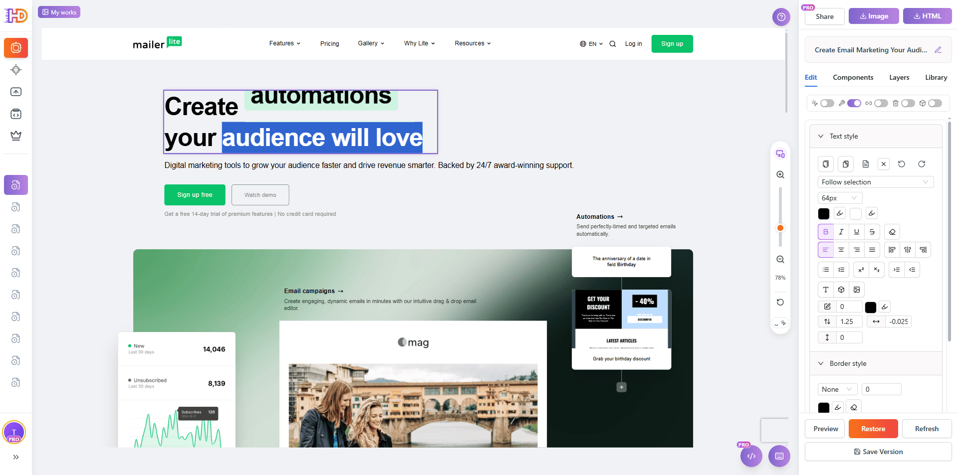
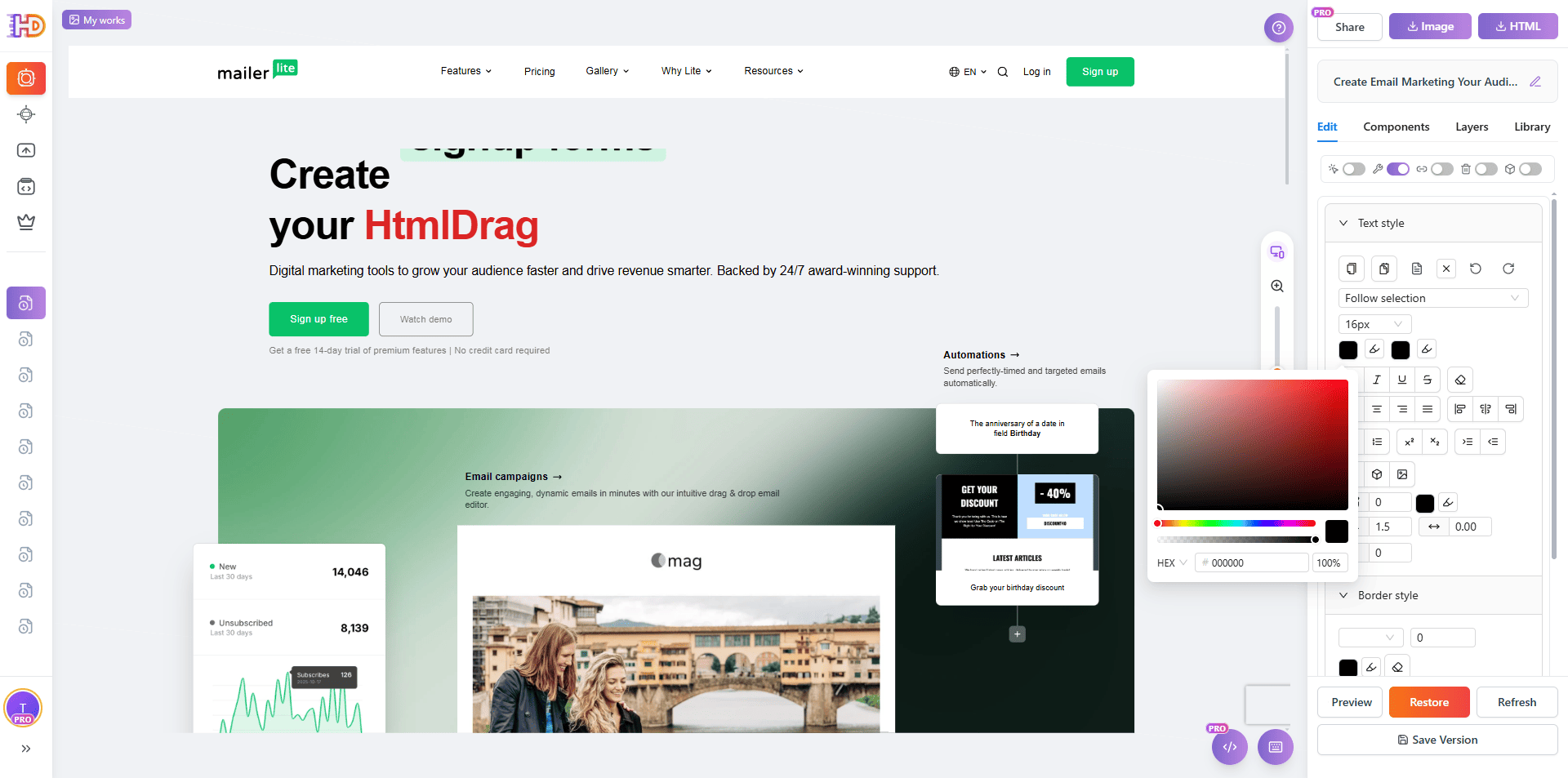
Step 3: Rewrite the Hero Message and Add Stronger Visual Emphasis
Once the page is clean, start with the hero. That is still the highest-leverage area on the page because it shapes first impression and positioning. In this edit, the headline is directly rewritten around HtmlDrag, and the key word is given stronger color emphasis so the brand focus becomes instantly clearer.
This is a good example of how a small content change plus a small style change can quickly make a page feel less generic and more intentional.
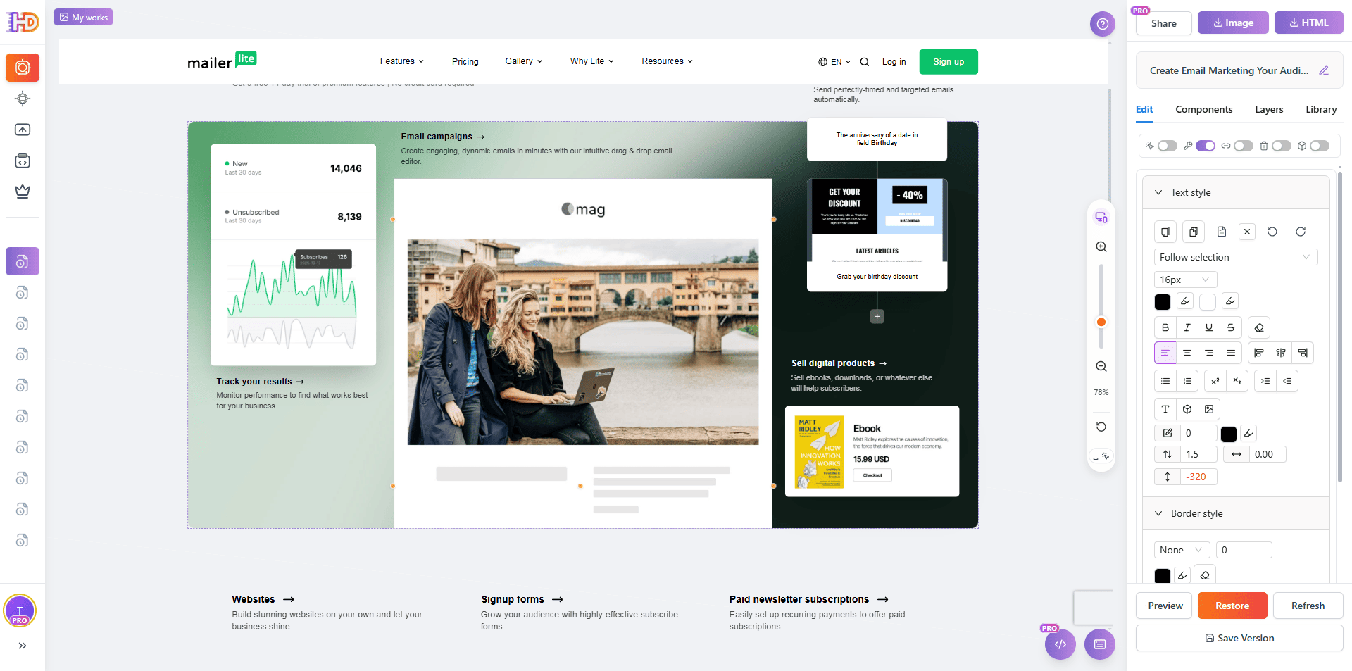
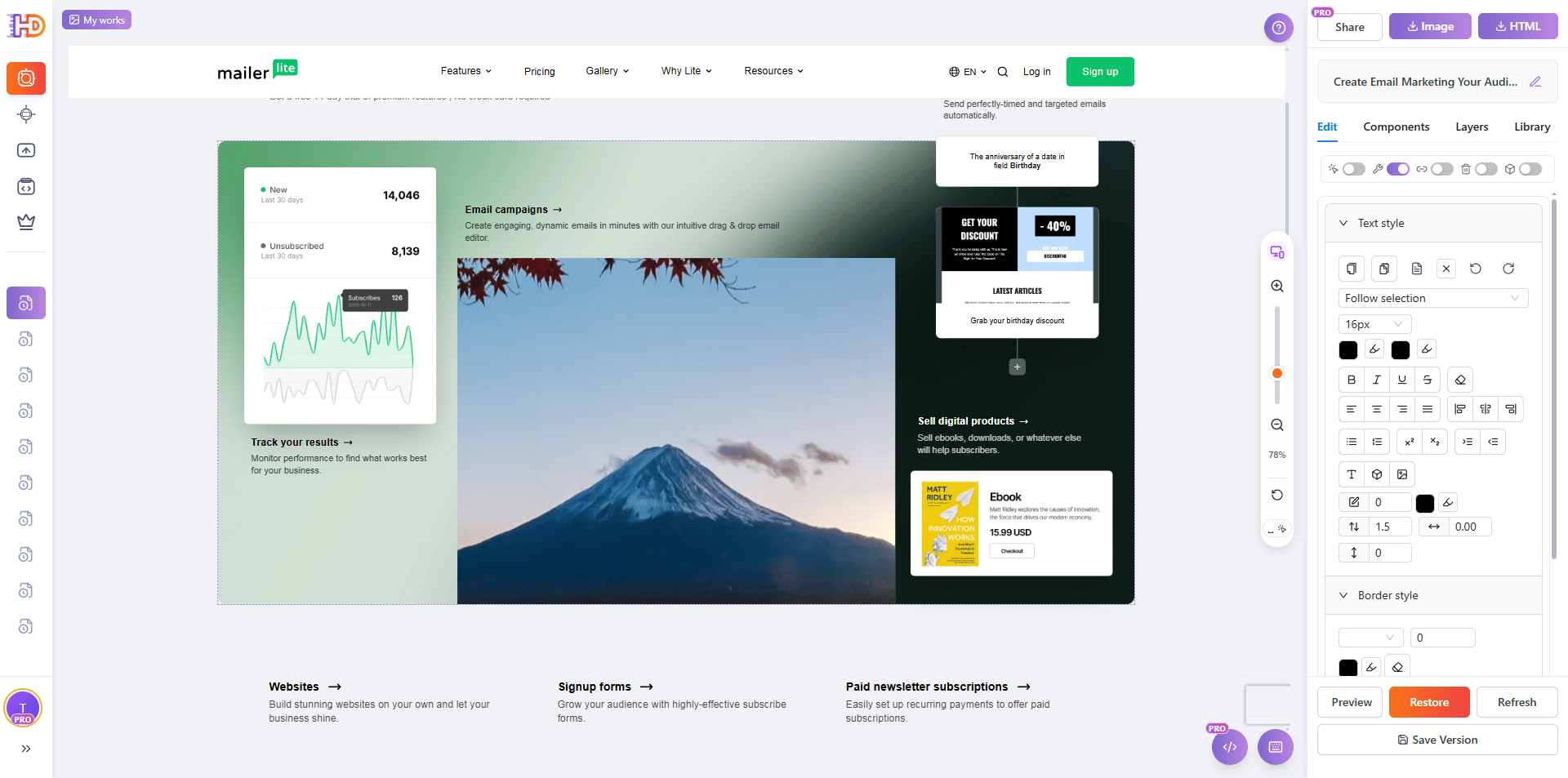
Step 4: Replace the Default Image with Your Own Visual
A lot of AI-generated or builder-generated pages still feel unfinished because the main visual is generic. Here, the central showcase image is selected and replaced with a brand-owned visual. That single change already makes the layout feel much less like a default SaaS template.
When a large image sits close to the top of the page, changing it usually has an outsized effect on credibility and polish.
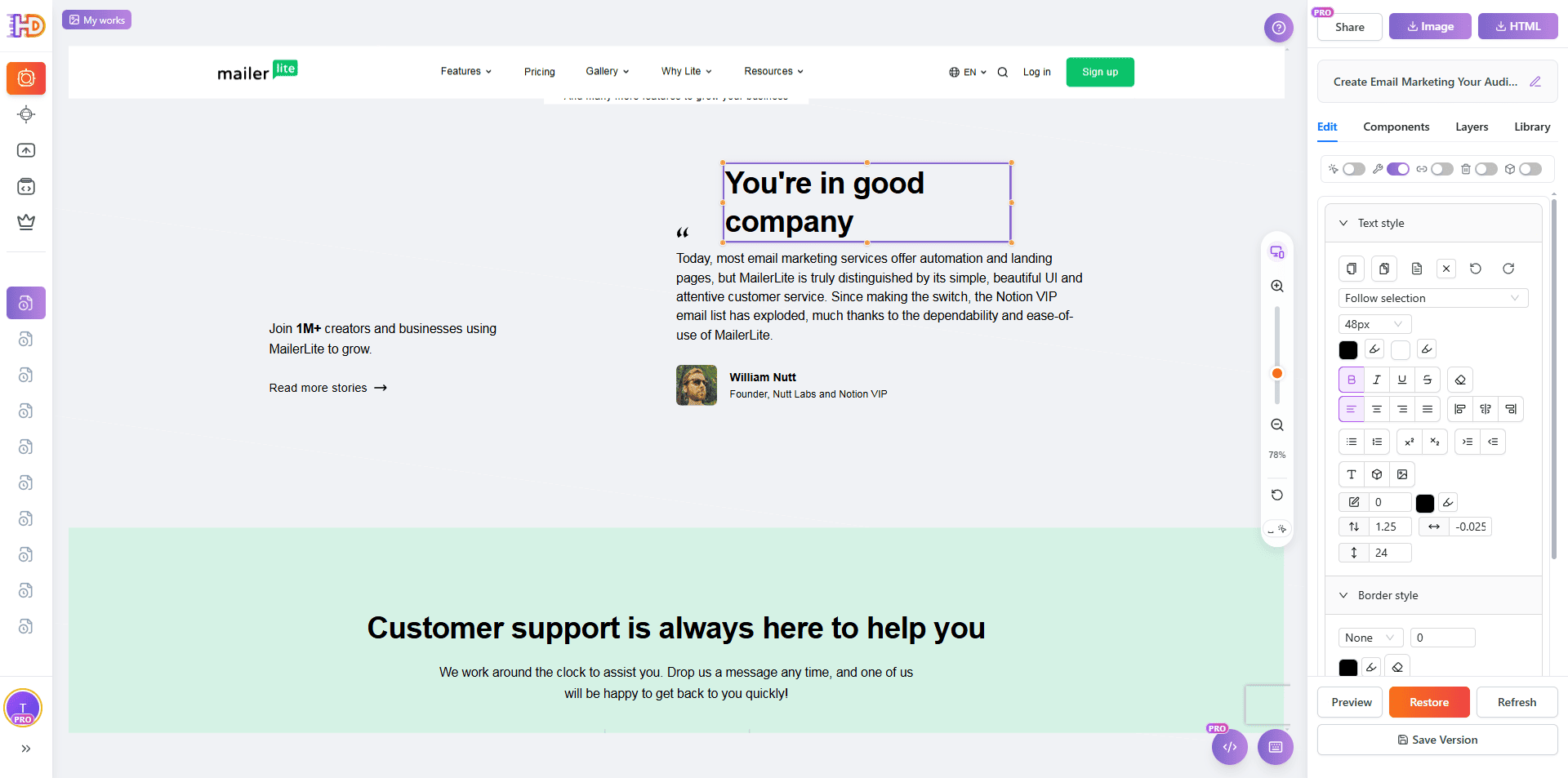
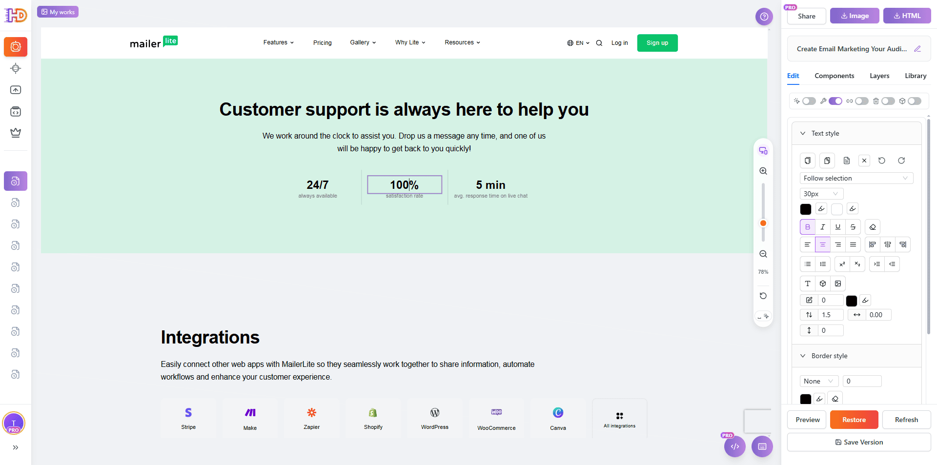
Step 5: Edit Lower-Page Copy, Numbers, and Section Positioning
What makes a page feel custom is rarely only the hero. The lower sections matter too. In this round, the text content, numeric values, and the position of the supporting content blocks are all adjusted. That kind of work turns a default marketing page into something that feels more specific to your own message.
Changing numbers, section labels, and local positioning is especially useful because it removes the “stock builder page” feeling without forcing a full redesign.
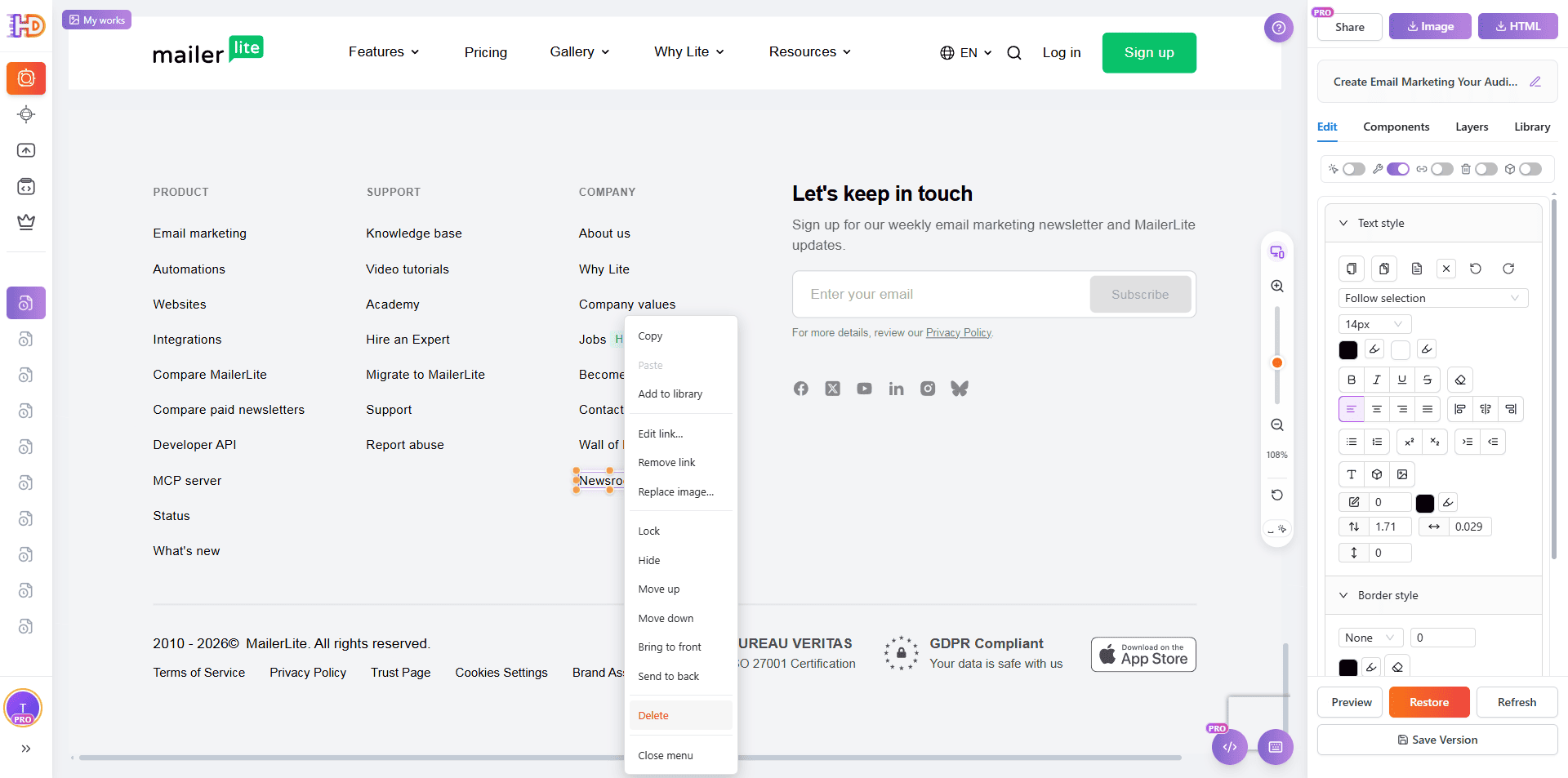
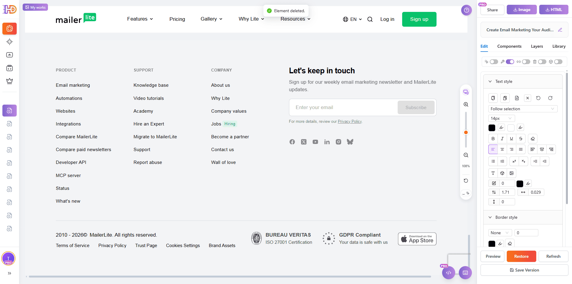
Step 6: Delete Unwanted Elements to Finish the Cleanup
The last step is often subtraction, not addition. Footer links, legacy labels, or content that still exposes the original site structure should be removed before you treat the page as finished. Deleting the wrong-fit elements helps the final page feel cleaner, tighter, and more intentional.
This is also why deletion is a real part of the editing workflow. A polished page is not only about what you add, but also about what you decide not to keep.
Generic AI Draft vs Custom-Looking Edited Page
| Focus Area | Generic AI Draft | Custom-Looking Refresh |
| Hero copy | Broad, safe, and interchangeable wording | Specific, sharper, and easier to scan |
| CTA clarity | Too many words or vague button text | Shorter copy and clearer next action |
| Visual emphasis | Flat hierarchy with little contrast | Purposeful highlight, contrast, and emphasis |
| Imagery | Placeholder-like or weak visual assets | Brand-relevant visual that supports the message |
| Section rhythm | Rigid, overly templated block spacing | More intentional grouping and movement |
| Feature and UI copy | Old, generic, builder-style wording | Clearer, value-driven language with less template feel |
Who This Workflow Helps Most
- Marketers who want their AI-generated page to feel more polished without handing everything back to engineering
- Indie founders polishing a generated site before launch
- Freelancers and agencies that need fast visual refinement on client pages
- Non-technical product teams that already have a working draft but need a stronger final presentation
FAQ
Do I need to rebuild the whole page to improve it?
No. In many cases, the structure is already good enough. What usually matters more is improving messaging, hierarchy, imagery, layout rhythm, and small UI text.
Does this only work with one AI website builder?
No. MailerLite is just the public demo page used in this article. The same visual workflow works for many AI-generated pages, exported HTML files, and other public websites you want to keep refining visually.
What should I fix first if I want the fastest improvement?
Start with hero positioning, CTA wording, visual emphasis, more relevant images, feature copy, and the small pieces of microcopy that still sound generic.
Why not just edit the original builder output in code?
You can, but it is often slower for content and layout polish. If the page is already visible and mostly correct, visual editing is usually the faster route for the final refinement pass.
Final Take
AI can generate a website draft quickly. What still creates differentiation is the finishing layer: the message, the emphasis, the visuals, the section rhythm, and the small interface details.
If you already have an AI-generated site and it feels a little too generic, the fastest improvement is often not rebuilding. It is visually refining the page so it feels more specific, more branded, and more ready to ship.
That is exactly why a visual editing workflow at htmldrag.com can be the practical bridge between “AI first draft” and “launch-ready website.”