
How to Use HtmlDrag: Import, Edit, Refine, and Export HTML
This guide follows the real workflow from starting material to a finished HTML result. Learn how to import an existing page, capture a public URL, use AI Refinement, turn supported files into editable HTML, make visual edits, and save, share, or export your work.
⚡ Key Facts at a Glance & 4-Step Quickstart (HtmlDrag Workflow)
- Core Purpose: The visual "last-mile" editor for existing HTML, AI-generated code, and live web pages. No need to rewrite code—simply drag, drop, edit copy, adjust layouts, and swap images visually.
- 4-Step Quickstart Workflow: Step 1 Import (Upload HTML / Paste Code / Clone Webpage / AI Creation) → Step 2 Visual Refinement (Double-click copy, drag elements, customize tables and styles in the right panel) → Step 3 Targeted AI Refinement (Select specific elements and prompt AI for localized edits without full-page regeneration) → Step 4 Platform-Independent Export (Download pure, production-ready HTML code with zero vendor lock-in).
- Five Core Import Methods: • Clone Webpage (Capture public web pages into editable projects); • Upload HTML (Drop local .html files into the canvas); • Paste Code (Instant visual rendering for AI code from ChatGPT/Claude/v0); • AI Refinement (Prompt-driven localized edits on existing pages); • File to HTML (Convert documents and images into editable layouts).
- Zero Vendor Lock-in: Exported projects remain 100% standard HTML/CSS. Deploy to your own server, Vercel, Netlify, or integrate directly into your codebase at any time.
1. Bring Content into HtmlDrag
Choose the starting path that matches the material you already have. Upload HTML and Paste Code open an existing page for visual editing; Clone Webpage captures a public webpage; AI Refinement performs targeted edits on an imported page; File to HTML turns supported documents and images into an editable HTML draft.
1.1 Home Workspace
The home workspace keeps the main starting credits together: HTML Editor for existing HTML, AI Refinement for targeted changes to an imported page, and File to HTML for generating an editable page from source material. Choose the entry that matches your starting point, then continue in the editor or preview workspace.
1.2 Clone Webpage
Clone Webpage captures a public webpage and turns the result into an editable project. It is useful when you have a live reference page but do not have its original HTML file.
Enter a Public URL
Open Clone Webpage, paste a public http:// or https:// address, and click Clone. Private network addresses, local file paths, and pages that require a private login are not supported.
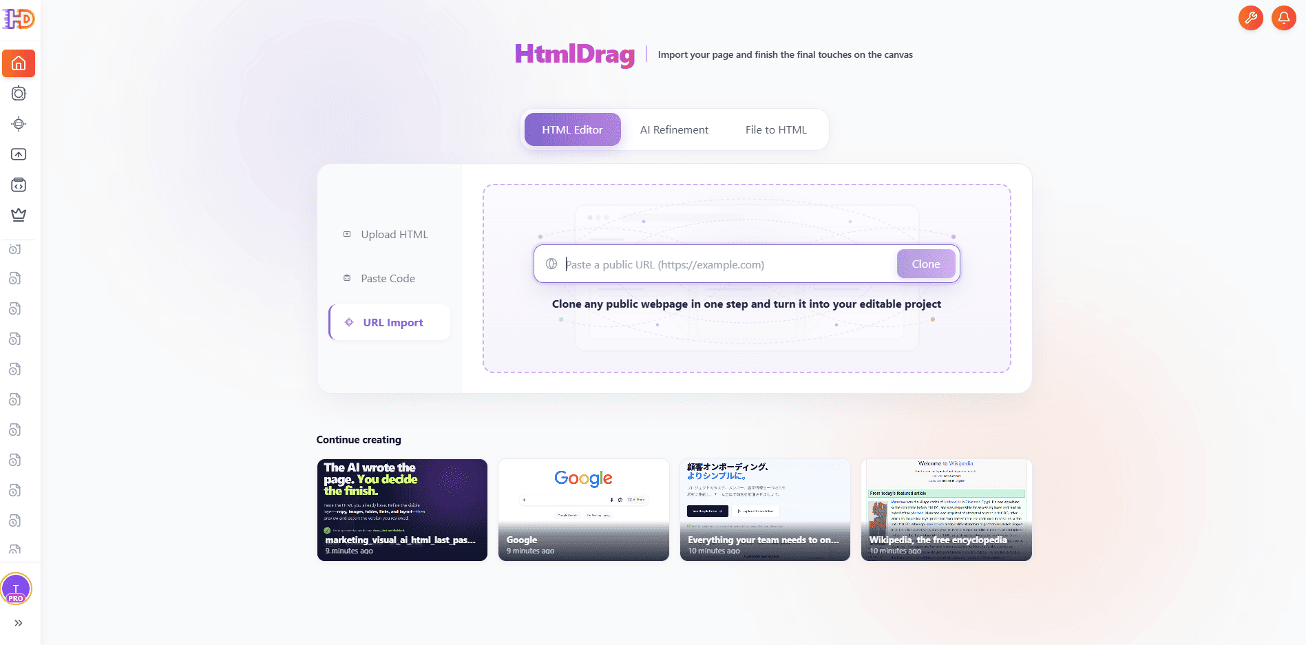
Clone Webpage: paste a public webpage address and start a clone
Review the Captured Page
When capture finishes, review the page in the preview or editor workspace. External assets, protected images, or JavaScript-only content may not reproduce exactly; if the result is incomplete, paste the rendered HTML or upload the original HTML instead.
1.3 Upload HTML
Use Upload HTML when you already have an .html or .htm file and want to make visual changes without rebuilding the page from scratch.
Select the Existing HTML File
Choose Upload HTML, then click or drag an HTML file into the upload area. The source page remains the starting point for the editor; HtmlDrag does not turn the page into a static screenshot.
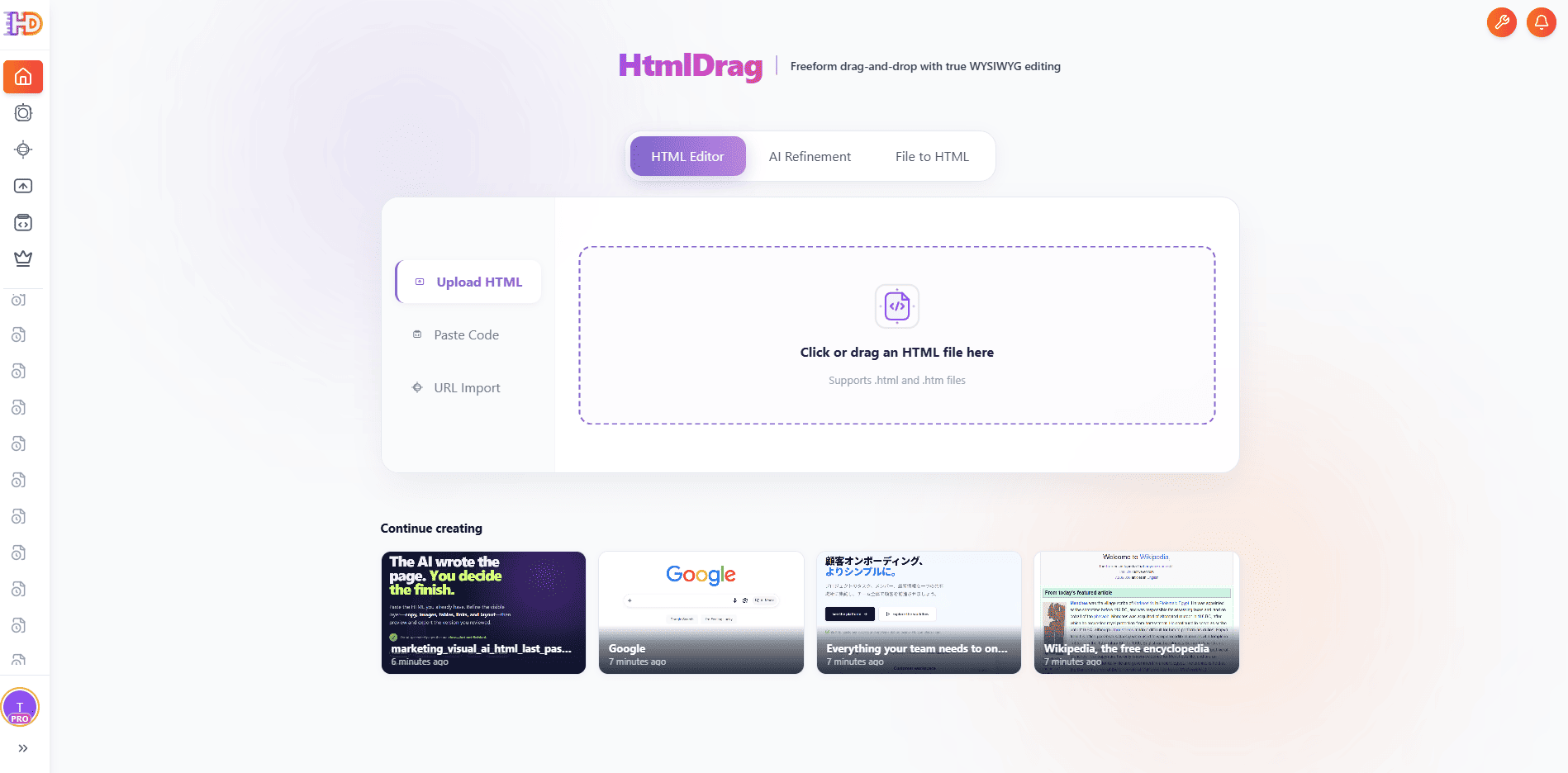
Upload HTML: select or drag an existing .html or .htm file
Check the Imported Result
After the security check and parsing step, open the preview or editor and verify the layout, text, images, links, and external resources before editing.
1.4 Paste Code
Use Paste Code when the HTML is in a code assistant, local editor, email, or another browser tab.
Paste the Rendered HTML
Paste the complete HTML into the code area, including the structure and styles needed for the page, then click Open editor. If the page was generated by an AI tool, paste the version you want to visually refine rather than a description of the page.
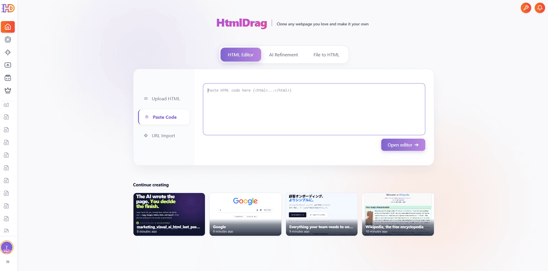
Paste Code: insert HTML source code and open it in the editor
Review Resources and Safety Notices
HtmlDrag checks imported content before opening it. Review any warning about scripts, local resources, external fonts, or blocked embeds, and confirm that the page still looks correct in the editor.
1.5 Targeted AI Refinement
AI Refinement is for changing an existing page with a focused instruction. Start from an uploaded HTML page, pasted code, or a captured URL, then tell AI what to change without asking it to rebuild unrelated parts of the page.
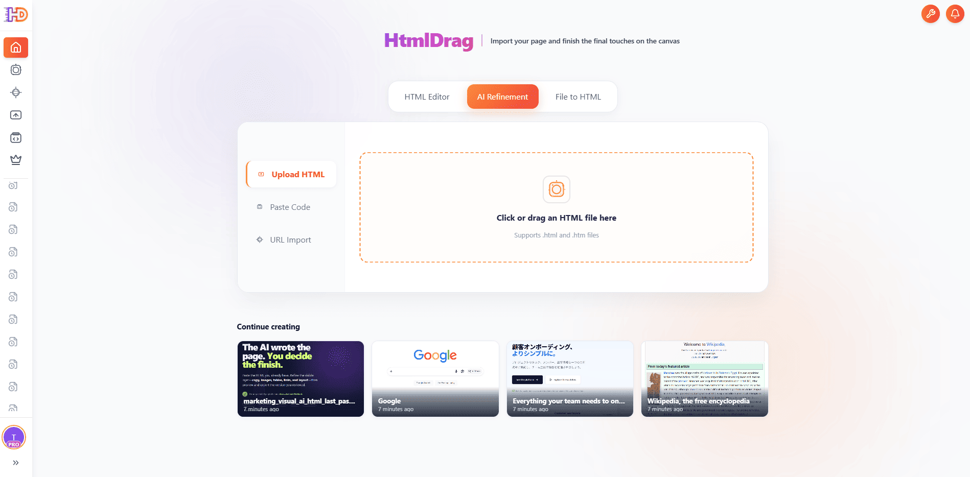
AI Refinement: choose an existing page as the source for a targeted edit
Open the Refinement Workspace
Choose the AI Refinement entry and wait for the page preview to load. The workspace keeps the instruction area beside the page so you can select the exact content that needs attention.
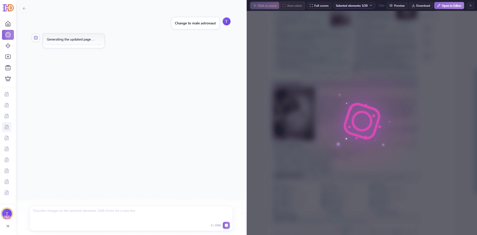
AI Refinement: the selected page is being processed
Select the Scope of the Change
Use Click to select for individual elements or Area select for a region. You can also enter fullscreen mode when the page needs more room for selection. Then describe the requested change in the prompt box, such as revising selected copy, replacing an image, or adjusting a focused visual area.
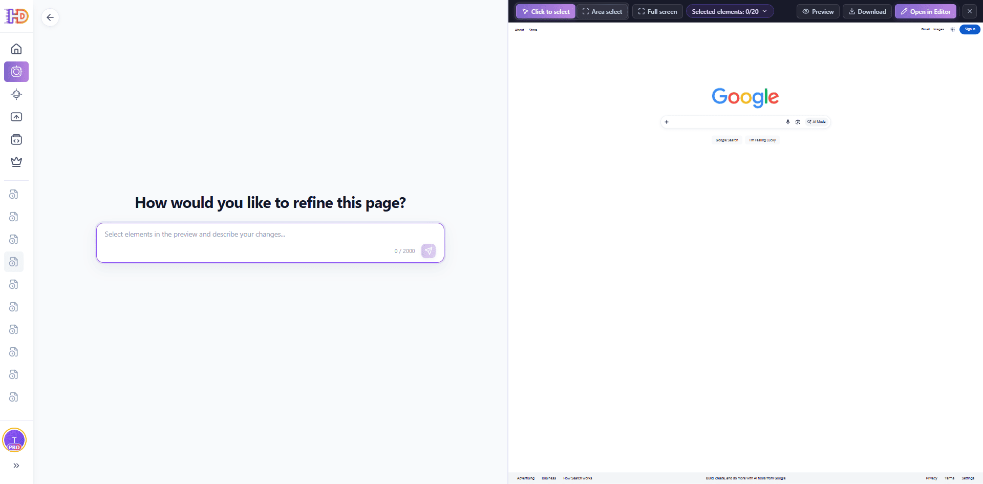
AI Refinement: mark the elements that the instruction should affect
Review and Continue Editing
After the result is ready, compare the updated preview with the original page. If the change is correct, open it in the editor for further visual edits; if it is not precise enough, narrow the selection or rewrite the instruction instead of changing unrelated elements.
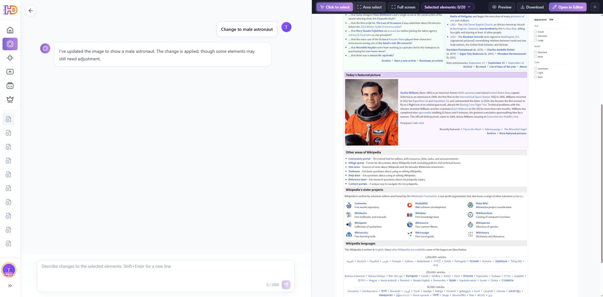
AI Refinement: review the result, then open it in the editor or preview
1.6 AI File to Editable HTML
File to HTML creates an editable HTML page from source material. It is useful when the starting point is a PDF, Word document, PPT/PPTX presentation, Excel/XLSX spreadsheet, CSV, Markdown or text file, or an image rather than existing HTML.
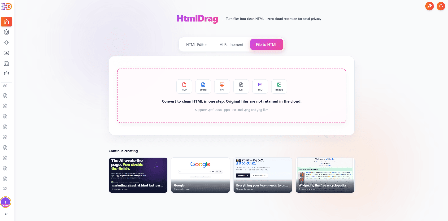
File to HTML: start from a document, spreadsheet, presentation, or image
Upload the Source File
Open File to HTML, attach the source file, and add a short instruction describing what you want to build. The prompt can specify the page purpose, audience, tone, structure, or visual direction.
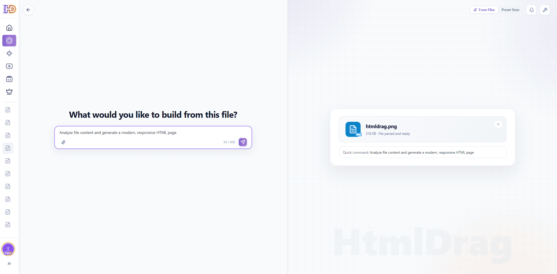
File to HTML: attach a source file and describe the page you want
Wait While the Content Is Organized
HtmlDrag first reads the source material, identifies its content hierarchy, and plans a page layout. Long documents, tables, slides, and images may take different amounts of time to process.
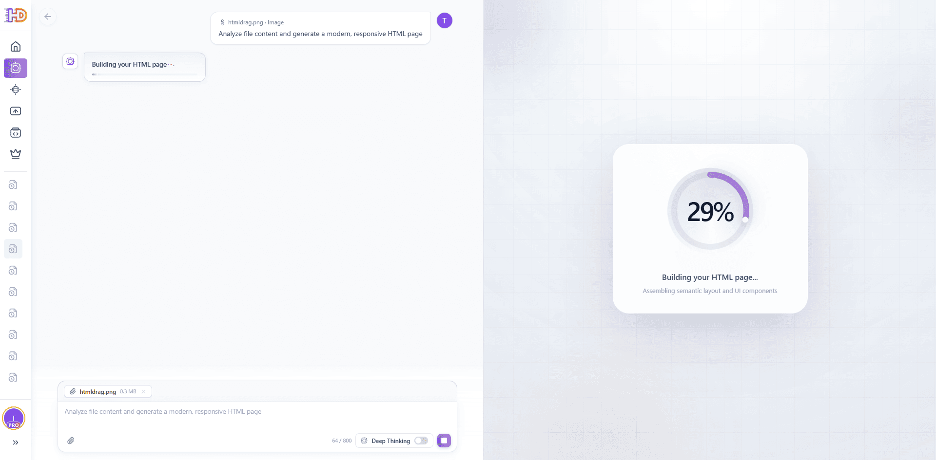
File to HTML: the source is being assembled into an HTML page
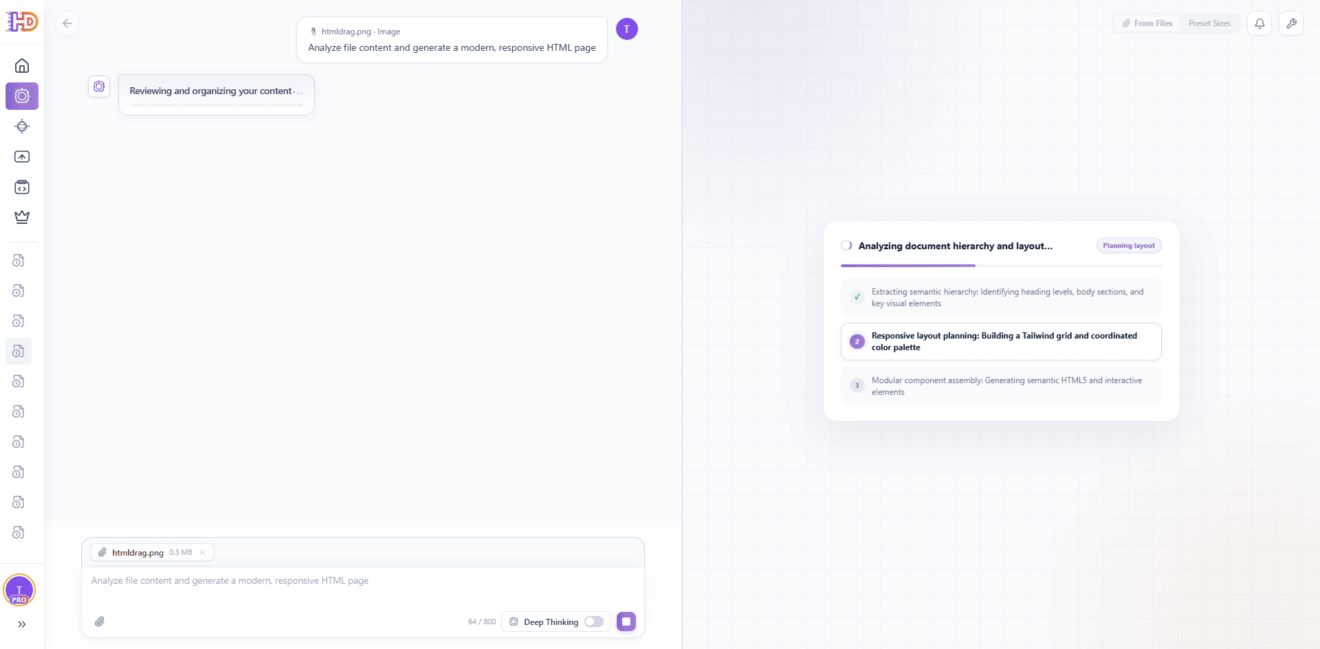
File to HTML: the system is organizing hierarchy, layout, and components
Review the Editable Result
When the page is ready, review the preview and choose AI Refine, Open in Editor, Share, or Download HTML as needed. The output is an editable HTML page that can continue through the same visual editing workflow.
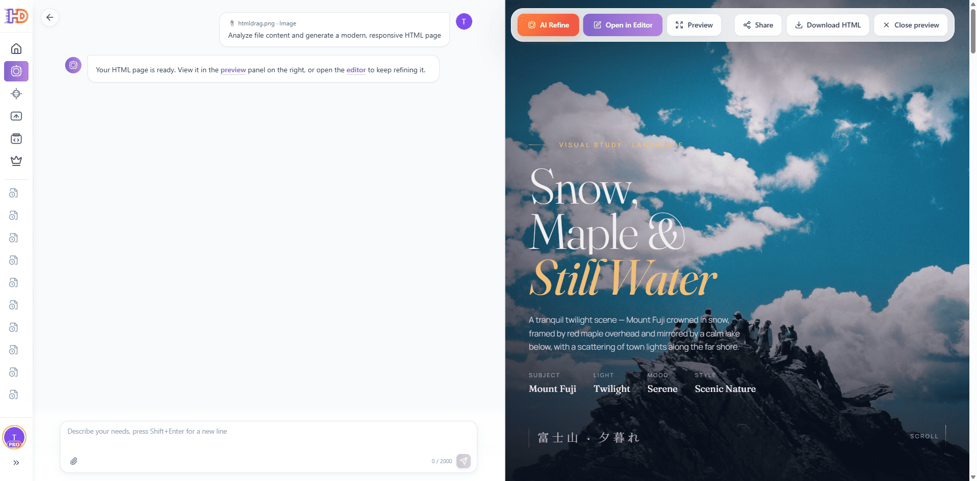
File to HTML: the generated HTML page is ready for review and editing
2. Visual Editor Core Capabilities
The heart of HtmlDrag is a powerful WYSIWYG editor that lets you work directly in a real HTML environment, eliminating the need for code editing.
2.1 Editor Interface Overview
The visual editor combines a canvas, navigation, a right-side control panel, and save or export actions. The selected element is outlined on the canvas, while the right panel exposes the controls that apply to the current selection.
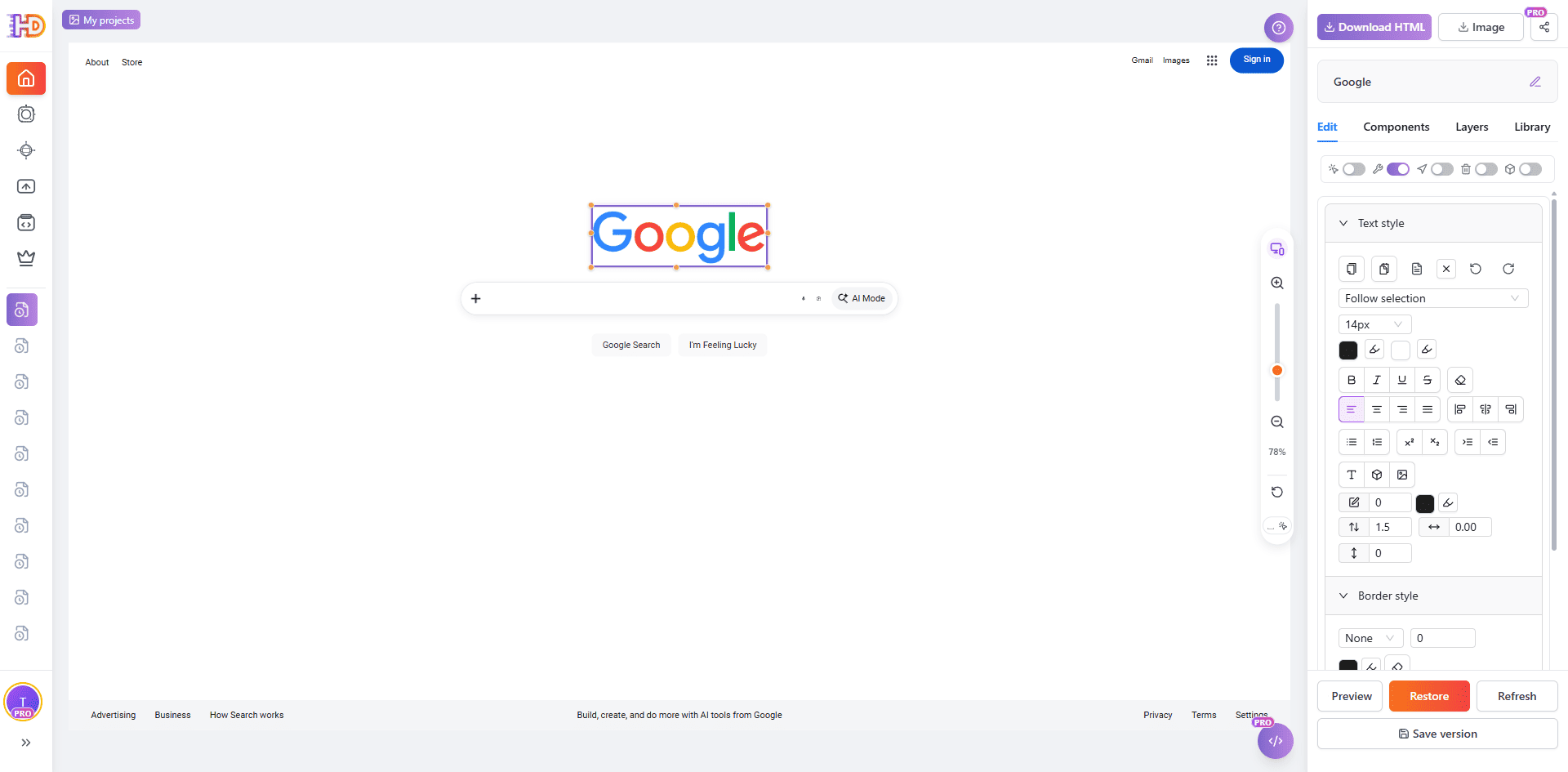
Visual editor workspace: select an element, adjust it, and save or export the project
Left Navigation & History
The left navigation switches between the main workspace and saved work areas. Use it to return to the home entry credits or open an existing project.
Center Canvas Area
The canvas shows the imported or generated HTML page. Select elements directly, use the selection tools when the page is complex, and use zoom or fullscreen controls when you need more room.
Right Panel (Edit / Components / Layers / Library)
The right panel contains the controls for editing the selected element, inserting components, locating elements in the layer list, and reusing saved components from the library.
Top and Bottom Actions
The top area provides the project title, share, image, and HTML export actions. The bottom controls provide preview, restore, refresh, and save-version actions.
2.2 Basic Operations & Selection
The editor supports direct selection, area selection, fullscreen review, and focused editing. Start with the smallest selection that covers the change you want to make.
Selection view: review the selected elements before applying a focused change
Element Recognition
Use Click to select to select one element on the page. The editor outlines the element and shows its tag or content in the selection state.
Area Select and Fullscreen
Use Area select when several nearby elements belong to the same visual region. Use Full screen when the page needs more space for selecting, reviewing, or refining a complex layout.
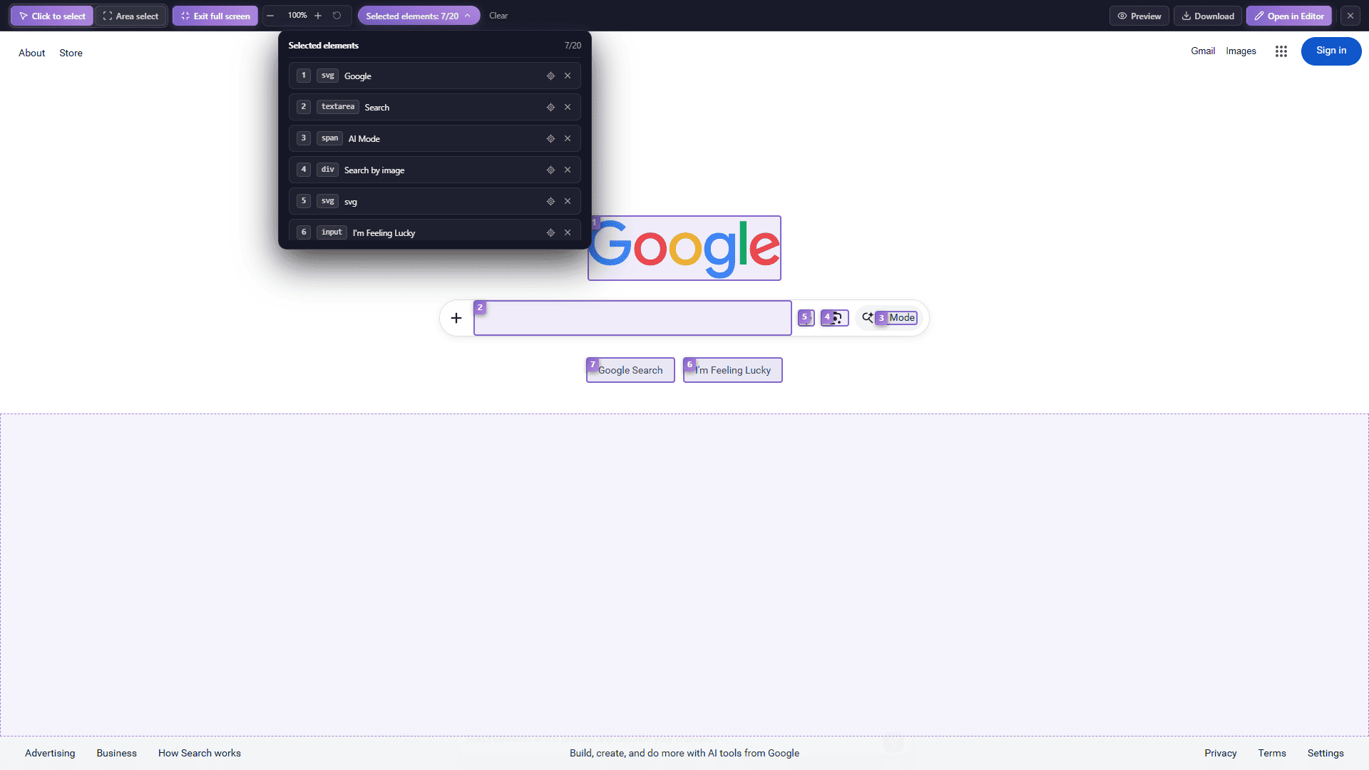
Fullscreen selection: work with more room on complex pages
Drag Mode and Edit Mode
Use drag mode to reposition a selected element and edit mode to change text or supported element content. The right-side controls update according to the current selection.
Lock, Hide, and Delete Elements
Use the element controls or context menu to lock an element against accidental editing, hide it while reviewing the layout, or delete it from the current HTML. Confirm the selection before deleting; use undo or restore when you need to return to an earlier state.
Context Menu
Right-click a selected element to access quick actions such as copying, pasting, adding an element to the library, editing links, layer operations, locking, hiding, and deleting.
Multi-Select
Use multi-select when several elements need to be reviewed or adjusted together. Check the selected-elements list before applying a change, and remove an item from the selection if it should not be affected.
2.3 Canvas Shortcuts
Mastering keyboard shortcuts can significantly boost your editing efficiency. Here are the main shortcuts supported in the canvas area:
| ActionShortcut | |
| Zoom | Ctrl / Cmd + Mouse Wheel |
| Pan | Space + Mouse Drag |
| Multi-select | Shift + Click |
| Copy | Ctrl / Cmd + C |
| Paste | Ctrl / Cmd + V |
| Undo | Ctrl / Cmd + Z |
| Delete | Delete / Backspace |
2.4 Right Panel - Edit Tab
The "Edit" tab is the most frequently used area, providing mode toggles and rich style adjustment tools. After selecting an element, the panel intelligently displays editing options based on the element type.
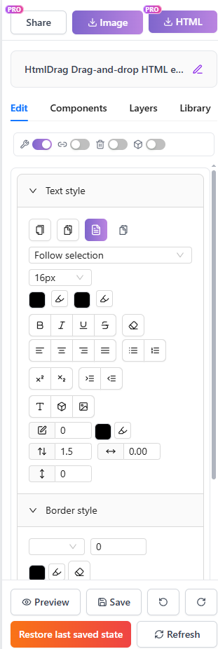
Edit tab: Mode toggles and style tools
Mode Toggles
The top of the panel provides four mode switches to control editor interaction behavior. Each toggle can be turned on or off independently, with a message notification indicating the current state.
| ModeDescription | |
| Component Editing | When enabled, you can select and adjust interactive functional components (such as buttons, form inputs, etc.); when disabled, only text content can be edited. Ideal for scenarios requiring precise form element manipulation. |
| Link Navigation | When enabled, clicking linked elements in edit mode navigates directly to the target URL; when disabled, navigation is blocked so you can edit the link element itself. Note: This setting does not affect preview or downloaded link functionality. |
| Delete Mode | When enabled, you can delete elements by simply clicking them without using the context menu; when disabled, normal editing mode resumes. Ideal for quickly clearing multiple elements. |
| Decorative Layers | When enabled, you can identify and edit empty containers and decorative elements (such as border containers, background layers, etc.); when disabled, only elements with actual content are recognized. For complex page layouts, enabling this feature allows finer control over decorative elements. |
Tip: Link navigation is disabled by default while editing to allow component editing. To follow links, turn on the "Link navigation" switch in the Edit panel. Form submission is also blocked in edit mode to protect your content.
Text Style
After selecting a text element or entering edit mode, the panel displays comprehensive text style tools with the following formatting options:
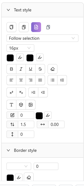
Text style: Font, size, color settings
| FeatureDescription | |
| Font | Choose from system fonts, English fonts (Inter, Roboto, Open Sans, etc.), and Chinese fonts (SimSun, SimHei, Microsoft YaHei, Source Han Sans, etc.). |
| Font Size | Multiple preset sizes from 12px to 72px, or enter a custom size manually. |
| Font Color / Background Color | Set text color and background highlight via color picker, with canvas color picker support. |
| Bold, Italic, Underline, Strikethrough | One-click toggle for bold, italic, underline, and strikethrough effects. |
| Alignment | Four text alignment options—left, center, right, and justify. |
| Line Height, Letter Spacing, Paragraph Spacing | Fine-tune line height (1x to 3x), letter spacing, and paragraph spacing for optimized typography. |
| Superscript, Subscript | Format selected text as superscript or subscript for math formulas, chemical notations, etc. |
| Bulleted List, Numbered List | Quickly convert text to unordered (bulleted) or ordered (numbered) lists. |
| Indent Control | Increase or decrease indent to adjust paragraph hierarchy. |
Element Style
After selecting any element, use element style tools to adjust its appearance:
| FeatureDescription | |
| Border Style | Set border type (none, solid, dashed, dotted), width (1px-10px), and color. Click "Clear border" to quickly remove all borders. |
| Corner Radius | Adjust the corner radius of all four corners to create rounded rectangles or circular effects. |
| Opacity | Use the slider to adjust element opacity (0%-100%) for transparency effects. |
| Shadow | Four shadow presets—none, light shadow, medium shadow, deep shadow—for quick depth effects. |
| Position & Size | Precisely set element X/Y coordinates and width/height values. |
| Lock Aspect Ratio | When enabled, adjusting width automatically scales height proportionally. |
Image Style
After selecting an image element, adjust display options and replace the image:
| FeatureDescription | |
| Image Fit | Four fit modes—contain (scale proportionally), cover (fill), fill (stretch), none (original size). |
| Position | Use the 9-grid positioner to set image alignment within its container (top-left, top-center, top-right, center-left, center, center-right, bottom-left, bottom-center, bottom-right). |
| Replace Image | Upload a new local image or enter a URL to replace. Local upload supports JPG, PNG, GIF, WebP, and other common formats. |
Table Style
When a table or table cell is selected, dedicated table editing tools become available. For detailed instructions, see 4.10 Table Editing.
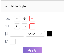
Table style: Row/column operations, borders, and cell settings
| FeatureDescription | |
| Row/Column Ops | Insert rows above/below, columns left/right, or delete rows/columns. |
| Cell Alignment | Set horizontal alignment (left, center, right) and vertical alignment (top, middle, bottom) for cell content. |
| Border Style | Adjust table border width, style (solid, dashed, etc.), and color. |
| Cell Background | Set cell background color—ideal for highlighting headers or important data. |
| Merge/Split | Select adjacent cells to merge into one; merged cells can be split back to original. |
Link Editing
Add click-to-navigate links to any element, or edit existing links:
| FeatureDescription | |
| Insert / Edit Link | Enter the target URL to add click navigation to the selected element. Supports http/https links. |
| Remove Link | Remove the link from the element, restoring it to a regular element. The system will confirm the number of links to be removed before executing. |
Alignment Tools (Multi-select)
When multiple elements are selected, the panel displays alignment and distribution tools to help you quickly organize element layouts:
| FeatureDescription | |
| Align Left / Right / Top / Bottom Edges | Align all selected elements to the leftmost/rightmost/topmost/bottommost element's edge. |
| Center Horizontally / Vertically | Align the center credits of all selected elements horizontally or vertically. |
| Distribute Horizontally / Vertically | Distribute multiple selected elements with equal spacing horizontally or vertically. |
2.5 Right Panel - Components Tab
The "Components" tab provides quick-insert options for various element types, helping you rapidly add new content to the canvas. Click a button to insert the corresponding component.
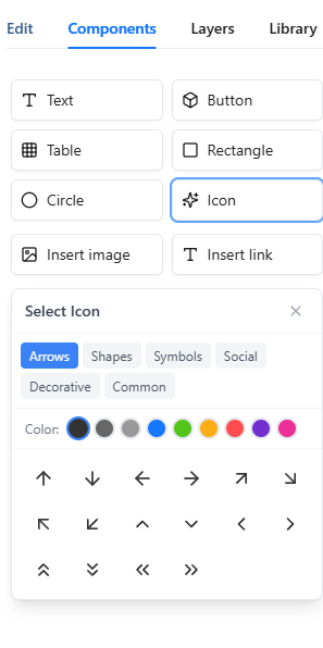
Components tab: Insert various elements with one click
| ComponentDescription | |
| Insert Text | Insert an editable text block into the canvas. Double-click after insertion to enter edit mode and modify content. |
| Insert Button | Insert a pre-styled button element. You can edit button text and add a click link. |
| Insert Image | Opens the image upload dialog supporting local upload or URL input. Single file size and batch upload limits apply—see the upload interface for details. |
| Insert Icon | Opens the icon picker with six categories—Arrows, Shapes, Symbols, Social, Decorative, and Common. Set icon color and size before inserting. |
| Insert Table | Opens the table size selector. Hover to choose rows and columns (e.g., 3×4 table), then click to insert. |
| Insert Link | Insert a linked text element into the canvas. Enter the link URL and display text. |
| Insert Rectangle / Circle | Insert basic shape elements. Use element style tools to adjust border, background color, radius, and other properties for decoration or layout. |
2.6 Right Panel - Layers Tab (DOM Tree)
The "Layers" tab provides a list view of all editable elements on the canvas, supporting filtering, batch operations, and precise positioning—a powerful tool for managing complex page elements.
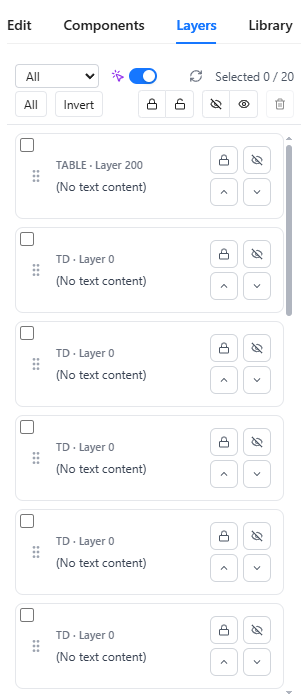
Layers tab: Layer management and batch operations
Element Card List
The panel displays all manageable elements as cards. Each card shows the element's tag type (e.g., DIV, IMG, SPAN) and layer level, with text elements showing a content preview. Decorative layer elements are marked with a "Decorative" badge. Quick lock/unlock and hide/show icons appear on the right side of each card.
Filter Options
Click the filter button to filter the list by element state, with the following options:
| FilterDescription | |
| All | Show all manageable elements |
| Locked | Show only locked elements |
| Unlocked | Show only unlocked elements |
| Hidden | Show only hidden elements |
| Visible | Show only visible elements |
Batch Operations
After selecting multiple elements in the card list, use the batch operation buttons for unified processing:
| OperationDescription | |
| Select All / Invert Selection | Quickly select all elements or invert the current selection |
| Lock Selected / Unlock Selected | Batch lock or unlock selected elements; locked elements cannot be edited or moved |
| Hide Selected / Show Selected | Batch hide or show selected elements; hidden elements are invisible on the canvas but remain in the HTML |
| Delete Selected | Batch delete selected elements with confirmation prompt |
Precision Toggle
The Layers tab provides a precision toggle to control element recognition accuracy:
| StateDescription | |
| Precision On | Auto-deduplicate, showing only host elements to reduce duplicate cards |
| Precision Off | Show all candidate elements (including inline fragments), ideal for precise inline element operations |
Click Card to Locate
Click any element card to automatically scroll the canvas and highlight the corresponding element, making it easy to quickly locate specific components on the page. This is especially useful when working with complex or layered page layouts.
2.7 Right Panel - Library Tab (Favorites)
The "Library" tab is your personal component library where you can save frequently used elements or components for reuse across different projects, boosting your creative efficiency.
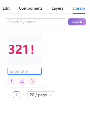
Library tab: Personal component library
Favorite Component List
The panel displays all your saved components as cards, each showing a thumbnail and name. Thumbnails are auto-generated when saving; unnamed components display as "Untitled".
Search Favorites
Use the search box to quickly find saved components by name. The list filters in real-time as you type.
Insert Favorite Component
Click the "Insert" button on a library card to add that component to the current canvas. Inserted components can be edited and adjusted normally.
Rename / Delete Favorites
Each library card offers "Rename" and "Delete" options. Renaming makes components easier to find later; deletion permanently removes the saved component—use with caution.
How to Add to Library
Select any element on the canvas, then choose "Add to Library" from the context menu to save that element and its children as a component. A "Added to Library" confirmation appears on success.
2.8 Context Menu
Right-clicking a selected element opens the context menu, providing quick access to common actions. Menu content dynamically adjusts based on the selected element type.
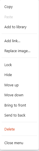
Context menu: Quick access to common actions
| Menu ItemDescription | |
| Copy / Paste | Copy the selected element to the clipboard, or paste clipboard content onto the canvas. Supports cross-work copy and paste. |
| Add to Library | Save the selected element to your personal library for reuse in other projects. |
| Add/Edit/Remove Link | Add a click-to-navigate link to the element, or edit/remove existing links. Removal prompts for confirmation. |
| Replace Image | Shown only for image elements; quickly replace with a local upload or URL image. |
| Move Up / Move Down | Adjust the element's position in the stacking order; moving up brings it forward. |
| Bring to Front / Send to Back | Move the element directly to the front or back of all elements. |
| Lock / Unlock | Locked elements cannot be edited or moved, preventing accidental changes. Unlock to restore editability. |
| Hide / Show | Temporarily hide the element from the canvas while keeping it in the HTML. Show restores visibility. |
| Delete | Permanently delete the selected element. When multiple elements are selected, the count is shown. |
Table-Specific Menu
When right-clicking a table cell, the menu shows additional table-specific operations:
| Menu ItemDescription | |
| Delete Row | Delete the entire row containing the current cell (cannot delete the last row) |
| Delete Column | Delete the entire column containing the current cell (cannot delete the last column) |
2.9 Table Editing
When a table or table cell is selected, the right panel displays dedicated table editing tools with comprehensive table styling and structure adjustment features.
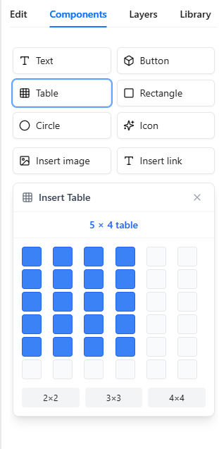
Table editing: Row/column operations and style settings
Row & Column Operations
The "Rows & Columns" section of the table editor panel provides:
| OperationDescription | |
| Insert Row Above / Below | Insert a new row above or below the current row |
| Delete Row | Delete the currently selected row (cannot delete the last row) |
| Insert Column Left / Right | Insert a new column to the left or right of the current column |
| Delete Column | Delete the currently selected column (cannot delete the last column) |
Merge / Split Cells
After selecting multiple adjacent cells, use "Merge Cells" to combine them into one. For merged cells, use "Split Cell" to restore them to the original multiple cells.
Cell Alignment
Set cell content alignment in two dimensions:
| DimensionOptions | |
| Horizontal | Left, Center, Right |
| Vertical | Top, Middle, Bottom |
Border Style
Customize table border appearance including:
| PropertyDescription | |
| Border Width | Set border thickness |
| Border Style | Solid, Dashed, Dotted, Double, None |
| Border Color | Choose border color via the color picker |
Click "Apply" to save changes.
Cell Background
Set cell background color using the color picker—ideal for highlighting headers or important data rows.
2.10 Zoom Control & Viewport Presets
The zoom controller at the bottom of the canvas provides zoom and viewport size adjustment, helping you preview your work at different device sizes.
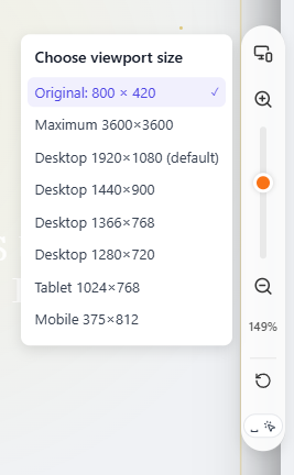
Zoom control: Adjust canvas zoom and viewport size
Zoom In / Zoom Out / Reset
Use the "+" and "−" buttons to zoom the canvas view in or out, or hold Ctrl/Cmd + mouse wheel to zoom quickly. Click the percentage number to reset to default zoom. Hold Space + drag to pan the canvas.
Viewport Size Presets
Click the viewport selector to switch between preview sizes, simulating display on different devices:
| Viewport SizeDescription | |
| Auto | Match content size, suitable for most scenarios |
| Desktop 1920×1080 (Default) | Full HD desktop monitor |
| Desktop 1440×900 | Common laptop screen |
| Desktop 1366×768 | Popular laptop resolution |
| Desktop 1280×720 | HD resolution |
| Tablet 1024×768 | Standard tablet device |
| Mobile 375×812 | iPhone and similar mobile devices |
Preview Patches
For HTML pages with special structures, three preview patches are available to optimize display. Enabling or disabling patches will auto-save and refresh the preview:
| PatchDescription | |
| USP — stabilise ultra-tall pages | Optimizes ultra-tall or boundaryless canvases, reducing jitter. Suitable for complex/boundaryless static files |
| UFP — fix the viewport width | Restricts viewport width, restoring proper complex layout display |
| SHP — optimise unusual sizes | Optimizes unusually structured HTML for improved compatibility |
Tip: If patches don't show noticeable effect, try "Restore initial HTML" first, then re-enable the patch.
2.11 HTML Source Editor
The HTML Editor allows you to directly view and edit the complete HTML source code of your work—ideal for advanced users needing fine-tuning or custom code additions. This feature is Pro only.
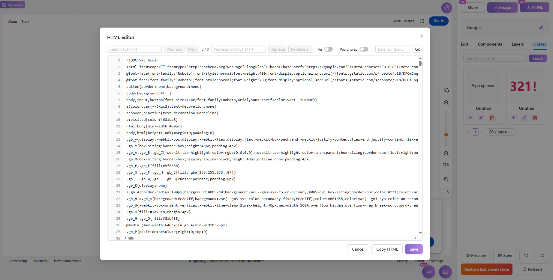
HTML Editor: Edit source code directly (Pro)
View / Edit Full HTML
When you open the HTML Editor, the complete HTML source code (including <!DOCTYPE html>) is displayed. You can edit the code directly; saving applies your changes.
Search & Replace
Use Ctrl+F to open find, entering keywords to quickly locate code. Use Ctrl+H to open replace for batch text replacement. The toolbar shows match count (e.g., "3 / 15"), with options for individual or replace-all.
Go to Line
Use Ctrl+G or the toolbar jump feature to enter a line number and quickly navigate to that line—useful for large HTML files.
Match Case
Enable the "Match Case" option during search to precisely match case-sensitive content.
Word Wrap
When word wrap is enabled, long code lines automatically wrap for viewing without horizontal scrolling.
Copy / Save
Click "Copy HTML" to copy the complete source code to the clipboard. After editing, click Save to apply changes. If content is empty or contains syntax errors, appropriate messages will appear.
Note: If HTML content exceeds storage limits, saving will show "Insufficient storage, cannot save this edit." Delete unnecessary content or upgrade your plan to increase capacity.
2.12 Bottom Toolbar
The bottom toolbar provides the editor's core action buttons, including preview, undo/redo, restore, and save functions.
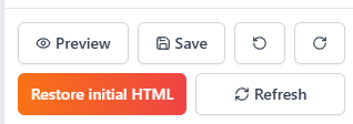
Editor workspace: bottom controls for preview, restore, refresh, and saving a version
Preview (Opens in New Window)
Click the preview button to open a full preview of your work in a new window, showing the actual display result. The preview page shows a temporary preview notice reminding users this is an editing-phase preview with a non-reusable link.
Undo / Redo
Undo reverts the last operation; Redo restores an undone operation. Supports multiple undo/redo steps. Also available via Ctrl+Z (undo) and Ctrl+Y (redo).
Refresh Preview
Clicking refresh reloads the preview area. The system first saves current content, then refreshes the canvas to show the latest state. Useful after extensive editing to sync the display.
Restore last saved state
Restores the work to the last manually saved state. All unsaved edits will be lost—use with caution. The system prompts for confirmation before executing.
Restore initial HTML
Restores the work's HTML to its original state when first created. All edit history will be cleared. This action is irreversible—ensure you've backed up important content.
Save
Manually saves all current changes. The system also supports auto-save, but manual saving after important edits is recommended to ensure data safety. "Save successful" appears on completion.
2.13 Top Toolbar
The top toolbar displays work information and quick action buttons, providing fast access to sharing and download features.
Editor workspace: top controls for HTML download, image export, and sharing
Project Title (Double-click to Edit)
The top displays the current project title; double-click the title area to enter edit mode and change the name. Title cannot be empty; "Title updated successfully" appears on success. Unnamed projects display as "Untitled work".
Share Button
Click the share button to enable work sharing and generate an accessible link. See 4.16 Share Feature for details. This feature is Pro only.
Download Buttons
The right side provides "Download as image" and "Download as HTML" buttons. See 4.15 Export & Download HTML for details.
3. Project Management, Sharing & Export
After editing, export clean HTML files, generate secure preview links with passwords, or manage project versions in your project workspace.
3.1 Export & Download HTML
Use Download HTML in the top-right toolbar to export the version you have reviewed in the editor. The export dialog separates the edited page from the original source and also provides copy and AI handoff options.
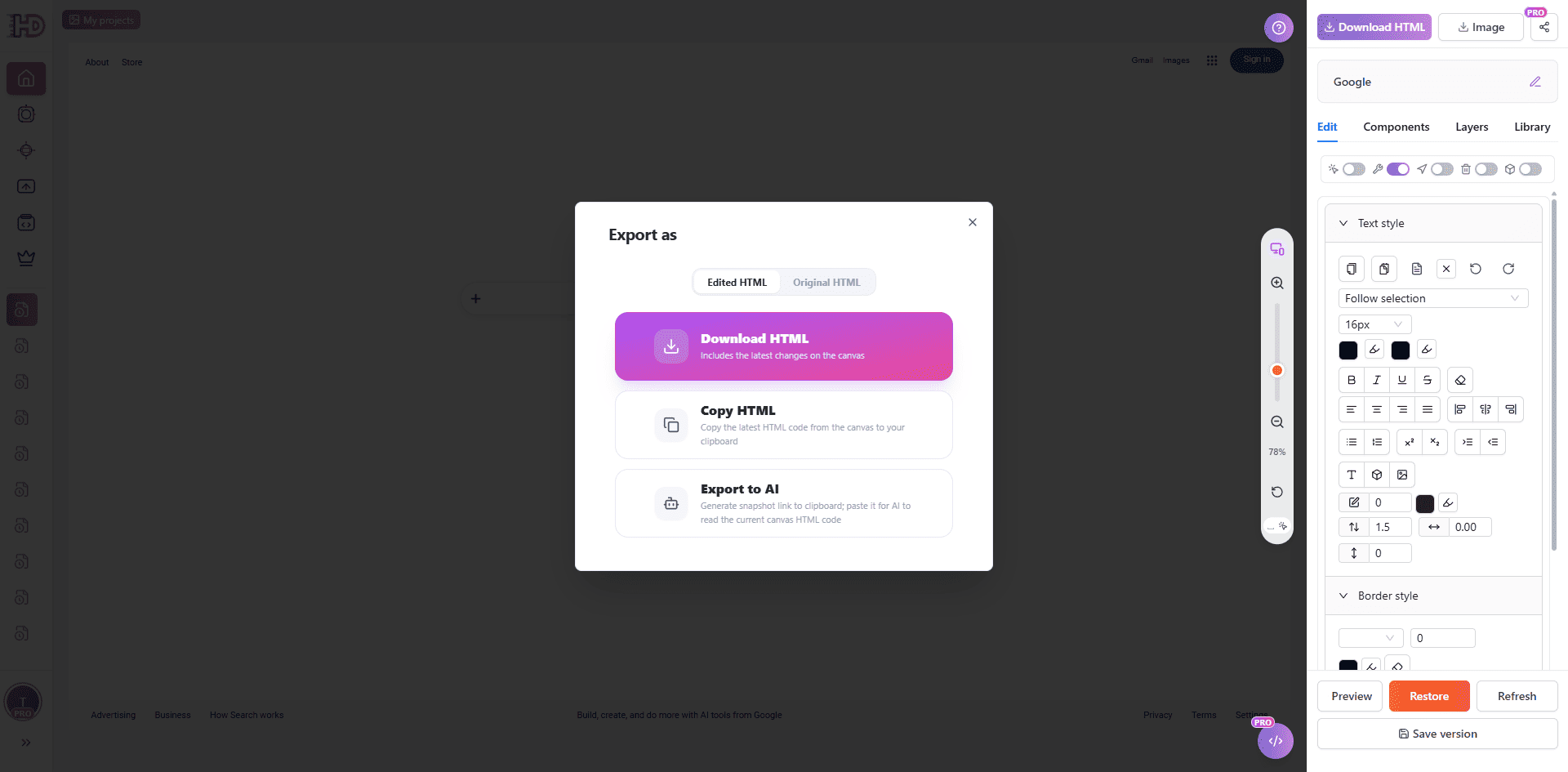
Export HTML: choose the edited or original source, copy HTML, or send it to AI
Edited HTML
The Edited HTML tab exports the current version, including the changes made on the canvas.
Original HTML
The Original HTML tab keeps the initial imported source available when you need to compare or recover the starting version.
Copy HTML and Export to AI
Copy HTML copies the current source to the clipboard. Export to AI creates a handoff link so another AI workflow can read the current HTML and continue from the edited result.
3.2 Share Feature & Public Previews
The Share feature creates a public link for the current work so other people can view it without entering the editor. The screenshot below shows the share settings available before publishing the link. This feature is available to Pro users.
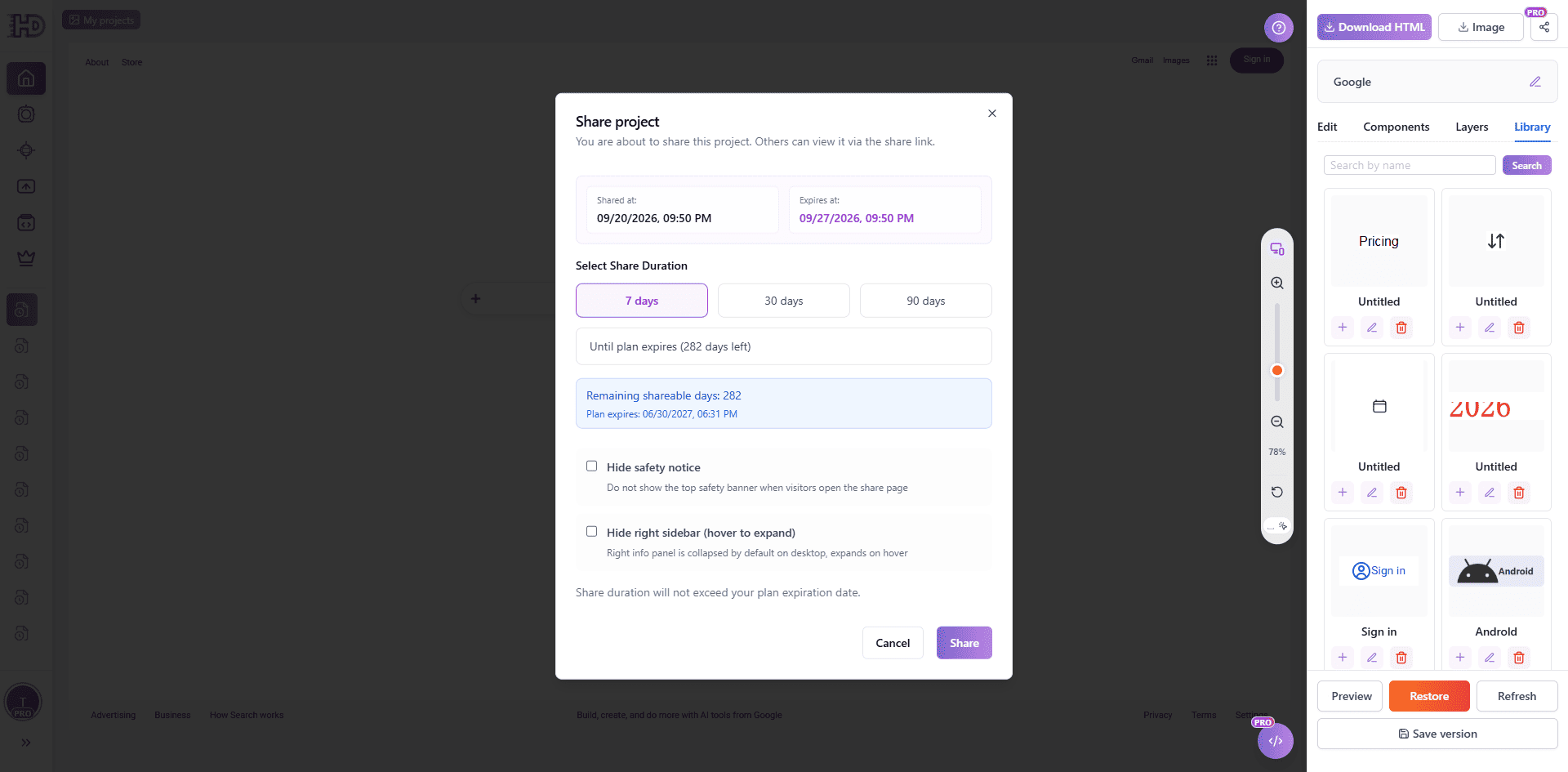
Share project: choose the link duration and decide which notices or sidebars to show
Choose Share Settings
Click Share and choose an available duration, such as 7 days, 30 days, 90 days, or the remaining period of your plan. The share link cannot outlive the plan expiration date.
Display Options
You can choose whether to hide the safety notice and whether to hide the right sidebar on the shared page. These options affect the visitor view, not the editable source in your project.
Share Page and Access
After sharing, copy the generated link and send it to reviewers or clients. You can return to the share controls to update the link or stop sharing when the page should no longer be public.
3.3 My Projects Shortcut Bar
The "My Projects" shortcut bar on the left allows you to expand/collapse the projects list and switch between projects quickly, facilitating smooth transitions between multiple creations.
Expand & Collapse
Click the "My Projects" button in the top left to expand the sidebar work list. Click again or click outside the sidebar to collapse it. When expanded, you can visually browse thumbnails and titles of your history projects.
Switch Projects
Click any project card in the list to immediately load its content into the editor. This allows you to quickly compare and modify different design drafts without returning to the homepage or profile.
3.4 Version History Snapshots
In the left sidebar, "My Projects" (History) provides quick access to your past creations. It lists all your editing records in chronological order.
Quick Select & Edit
Click any record in the list to quickly load it into the editor and continue where you left off, without re-importing.
Preview Window Details
Hover over a history record to see its preview window. In the preview window, you can:
- Edit Title Directly: Click the title text to modify the project name instantly.
- View Share Status: Icons indicate if the work is currently shared.
- Quick Actions: Access edit, delete, and other shortcuts.
History: Quick preview and management of past projects
3.5 Project Management & Organization
The project Management module displays all projects you've created, supporting view, edit, share, and delete operations.
Work List & Filters
Projects are displayed as cards or in a list. You can filter them using:
- Search: Enter work code or title to search
- Type filter: Filter by AI Generator, File Upload, Clone Webpage, Code Paste, etc.
- Date range: Select start and end dates to filter projects from a specific period
- Sort by: Sort by newest first, oldest first, likes count, or view count
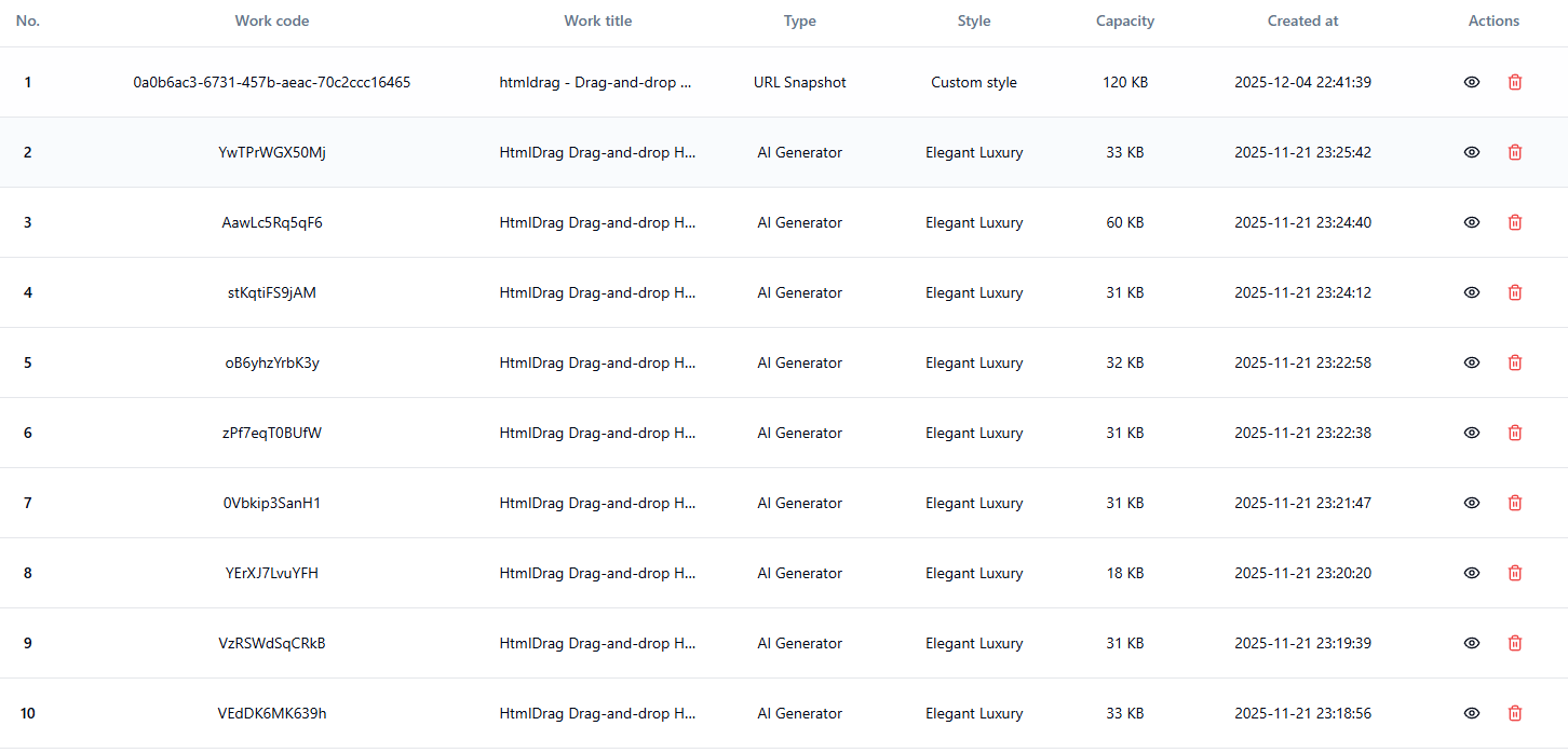
project management: View, filter, and manage all projects
View & Edit Projects
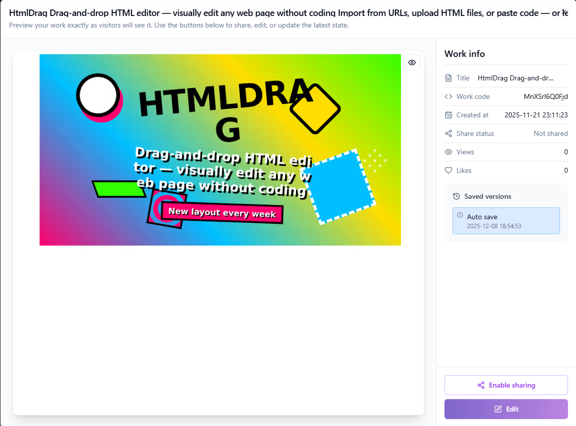
Click the "View" button on a project card to preview it. In the preview interface, you can:
- Edit the project title (double-click the title to edit)
- Click "Edit" to enter the visual editor and continue editing
- View the work's save history and restore to a specific version
Share Status Management
Pro users can share projects, allowing others to view via link:
- Enable sharing: Click the "Share" button to generate a share link valid for 7 days
- Update share: Already shared projects can have their links updated, refreshing the validity period
- Stop sharing: Click "Stop sharing" to immediately invalidate the link
Delete Projects
Click the "Delete" button on a project card to delete it. The system will show two confirmation dialogs to prevent accidental deletion:
- First confirmation: Asks if you want to delete this work
- Second confirmation: Reminds you that deletion is irreversible
Tip: You can delete up to 3 records at a time. After deleting a work, its storage space will be released.
The Projects page is your dedicated space for viewing and managing all your creations. Access it quickly from the sidebar or user menu.
Work Display
The page displays all your projects as cards, each containing:
- Thumbnail preview: Visual preview of the work for quick identification
- project title: Shows the project name, click to edit
- Creation time: Records when the work was created
- Share status: Shows whether the work is currently shared
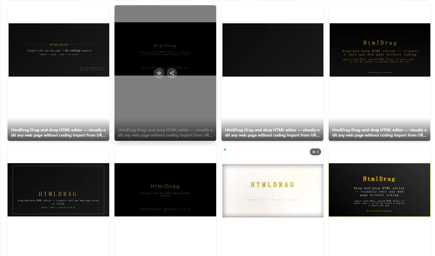
Projects: View and manage all your creations in one place
Quick Actions
Each project card provides convenient action buttons:
- Edit: Enter the visual editor to continue creating
- Share: Generate or manage share links (Pro only)
4. System Tips & Troubleshooting
During use, you may encounter system alerts or limits. Here are explanations and suggestions for common system tips.
4.1 HTML Detection & Hotlink Alerts
To ensure import quality and editor stability, the system automatically scans URLs and files, alerting you to potential issues.
Local Resource Detection
If a page contains local paths (e.g., file:// or C:/), resources won't load. Suggestion: Ensure all resources use public HTTP/HTTPS links.
Image Hotlink Protection
Some sites block external access to images. Suggestion: Use "Replace image" to upload local files or host them on a public service.
Dynamic Rendering Pages (SPA)
Pages relying entirely on JavaScript (SPA) may import as empty or incomplete because the dynamic DOM isn't captured directly. Suggestion: Use "Paste Code" by copying the rendered HTML from your browser.
External Fonts / Icon Libraries
Fonts or icons with missing CORS headers may display incorrectly. Suggestion: Replace them with system fonts or library icons in the editor.
Embedded Content (iframe)
For security, some iframe content may be blocked or non-interactive. The system preserves placeholders where possible.
4.2 Storage & Usage Limits
HtmlDrag applies resource quotas based on your plan. You may see "Storage limit reached" or "Work limit reached" alerts.
Storage Limit Reached
You cannot save edits or upload files when out of space. Solution:
- Delete old items in "Projects" to free up space.
- Click "Upgrade now" in the dialog to get more capacity with a Pro.
Project Count Limit
Free users have a limit on the number of saved projects. Delete old projects or upgrade to increase this limit.
Image Upload Limits
The system checks single file size and batch limits. If you see "File size exceeds the limit" or "Batch size exceeded", compress images or upload in smaller batches. Pro users enjoy higher limits.
4.3 Security Sandbox & Sanitization
The built-in Security Scan automatically evaluates content risk when importing URLs, uploading files, or pasting code to protect your account.
Risk Level
Based on threats like XSS, malicious scripts, or dangerous tags, risks are classified as:
- Low risk: Minor warnings; usually safe to proceed.
- Medium risk: Potential issues; proceed with caution.
- High risk: Severe risks; proceed only if the source is trusted.
- Critical risk: Contains malware or phishing content; blocked immediately.
Safe Mode
For files with some risk, the system offers "Safety measures" like Auto Sanitize. You can choose to "Continue in safe mode," where the system removes dangerous code while preserving layout and editability.
4.4 System Notifications & Messages
The Messages module receives important system notifications, including account status, payment reminders, subscription expiration alerts, and feature updates.
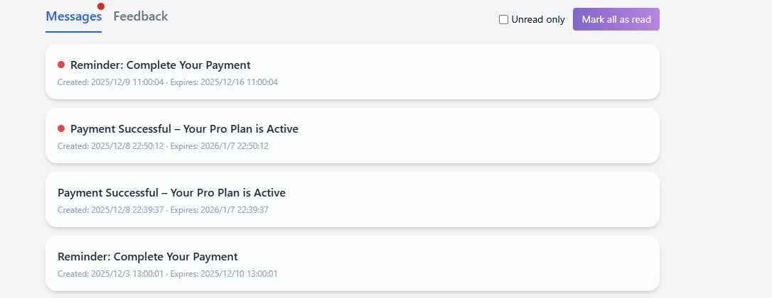
Messages: Receive system notifications and alerts
System Message List
The message list is sorted chronologically, showing the title, summary, creation time, and expiration time. Click a message to view details or perform actions (e.g., "Continue Payment", "Renew Now").
Unread Filter
Check the "Unread only" box in the top right to quickly filter for unread messages, helping you focus on important notifications.
Mark All as Read
Click the "Mark all as read" button to instantly mark all messages in the current list as read, clearing red dot indicators.
Message Details
Click a message card to view the full notification content. For order or subscription messages, details often include quick action buttons for your convenience.
4.5 Feedback & Support
If you encounter issues or have suggestions, submit them via the Feedback module. You can upload images to better describe your problem.
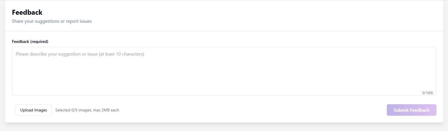
Feedback: Submit issues or suggestions
Feedback List & Status
The list shows your submission history and current status:
- In Progress: Feedback submitted, awaiting admin review.
- Replied: Admin has responded; click to view.
- Closed: Feedback archived or resolved; no further replies allowed.
Submit New Feedback
Click "New Feedback", enter your content (required, min 10 chars). You can "Upload Images" (max 2MB each) to provide screenshots. Click "Submit Feedback" when done.
Feedback Details & Conversation
Click a list item to view the full conversation history, including your messages and admin replies. The top shows the Feedback ID and attachments.
Continue Reply
For "In Progress" or "Replied" feedback, use the input box at the bottom to provide more info or reply to the admin until resolved.
When submitting feedback, you can add relevant screenshots or files to help us understand your request more clearly. In the feedback details, you can also review admin replies and the conversation history to follow the progress of your request.
We value every piece of feedback and will address it as soon as possible. Thank you for your participation and support!
5. Account, Credits & Subscription (Appendix)
Manage your account settings, login security, credit balances, and subscription plans.
5.1 Sign Up
HtmlDrag uses email registration. Simply fill in a few basic details to create your account. After successful registration, you'll be automatically signed in and redirected to the homepage.
Email Registration
On the registration page, complete the following steps to create your account:
- Enter email: Provide your frequently used email address. This will serve as your login credential and notification channel. Ensure the email format is correct, e.g.,
[email protected]. - Set password: Password must contain both letters and numbers, with a length of 8-32 characters. We recommend using a strong password to secure your account.
- Confirm password: Re-enter the password to ensure both entries match.
- Set nickname (optional): You can customize your nickname. If left blank, the system will automatically generate a default nickname for you.
- Agree to Terms: Check "I have read and agree to the Terms of Service and Privacy Policy", then click the "Sign Up" button to complete registration.
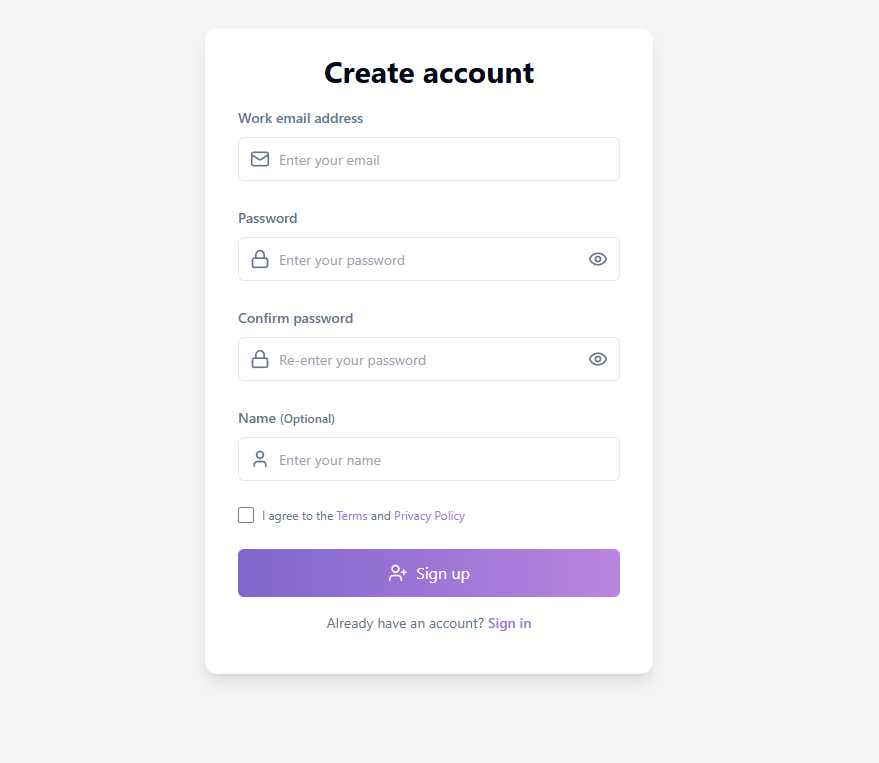
Registration page: Enter email and basic information to create account
Email Verification & Credit Reward
After successful registration, the system will send a verification email to your inbox. Upon completing email verification, you'll receive bonus credits that can be used for AI Generator and Clone Webpage features. If you don't receive the email, check your spam folder; you can click "Resend" to request another verification email after 3 minutes.
Tip: Completing email verification not only earns you bonus credits but also unlocks the full experience and enhances your account security.
5.2 Sign In
HtmlDrag supports multiple sign-in methods. Choose the most convenient option based on your preference.
Email & Password Sign In
Sign in using the email and password you registered with:
- Enter your email address on the sign-in page
- Enter your password (click the eye icon to toggle password visibility)
- Click the "Continue" button to complete sign-in
After successful sign-in, you'll be automatically redirected to the homepage where you can start creating.
Third-Party Sign In (Google / GitHub)
For quicker access, you can sign in using your Google or GitHub account:
- Sign in with Google: Click the "Sign in with Google" button. In the Google authorization popup, select your account and confirm authorization.
- Sign in with GitHub: Click the "Sign in with GitHub" button. You'll be redirected to GitHub's authorization page. After confirming, you'll be automatically returned to HtmlDrag.
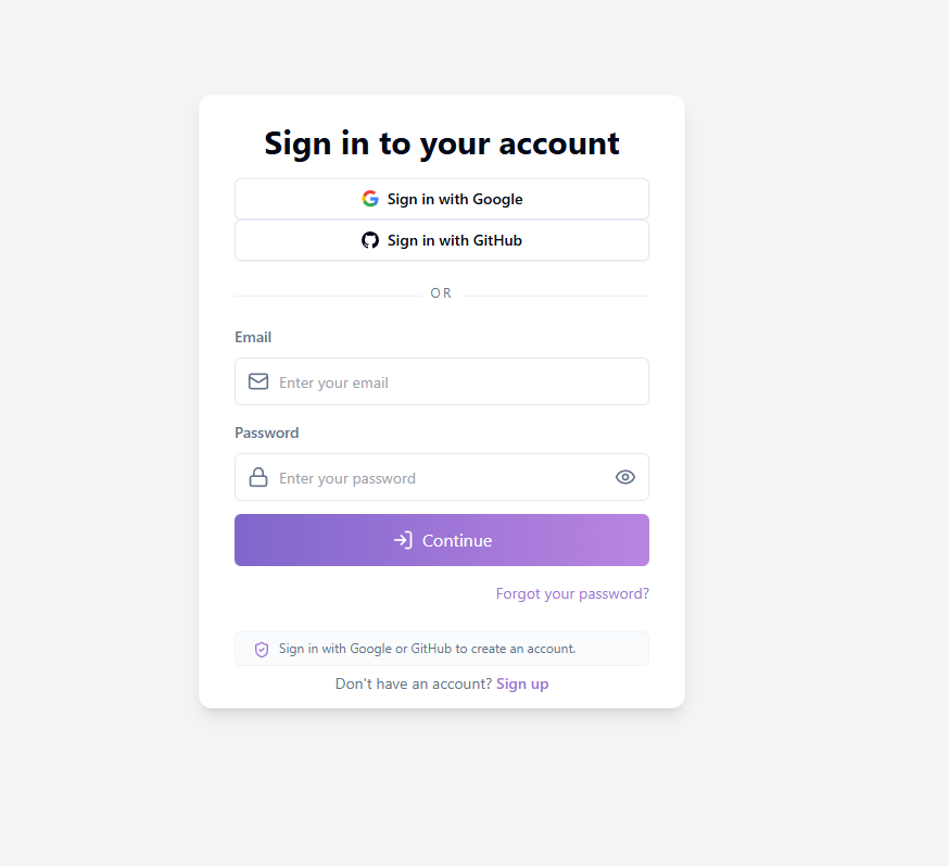
Sign in page: Supports email/password and third-party accounts
Tip: Using Google or GitHub sign-in automatically creates an account—no separate registration needed. On your first third-party sign-in, the system will automatically create a linked account for you.
Forgot Password Link
If you've forgotten your password, click the "Forgot your password?" link at the bottom right of the sign-in page to enter the password reset process (see Section 1.3).
5.3 Forgot & Reset Password
If you've forgotten your password, you can reset it using an email verification code. The entire process is completed on a single page without redirects.
Reset Password Process
Follow these steps to reset your password:
- Enter email: Provide the email address you used during registration
- Get verification code: Click the "Send Code" button. The system will send an email containing a 6-digit verification code
- Enter verification code: Input the 6-digit code you received in the verification code field
- Set new password: Enter your new password (must contain letters and numbers, 8-32 characters long)
- Confirm new password: Re-enter the new password to ensure they match
- Click "Reset Password": Complete the password reset. After seeing the success message, you'll be automatically redirected to the sign-in page
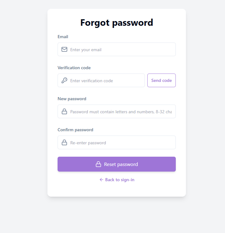
Forgot password: Reset via email verification code
Verification Code Validity
The verification code has a limited validity period—please use it promptly after receiving the email. If the code has expired, you can click the "Resend" button to request a new code (you'll need to wait for the countdown to finish before resending).
Note: If your email is not registered in the system, the verification code cannot be sent. Please ensure you're entering the email address used during registration.
5.4 Profile Settings
The Profile Settings module lets you manage your basic account information, including avatar, nickname, email, bio, and password settings.
Change Avatar
Click the "Change avatar" button in the avatar area and select a local image file to upload. The system will automatically crop and save your new avatar.
Change Nickname
Click the edit button next to your nickname, enter a new name, and click "Save". Your nickname will be displayed on all your projects and comments.
Email Management
The email section shows your current email address and verification status:
- Verified: Your email has been verified, and all features are available
- Not verified: Click "Send verification email" to complete verification and earn bonus credits
- Change email: You need to verify your current email first, then enter a new email address to complete the change
Bio
Enter your self-introduction in the bio area (recommended: no more than 200 characters), then click "Save" to update.
Change Password / Set Password
Click the "Change password" button to open the password settings dialog:
- Users with an existing password: Enter your current password, then set a new password (8-32 characters, including letters and numbers)
- Users without a password: Set a new password directly. After setting, you can sign in with email and password
Delete Account
To delete your account, click the "Delete account" button at the bottom of the page. For security, you'll need to verify your identity via email verification code.
Note: After submitting the deletion request, your account will enter a retention period (typically 30 days) during which you cannot sign in. After this period, the system will permanently delete your projects, credits, and history.
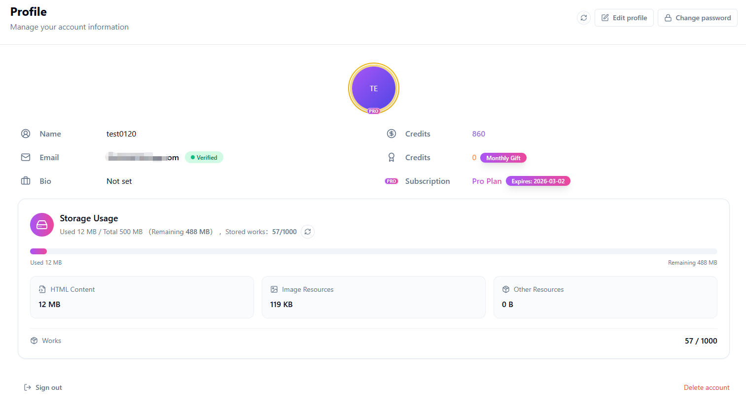
Profile: Manage avatar, nickname, email, and password
5.5 Storage Usage
The Storage Usage module displays your account's storage consumption, helping you understand remaining space and plan your creations accordingly.
Storage Overview
The top section shows your overall usage, including:
- Used: The storage space currently in use
- Total: Your account's storage limit (Pro users enjoy larger capacity)
- Remaining: Available space for creating new projects
- Stored projects: Current number of saved projects and the limit
Storage Breakdown
The system categorizes storage into three types:
- HTML Content: Space used by webpage code of your projects
- Image Resources: Space used by uploaded image files
- Other Resources: Space used by other attachments
Project Count Limit
Free and Pro users have different work count limits. When you reach the limit, you'll need to delete some projects or upgrade your plan before creating new ones.
Storage Refresh & Upgrade
Click the refresh button to update storage information. For more storage space, click "Upgrade storage" to visit the Pricing page and choose a suitable plan.
Tip: If your account storage is full or work count reaches the limit, the system will freeze new work creation. Please delete some projects or upgrade your plan to restore upload permissions.
5.6 Credits & Usage History
The Credit History module displays your account's credit transaction history, including consumption and earning records.
Credit Transaction History
Credit records are displayed in a table containing the following information:
- Date: When the credit change occurred
- Type: The operation type of the credit change
- Credits change: Credits added (positive) or deducted (negative)
- Description: Detailed explanation of the change
You can use date range filters to view records from a specific time period.
Credit Types
- AI Generator: Credits consumed when using the AI Generator feature
- Clone Webpage: Credits consumed when using the Clone Webpage feature
- Registration Reward: Credits awarded to new users after registration and email verification
- Platform bonus: Credits gifted by the platform
- Monthly Gift: Monthly credit allowance for Pro users
- Credit Top-Up: Credits obtained through credit purchases
- Admin Adjust: Credits manually adjusted by administrators

Credit history: View credit transaction details
Tip: Pro users receive extra credits each month. Credits can be used for paid features like AI Generator and Clone Webpage.
5.7 Order History & Billing
The Order History module displays your purchase history and payment records, making it easy to query and manage orders.
Order Management
The order list shows your purchase records. You can:
- View order status and details
- Use filters to quickly find specific orders
- Continue payment for pending orders
- Close or delete orders you no longer need
Tip: If you encounter payment issues, you can close the current order and place a new one.
5.8 Pricing & Subscription Plans
The Pricing page is where you manage your subscription and credit top-ups. Choose the plan that fits you best and unlock more creative possibilities.
Subscription Plans
HtmlDrag offers Pro and Pro Max subscription plans. After subscribing, you can use the included benefits during the active subscription period:
Pro: For regular creators who need the full HTML editing, AI generation, sharing, and export workflow.
Pro Max: For heavier AI creation, larger projects, and higher usage limits.
Subscriptions renew according to the billing cycle shown at checkout. You can manage or cancel renewal from your account or the payment provider.
Pricing: Choose the plan that fits you best
Top-Up Credits
If you only need temporary use of AI generation or Clone Webpage features, you can choose to top up credits. Purchased credits never expire, and you can top up anytime when running low—no waiting required.
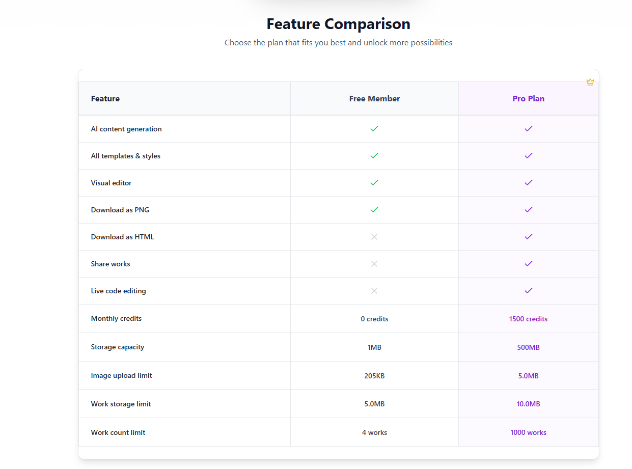
Feature Comparison
The main differences between Free and Pro are as follows:
| FeatureFreePro | ||
| AI content generation | ✓ | ✓ |
| All templates & styles | ✓ | ✓ |
| Visual editor | ✓ | ✓ |
| Download as PNG | ✓ | ✓ |
| Download as HTML | ✗ | ✓ |
| Share projects | ✗ | ✓ |
| Live code editing | ✗ | ✓ |
| Monthly credits | Basic quota | Premium quota |
| Storage capacity | Basic capacity | Larger capacity |
Credit Usage Guide
Each AI generation consumes a fixed amount of credits. Free users receive basic monthly bonus credits, while Pro users receive more. Purchased credits never expire, and you can top up anytime when running low—no waiting for quota recovery.
Get Started with HtmlDrag
Start with an existing HTML page, a public URL, a prompt for AI Refinement, or a supported file. HtmlDrag helps you move from source material to a visual edit, a shareable preview, or a clean HTML export.
This guide covers HTML upload, code paste, Clone Webpage, AI Refinement, File to HTML, text and image editing, tables, components, layers, links, locking and deleting elements, saving, sharing, and HTML export.